Posts about Public Typography
Main content
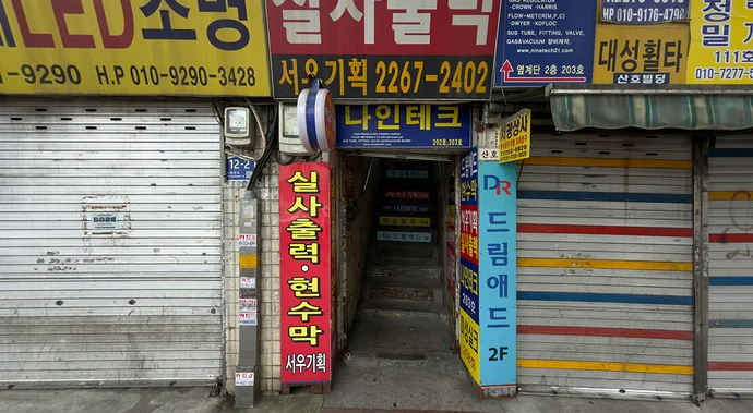
66 Street Type Findings
The Good, the Bad and the Ugly: Seoul Edition
From the workshop signs of the increasingly gentrified Mullae-dong district and the backyard print shops around Euljiro Printing Alley to the student-oriented streets of Hongdae and slightly faded nightlife districts such as Sinchon, Seoul presents a remarkably broad spectrum of individual public lettering.
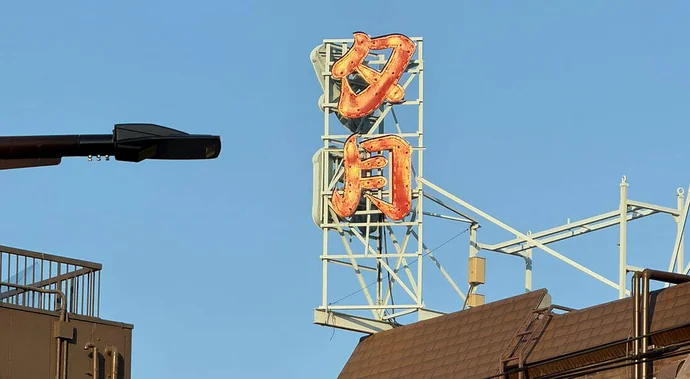
99 Street Type Findings
The Good, the Bad and the Ugly: Tokyo Edition
The series ‘The Good, the Bad and the Ugly’ brings together typographic finds from a range of cities. The photographs present them as they were encountered: unembellished, unedited and without aesthetic or qualitative judgement. Rather than distinguishing between ‘good’ and ‘bad’ or ‘ugly’ design, the focus is on typography as a direct expression of everyday urban culture.

Nike Shinjuku, façade. Photo: Nike
Shūetsu Satō’s adhesive tape lettering
Tokyo Tape Type: From the Underground to the Flagship Store
In April 2026, a new NIKE flagship store opened on the east side of Shinjuku Station. In an environment that all but overwhelms the viewer with advertising messages, the creative team led by the Creative director Shuichi Narita (Nike) and art director Shun Sasaki (Ayond) achieved a move that was as engaging as it was clever: for the branding, they drew on the iconic adhesive-tape lettering Shūetsu-tai by security guard Shūetsu Satō, which for over twenty years has been inseparably associated with Tokyo’s busiest railway station—and indeed the busiest in the world.
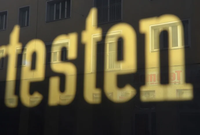
A (virtuell) walk to Vienna’s gilded Signs
Vienna, Gilded
Pallas Athena, the Secession, the Plague Column—Vienna has never been sparing in its use of gilding on architectural landmarks. Far less attention, however, has been paid to the gilded shopfronts and commercial portals that came into vogue around the turn of the twentieth century, and which played a formative role in establishing Vienna’s reputation as a centre of sign painting.
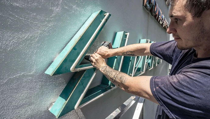
The Verein Stadtschrift in Vienna
The Typographic DNA of the City
Television repair, photographic studios, taverns: not only the design of the lettering itself, but also the services once advertised by these signs now appear curiously antiquated. Yet it is neither nostalgia nor a longing for a “better past” that motivates the association Stadtschrift, which collects, preserves, and reintroduces these Viennese signages into the public realm.
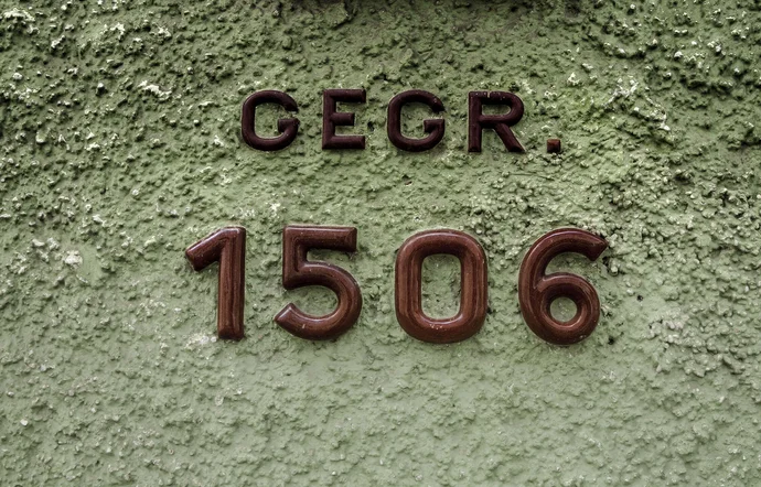
Gmunden Ceramics
Type, fired in ceramic
Gmunden, a small town situated in Austria on the shores of Lake Traunsee, is recognised as an important centre of ceramic production. This tradition is visibly embedded within the townscape: ceramic reliefs and typographic elements appear throughout the streets, forming subtle yet characteristic details that attest to a long-standing artisanal practice.
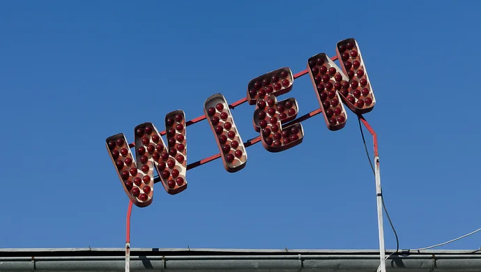
Alone in the Wiener Prater
Lockdown in the Amusement Park
Vienna’s Prater looks back on more than 250 years as a place of recreation on the city’s doorstep. The Wurstelprater in particular, with its array of attractions, has long been a favoured destination for Viennese families and a place of longing for generations of children. In spring, the Prater enters its high season, when tourists and local families alike crowd around its stalls. In April 2020, however, everything was different. During the first lockdown, the deserted Prater revealed itself as both captivating and eerily uncanny.
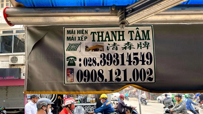
Awnings as Advertising Space
Extreme Scale 3D-Typography
In Ho Chi Minh City, the prolific use of awnings as advertising surfaces is a defining feature of the urban landscape. Smaller shops and restaurants, in particular, make use of these large-format displays to attract attention, often prominently presenting the house number in oversized numerals.
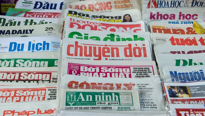
Vietnamese Newspaper Titles
Colourful roadside finds
A chance discovery not far from the memorial to Thích Quảng Đức—who set himself alight in Saigon on 11 June 1963 in protest against the persecution of Buddhists: at a roadside stall, the colourful newspaper headlines immediately draw attention.
Amsterdam’s Krulletters
Letters and Lager
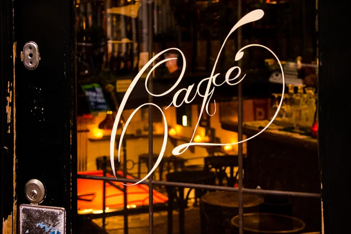
They belong to Amsterdam much as pubs belong to London: bruin cafés—intimate, traditional establishments frequented by locals and, for the most part, still largely untouched by gentrification and the excesses of tourism. What unites these cafés, beyond their preserved local character, are the often playful letterings at their entrances, known as krulletters.