Main content
The Verein Stadtschrift in Vienna
The Typographic DNA of the City
Letters with Character
This is all the more regrettable, as shopfront signage contributes in no small measure to the atmosphere of a city or neighbourhood. In Vienna, many storefront letterings from the 1950s and 1960s survived comparatively long when set against other cities; yet in recent years, a pronounced wave of closures has taken its toll. Where such signs were once routinely discarded, they have since become highly sought-after collector’s items.
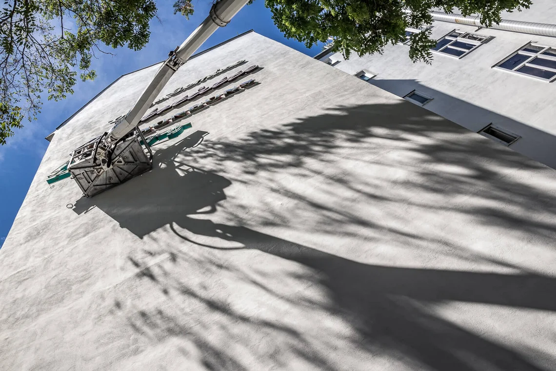
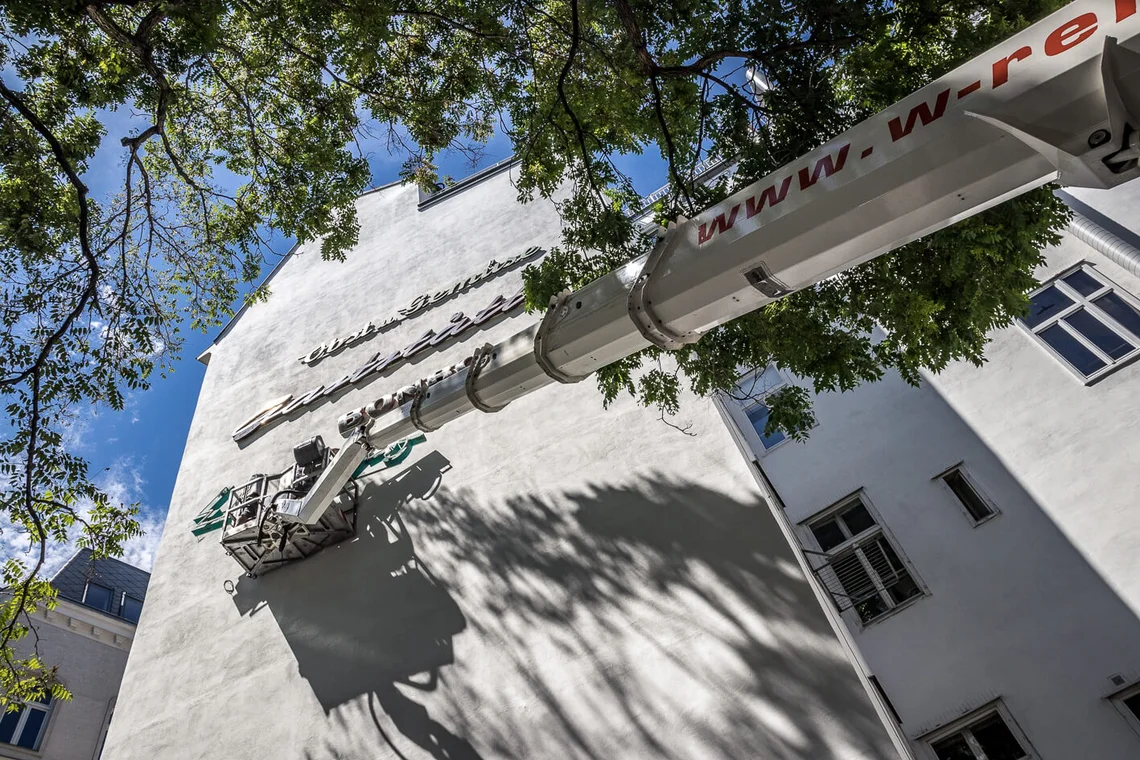
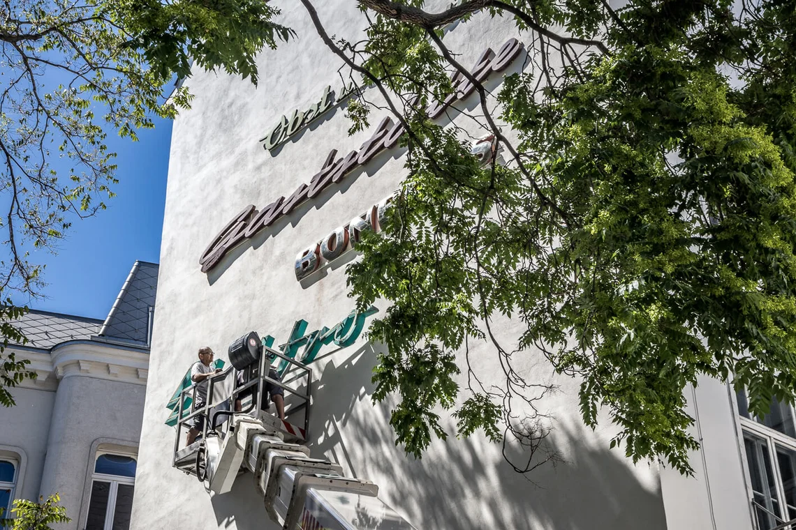
In 2012, the Verein Stadtschrift began systematically documenting historic Viennese shop signage and rescuing it from destruction. From the outset, the guiding idea was to return these artefacts to the public realm. In September 2014, the first Mauerschau opened in the small Sperlgasse in Vienna’s second district—only to be dismantled again in the autumn of 2018.
This article accompanies the realisation of their second Mauerschau in August 2020 and was first published in the online magazine of the Vienna Museum.
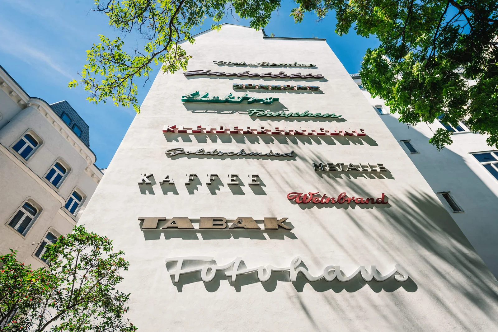
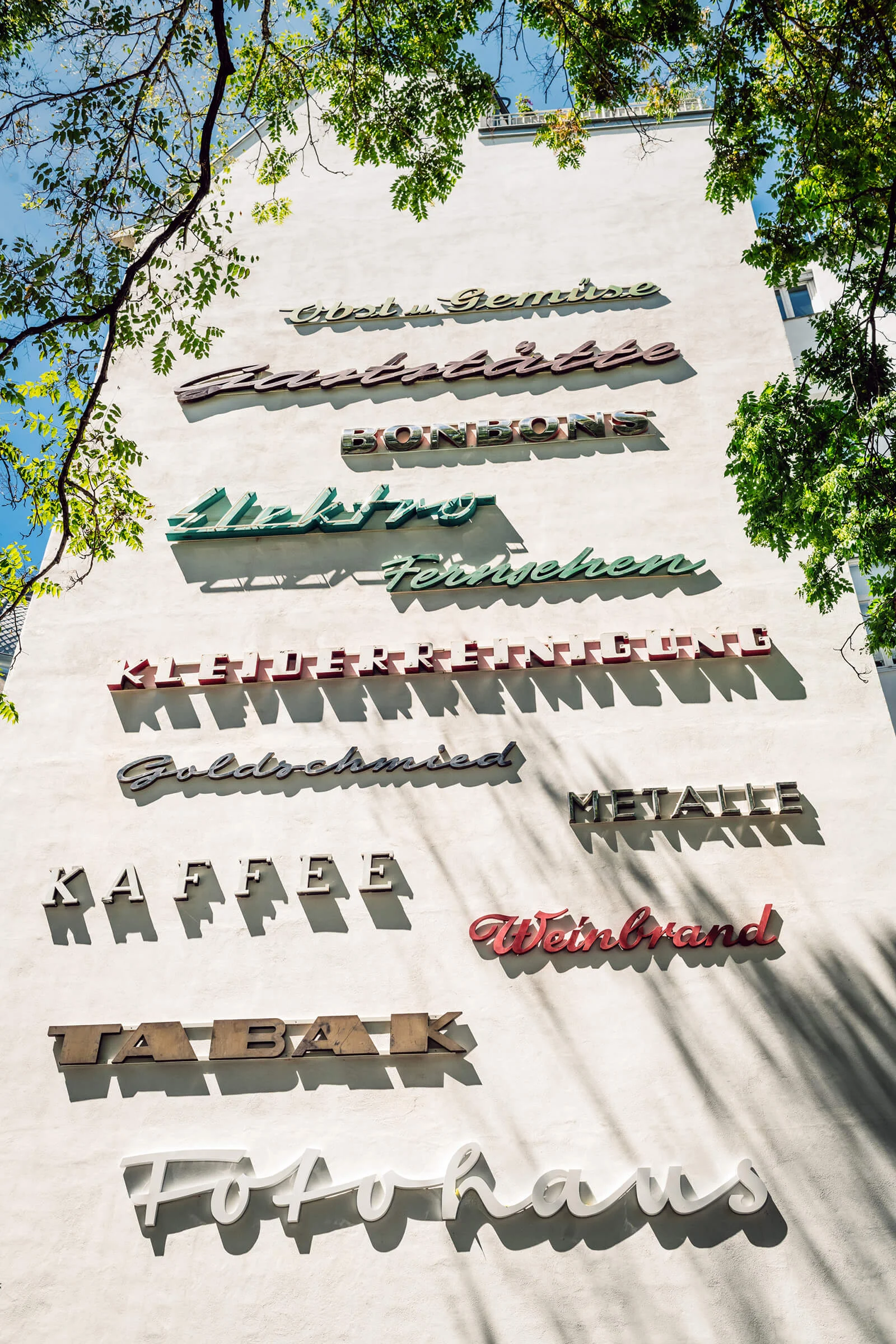
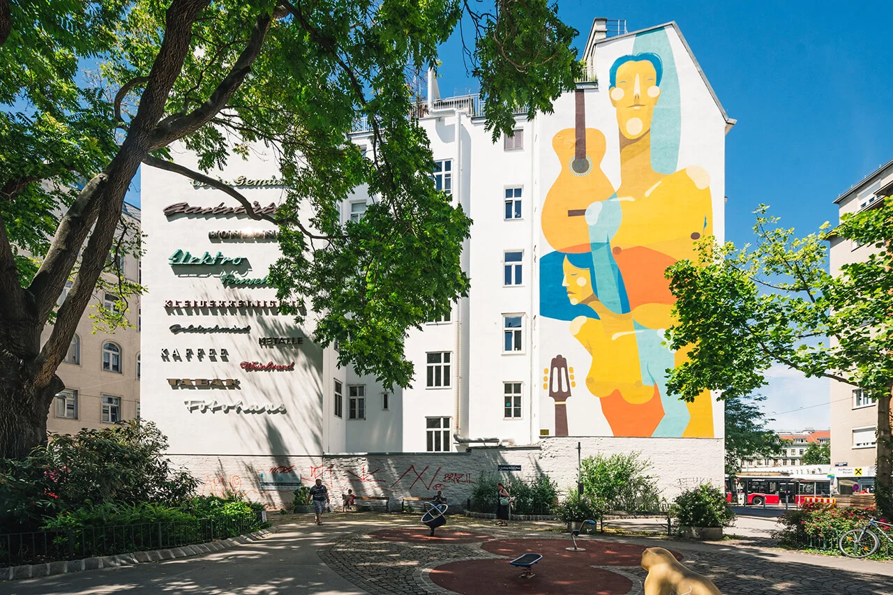
A Distinctive Format
In recent years, numerous initiatives have emerged in cities across the world, dedicated to the preservation, collection, or at least the documentation of local signage. These letterings can be encountered in books and online archives, or admired in museum contexts—such as the Neon Muzeum in Warsaw, the now-closed Buchstabenmuseum in Berlin, or the American Sign Museum. Yet however carefully these exhibitions may be conceived, they invariably carry a note of melancholy when such works “enter the museum.” For these letterings were created to be mounted above eye level; their full effect unfolds only in situ, across the façade.
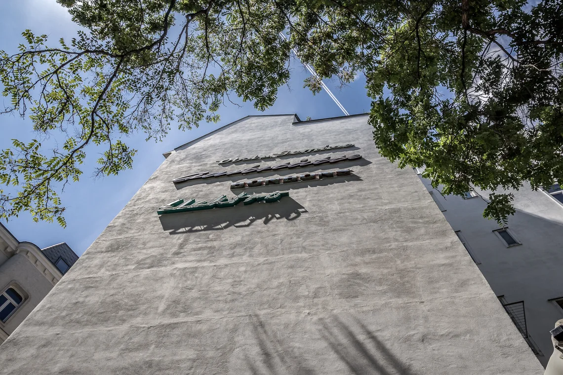
The Viennese approach—granting these signs a “second life” in the public realm—accords far more closely with their original nature. Positioned high upon firewalls, they are dispersed throughout the city, accessible to all. Anyone passing by may take notice—or may not.
Much as in their “first life” above shopfronts: passers-by, encountering them day after day, may eventually cease to register their presence at all—just as they once overlooked the lettering of the “small shop around the corner,” until the day it closed for good.
A Labour-Intensive Commitment
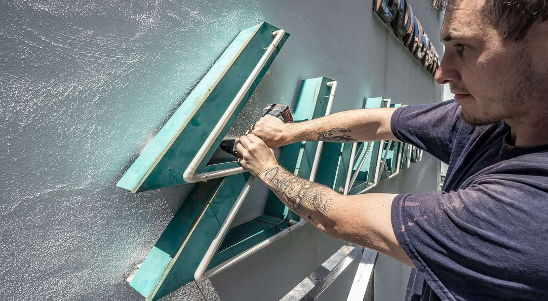
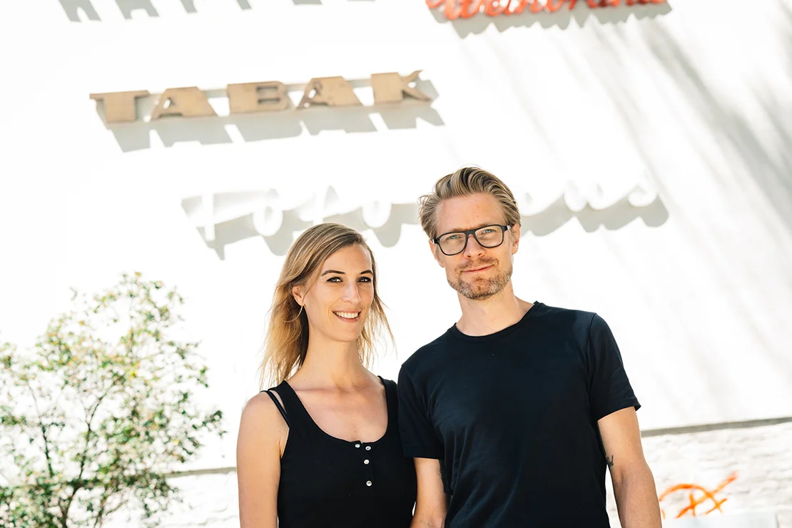
Behind the Stadtschrift project stand Birgit Ecker and Roland Hörmann, who describe their work as decidedly labour-intensive. Following up on reports of shop closures, negotiating with property management companies, securing sponsors, and restoring the signs for reinstallation are only some of the many steps that precede a Mauerschau.
In the case of Ludwig-Hirsch-Platz, more than a year and a half elapsed between the initial discussions and the eventual installation.
Further information on their projects can be found at Stadtschrift: www.stadtschrift.at.
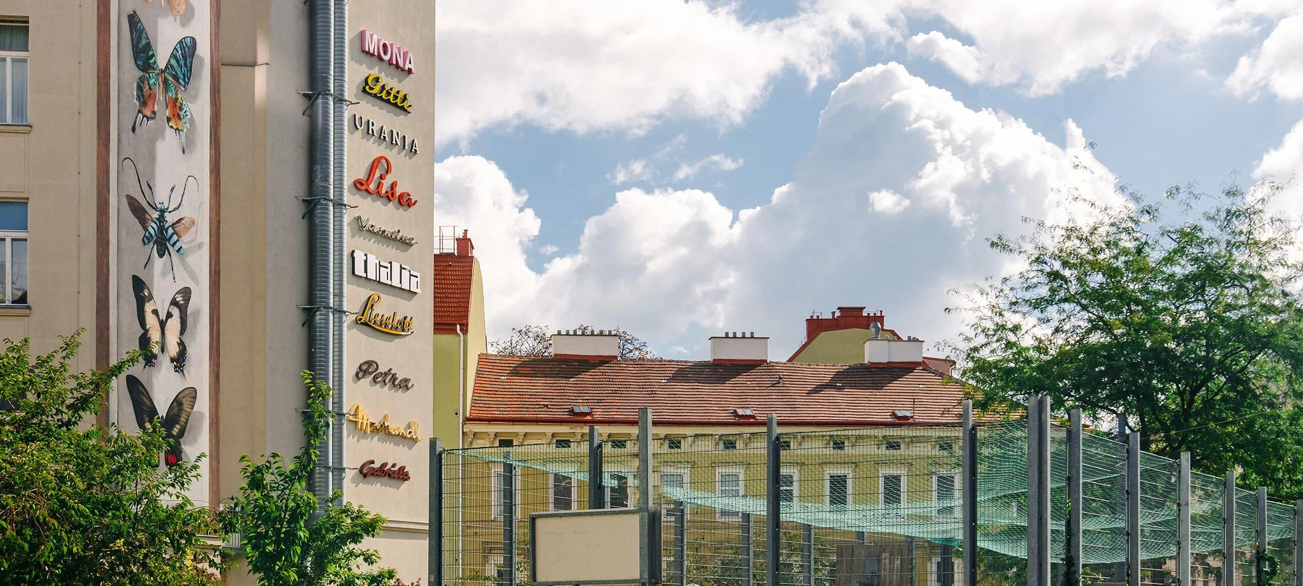
Ideas are in no short supply for Birgit Ecker and Roland Hörmann—nor, indeed, are letters. As early as 2018, the two realised the project “Lieselott,” “Mona,” and “Gitti,” bringing a total of ten women’s names, rendered as typographic signages, onto the Frauennamenmauer at the corner of Hofmühlgasse and Mollardgasse. At present, three firewalls and two showrooms are dedicated to Viennese signage.
In conversation, Roland Hörmann mentions a project particularly close to his heart: following the women’s names in the sixth and the abstract concepts in the second district, the time has come, he suggests, to dedicate a wall to the great Viennese commercial names—Slama, Osei & Co. The supply of suitable lettering, at any rate, would be more than sufficient.
A (Hi)storie Behind Every Façade
As another, equally compelling aspect of their work, Birgit Ecker and Roland Hörmann describe the reconstruction of the histories behind the letterings and the businesses to which they once belonged. These signs often bear witness to family-run enterprises that, across generations, offered their goods and services to the city.
Many were institutions within their neighbourhoods; for others, customers would travel across Vienna in search of their specialised offerings. An information panel on site provides insight into these businesses and their histories, presenting the letterings within their original contexts.
Selected Examples:
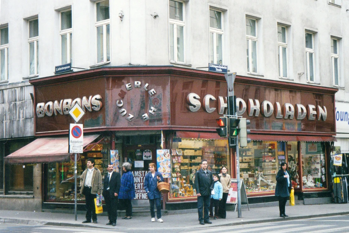
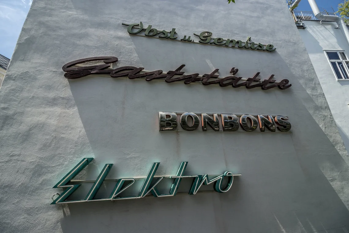
Bonbons
Sweet Shop, 5th district, Reinprechtsdorfer Straße 39
Removal: 2005
Lavishly decorated display windows, the unforgettable scent upon opening the door: sweet shops were the ultimate childhood dream, often strategically located near cinemas or theatres. Zuckerlecke ceased trading in 2005; its last proprietor was Hans Jaul. By the time of its closure, the word “Schokoladen” was already incomplete, as the letters—mounted on glass panels—had not been drilled but affixed, a method that proved surprisingly durable, though not indefinitely so.
The lettering is likely to have been produced by Körner & Kloss (1897–2002), which held a patent, well into the 1950s, for this particular construction of mirrored and curved letters. In a small number of historically preserved confectionery shops still found across Vienna, it remains possible to embark upon a sweet journey into the past.
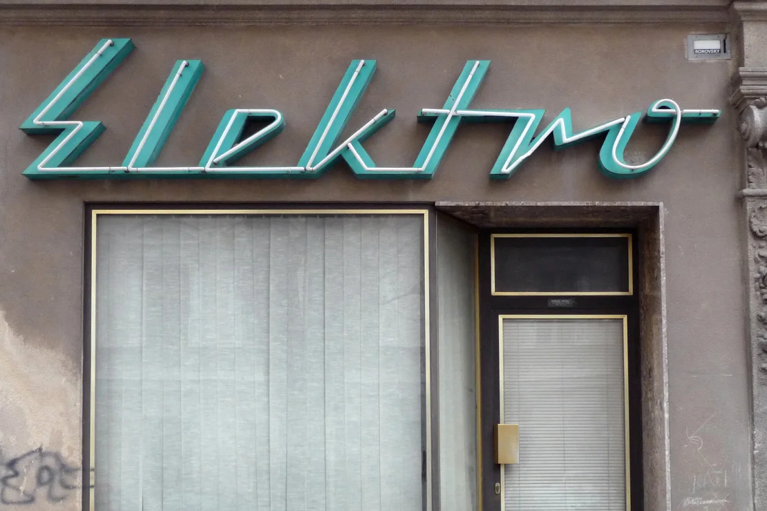
Elektro
Electrical Supplies, 16th district, Hasnerstraße 59
Removal: 21 April 2012
“Elektro Heyhall” was among the first signage rescues undertaken by the Stadtschrift, and for four years it illuminated the inaugural Mauerschau in the small Sperlgasse. Installed in 1964 by the firm Ronovsky, the futuristic lettering—most notably the lightning-bolt-shaped “E”—stands as a typographic homage to electrification. The neon installation was maintained by the staff themselves.
Until the mid-1980s, the shop operated six days a week; thereafter, the premises were used as storage. The company itself continues to exist: since 1985, Heyhall Elektro Installationen has been registered as a limited liability company, and since 2008 it has operated under new management.
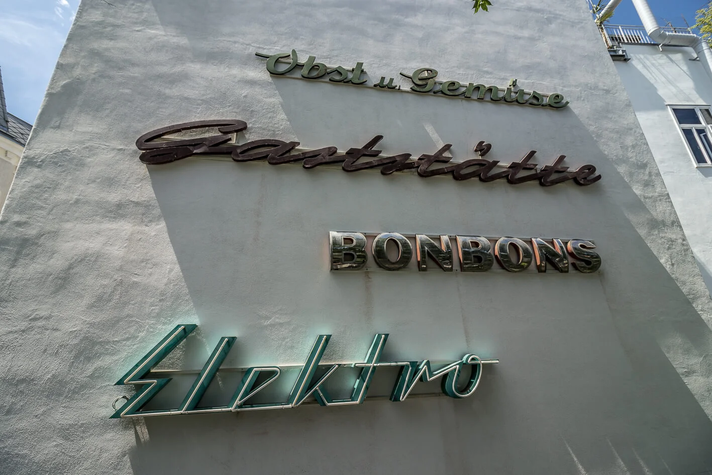
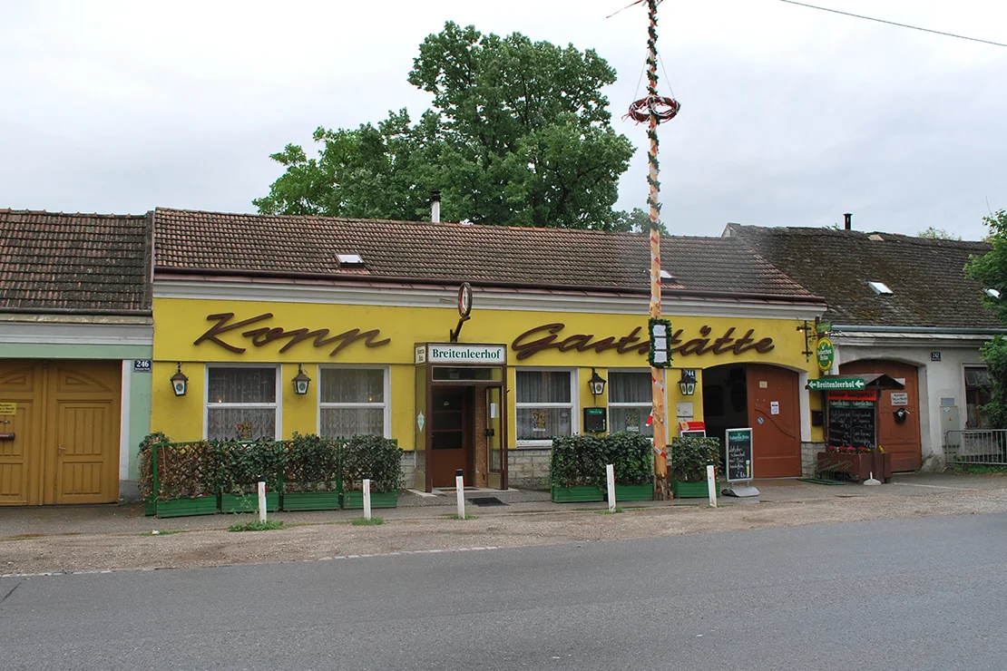
Gaststätte
Restaurant, 22nd district, Breitenleer Straße 244
Removal: 15 April 2014
In recent years, a number of traditional inns in Donaustadt have been forced to close, prompting local newspapers to speak of a veritable “die-off” of taverns. Among those affected was the Gaststätte Kopp, known since 1997 as the “Breitenleerhof.” The extensive grounds of this establishment—dating back to the 1880s—were acquired in 2013 by the Wohnbauvereinigung für Privatangestellte. In its place, a residential complex of rental apartments was developed across several buildings, while the existing historic ballroom was preserved.
There were efforts to reinstall the original signage following the redevelopment; however, due to its considerable width, no suitable location could be found. A distinctive feature of the lettering is its yielding baseline, which appears to curve away at the end of the word, as if accommodating the adjacent archway.
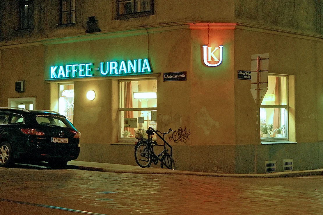
Kaffee Urania
Café, 3rd district, Radetzkystraße 24
Removal: 2 March 2016
When Hubert Horky took over the café from his mother in 1964, the location already looked back on a long tradition of Viennese coffeehouse culture. The proprietor’s distinctive Schmäh—that uniquely Viennese blend of wit and charm—alongside furnishings that remained unchanged until the very end, made Kaffee Urania one of the city’s more idiosyncratic establishments. In January 2016, the café closed; not long thereafter, Horky passed away.
The signage, executed with neon tubing at the entrance and continuing unlit around the corner, dates from 1964. The second element of the sign—the figure of the muse Urania—has since found a new home on the Female-Names-Wall in Hofmühlgasse, in Vienna’s sixth district.
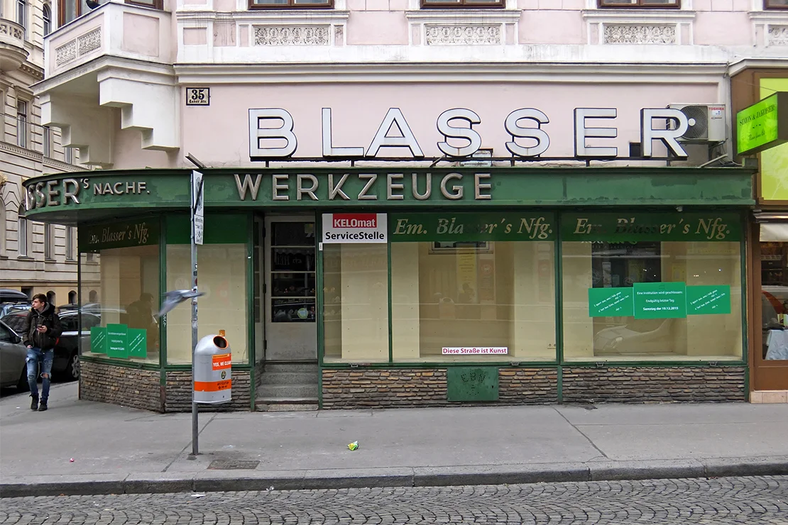
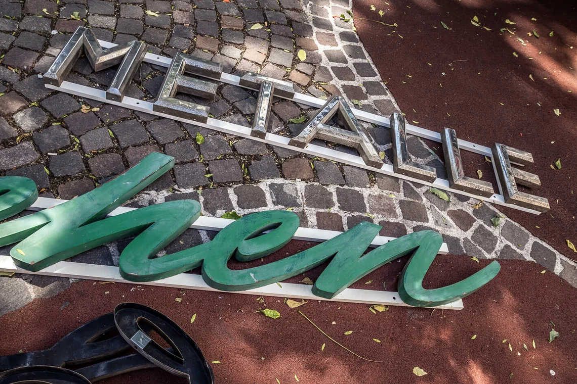
Metalle
Metal Goods, 2nd district, Taborstraße 35
Removal: 15 January 2016
This lettering originates from the immediate vicinity of the Mauerschau. Founded in 1836, the business rested on three distinct pillars: along Taborstraße, iron goods, screws, and nails could be purchased individually; on Große Pfarrgasse, a household goods department offered an eclectic range of items, from honey dispensers to electric bread knives. Those wishing to have their pressure cookers safety-checked would find the appropriate service at Blasser’s KELOmat workshop.
Beyond this, “der Blasser” was also a longstanding presence in the Austrian water sports market: boat fittings, ropes, and rigging were available just opposite, on Große Pfarrgasse. As early as 1905, Ernst Bathelt is recorded as the successor to Emmerich Blasser—suggesting that the chrome-plated lettering may well date from this period. In the late 1970s, the business was taken over by Ing. Peter Hahn; from 2004 onwards, it was run by Herbert Felfernigg, a proud and knowledgeable shopkeeper of the old school.
Write comment
Write comment
Comments
No Comments