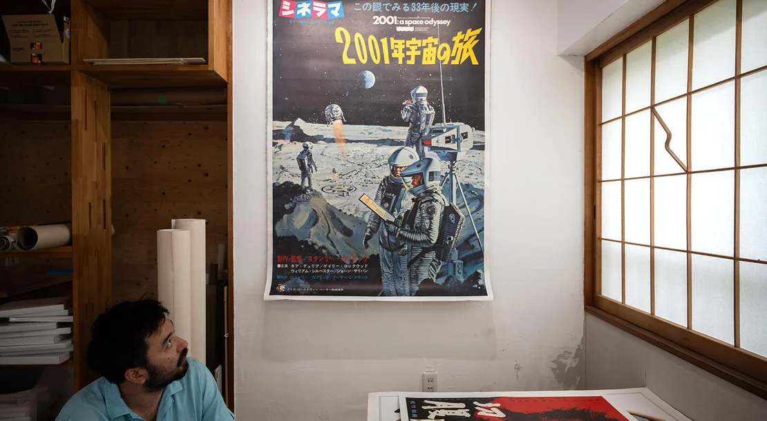
On display in the Japan Poster Shop showroom: the huge B0 billboard for Stanley Kubrick's 2001: A Space Odyssey, a monumental survivor from the era of roadshow science fiction.
Main content
The World of Japanese Film Posters
Designed to Disappear
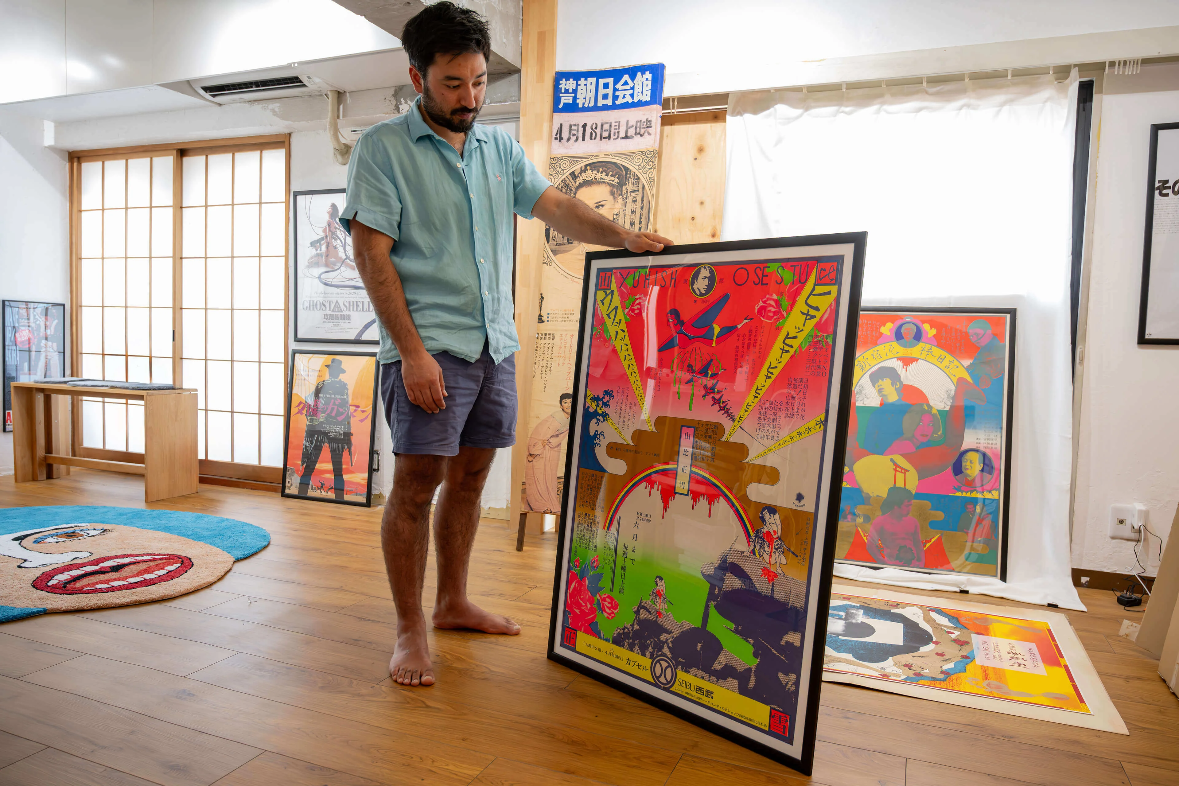
What is it about Japanese film posters that fascinates you? Where did your passion for collecting begin?
I think it really began with my background as a collector. My father has always collected books and various other things, so collecting was something I grew up with. But my fascination with Japanese film posters started in 2008, when I was eighteen years old and bought my first poster, which was for La Dolce Vita.
I still own that poster today. It was the piece that sparked everything. From that moment on, I simply kept collecting, learning and gradually immersing myself in the world of Japanese film posters. What began with a single purchase eventually developed into a lifelong passion.
Your personal fascination with collecting has grown over almost two decades into one of the world’s leading specialist collections of Japanese film posters. How did that develop?
It’s actually quite difficult to describe because it didn’t happen through one defining moment. It was a gradual process that evolved over many years. I kept learning more about Japanese film posters, reinvesting everything back into the collection and steadily building on what I’d already achieved. Over time, that process simply compounded. Year after year, the collection grew, my knowledge expanded, and the relationships I built within Japan became stronger. Looking back, that’s really how it developed.
The Japan Poster Shop sees itself not just as a retailer, but as much more than that?
First and foremost, we are a business, but I also see us as custodians of a unique collection. Film posters are at the heart of what we do, yet our collection extends far beyond cinema. It includes everything from pre-war Japanese beer advertisements to posters from different decades, genres and formats. We’ve never tried to define ourselves too narrowly. If it’s a Japanese poster with historical, artistic or cultural significance, and we genuinely like it, then it’s something we want to preserve and add to the collection.
Creating this gallery was never simply about having a showroom. I wanted to establish a place where people could experience original works that they simply cannot see anywhere else. Looking at a rare poster on a screen is one thing; standing in front of the original is something entirely different. That experience is important to us.
So while we certainly sell posters, our work goes beyond retail. We are documenting, preserving and sharing an important part of Japan’s graphic and cinematic history.
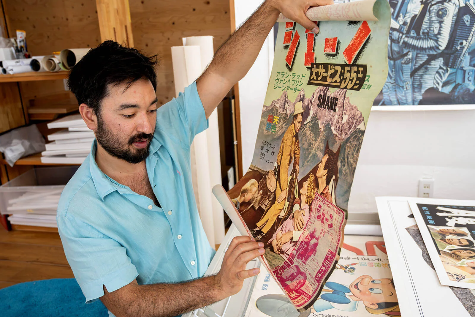
You also work with museums and institutions? Are there any museums or collections in Japan that focus on poster art? And if so, are these collections open to the public?
Yes, although perhaps not in the way people might expect. We regularly visit exhibitions at the National Film Archive of Japan whenever they organise poster displays, and it’s always interesting to compare what they exhibit with our own collection. Quite often we discover that we own many of the same posters.
We don’t have a formal partnership with the National Film Archive, but we do collaborate with museums and cultural institutions internationally. Recently, for example, we supplied several Japanese horror posters for an exhibition at a major film museum in Los Angeles. They were looking for very specific pieces and four or five of the posters came directly from our collection.
We’ve also worked with institutions in Australia and elsewhere. Sometimes we sell posters for exhibitions, other times we’re happy to lend them. If an exhibition helps present Japanese poster art to a wider audience, we’re always interested in supporting it.
Alongside other traditional techniques such as woodblock printing, textile printing or calligraphy: what significance did and does poster art hold in Japan?
Japanese poster design has always been closely connected to the country’s wider graphic arts tradition. Many of Japan’s best-known graphic designers also designed film posters. One of the most celebrated was Hisamatsu Noguchi, whose work during the 1950s and 1960s, including the famous Japanese poster for The 400 Blows, is now internationally recognised as a design classic.
The same applies to designers such as Tadanori Yokoo, Eiko Ishioka and Kiyoshi Awazu. Although they are primarily known as graphic designers and artists, they all created memorable film posters. That crossover between fine art, graphic design and cinema has always been an important characteristic of Japanese poster culture.
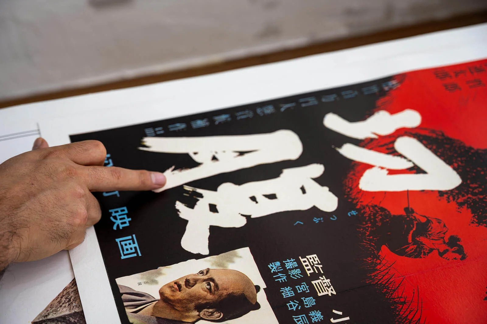
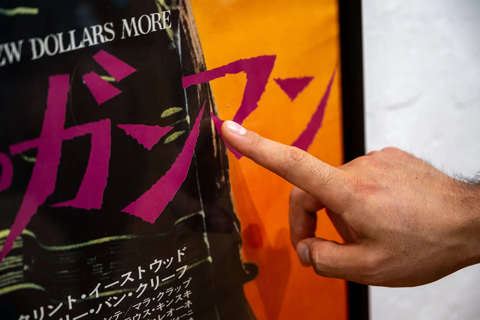
Calligraphy is equally significant. In Japan, shodō is regarded as a traditional discipline in the same way as ikebana or the tea ceremony. Every child learns the fundamentals at school, but true mastery takes decades. The movement of the brush, the pressure applied to each stroke and the rhythm of the writing all carry meaning. Many classic film posters were created by master calligraphers, so the lettering is not simply typography – it is an integral part of the artwork itself.
This combination of graphic design and traditional calligraphy gives Japanese posters a very distinctive visual language. Even when internationally renowned designers created posters, they often incorporated these traditional principles, making the typography as expressive as the imagery itself.
How significant is the international influence? Did international trends play a role? If so, when did globalisation make its mark on poster art in Japan too?
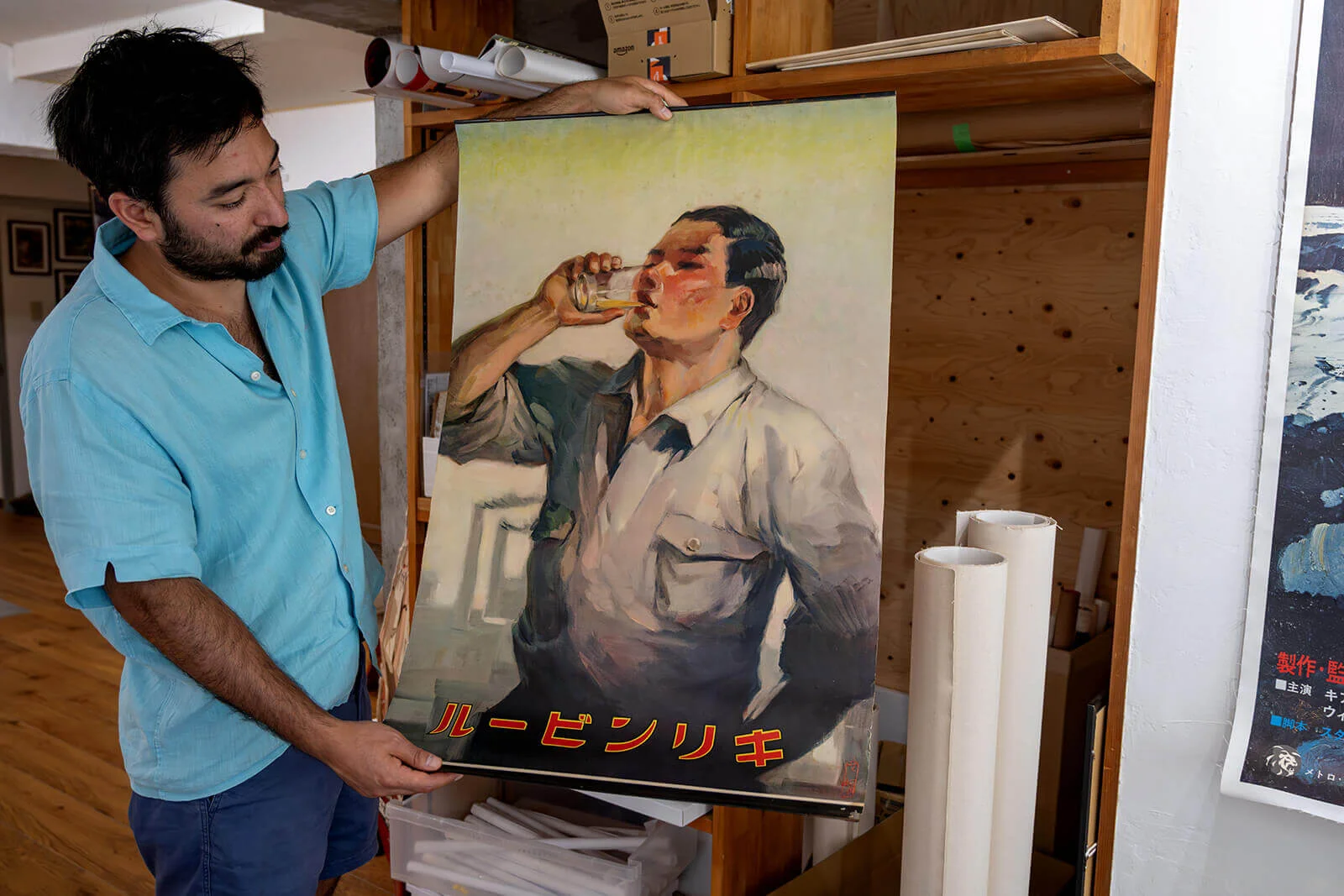
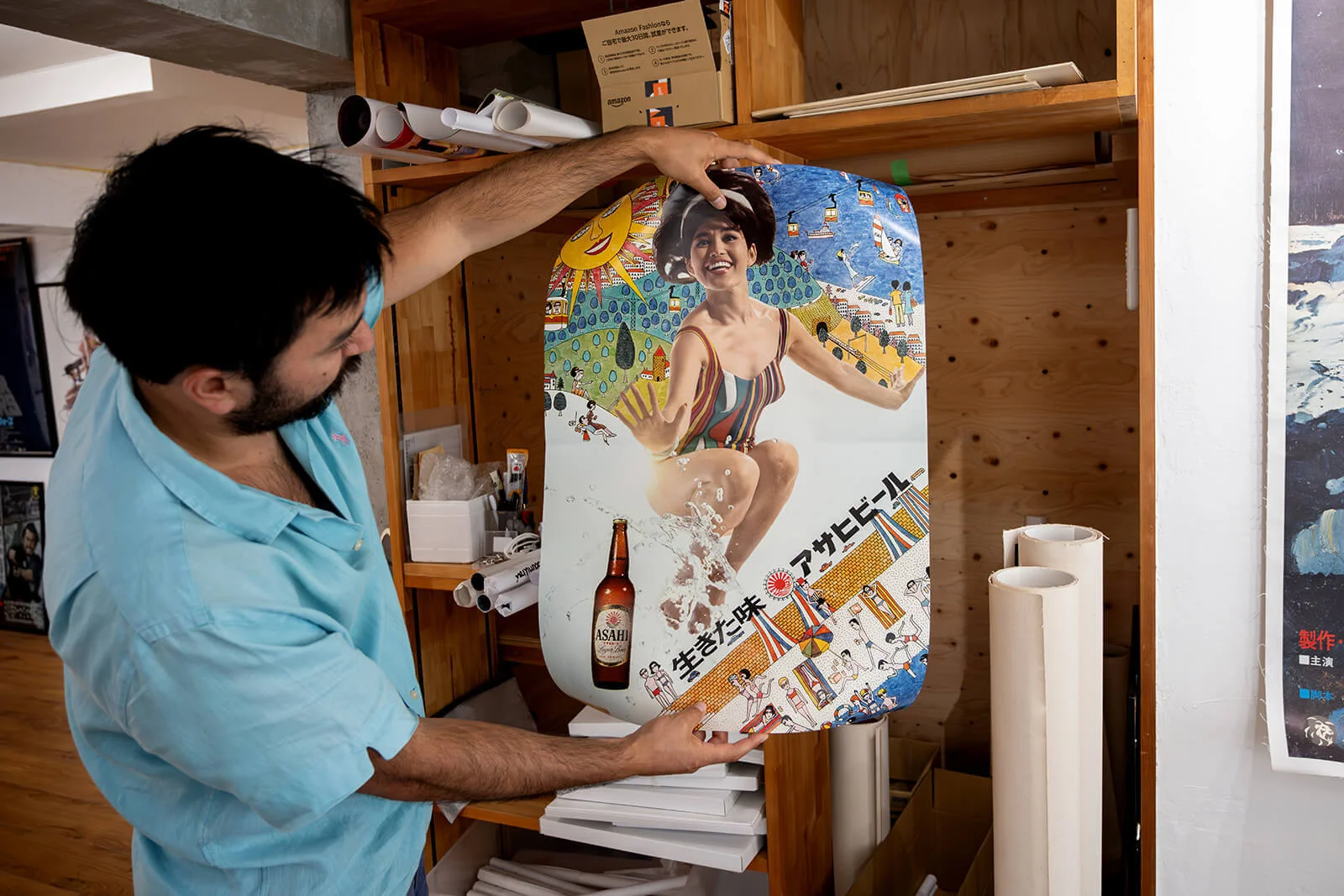
International influence appeared much earlier than many people realise. You can already see it in Japanese commercial advertising at the end of the nineteenth century. Early beer advertisements, for example, clearly reflect German and Dutch influences because brewing itself had been introduced from Europe. Even the people depicted in these advertisements gradually changed from wearing traditional kimono to Western clothing as Japan modernised.
By the 1910s and especially throughout the 1920s, Western aesthetics had become increasingly visible in Japanese poster design. Fashion, typography, illustration styles and advertising techniques all evolved alongside Japan’s growing engagement with Europe and the United States. Rather than replacing Japanese traditions, these influences blended with them, creating a visual language that remained distinctly Japanese while embracing international design trends.
According to your website, the price range is from 100 to 50,000 USD. Collecting is always a matter of trust. What standards do you have regarding the provenance, authenticity and condition of the posters?
Trust is absolutely fundamental. When someone buys a poster from us, particularly an expensive one, they need complete confidence in its authenticity, provenance and condition. Condition starts with transparency. Every poster is carefully photographed and any flaws are clearly documented.
Provenance is equally important. Although we’re still a relatively young company, we’ve invested heavily in building one of the most significant collections of Japanese posters available. More importantly, we’ve spent many years developing trusted relationships with collectors, dealers and estates throughout Japan. Knowing exactly where a poster came from is often the strongest proof of authenticity.
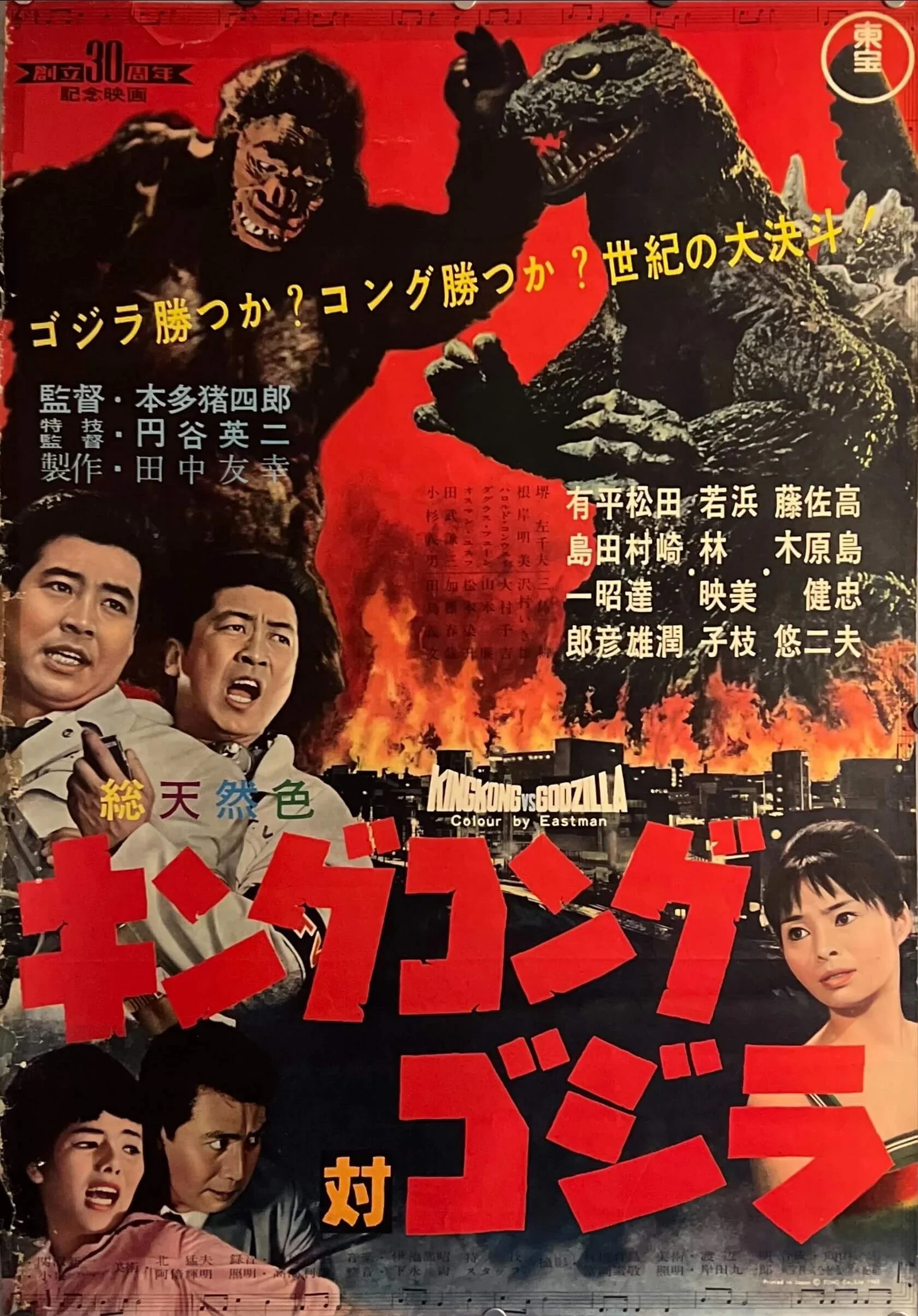
Experience also plays a huge role. After handling tens of thousands of original posters, you develop an instinct for authenticity that goes far beyond certificates. The paper, the printing process, the folds, the ageing, the smell of old paper, even the way Japanese posters were originally stored, all become part of the assessment. A good example is the original King Kong vs. Godzilla poster. At first glance it looks almost identical to an official reprint from the 1980s, but once you’ve handled both versions, the differences become immediately obvious.
Unfortunately, as prices have increased dramatically over the last few years, reproductions and counterfeit posters have become much more common. Many buyers purchase through online auctions from overseas, where they only have a few photographs and often cannot inspect the poster themselves. Once import duties and shipping are involved, recovering money from a fraudulent sale becomes extremely difficult. Being based in Japan allows us to inspect posters in person and challenge sellers if something isn’t genuine. On the rare occasions we’ve encountered misrepresented posters, we’ve been able to resolve the situation directly.
We do issue certificates of authenticity, but ultimately a certificate is only as trustworthy as the person behind it. In Japan I’ve seen antique dealers selling samurai armour worth tens of millions of yen without certificates because their reputation alone guarantees authenticity. In the end, expertise, provenance and trust are always more valuable than a piece of paper.
The rarity of individual subjects is also largely determined by the poster formats. Which formats were commonly used in Japan? And have certain formats survived to this day?
Traditionally, the standard Japanese cinema poster has always been the B2 format, and it is still widely used today. More recently, however, many cinemas have moved towards larger B1 posters or replaced printed displays altogether with digital screens. Some historic formats, such as the tall Tatekan posters that were displayed outside cinemas, disappeared during the 1970s.
Interestingly, rarity isn’t always determined by size. Large formats such as B1 or B0 posters are often exceptionally scarce simply because very few people had the space to store them. Most were discarded after their promotional use. One of our long-time suppliers actually spent years collecting posters that were destined to be thrown away after cinema campaigns. Without people like that, many of these posters simply wouldn’t exist today.
One of the most fascinating Japanese collecting traditions actually revolves around the smallest format: the chirashi. These B5-sized flyers were distributed free of charge in cinemas and have been produced continuously from the early twentieth century right up to the present day. Although they were originally considered disposable, many have become highly collectible, especially among Japanese collectors. We still include original chirashi with all of our orders because they represent an important part of Japanese cinema culture.
Today, larger posters are generally printed in much more carefully controlled quantities and are removed from cinemas far more systematically than they were decades ago. As a result, modern posters often reach the secondary market much less frequently than older ones, despite being produced in the digital age.
More about chirashi formats in the blog post at japanposter.co.uk.
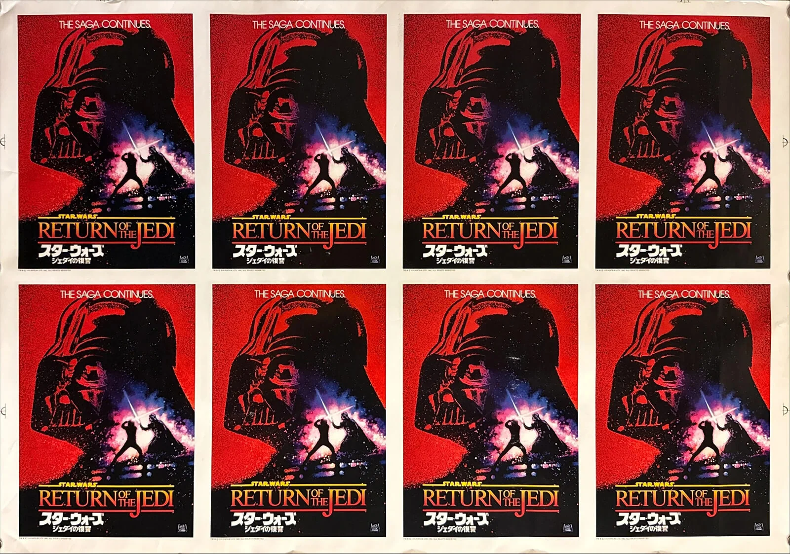
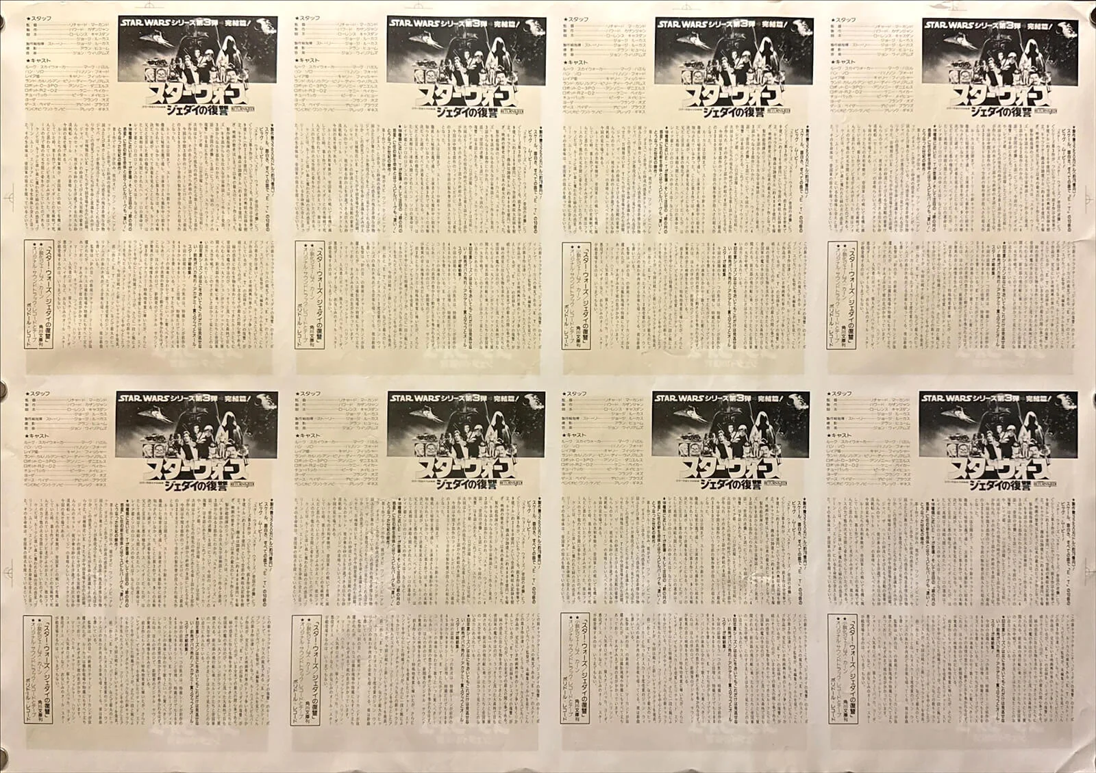
From my experience with European collections, I know that the paper qualities used during the war years and well into the 1950s were problematic from a conservation perspective. I assume it was similar in Japan?
Yes, very much so. Like many countries after the Second World War, Japan experienced severe paper shortages. That had a direct impact on poster production. Many posters printed during the late 1940s, including releases such as Casablanca, Frankenstein and Dr. Jekyll and Mr. Hyde, were produced in smaller B3 formats simply because paper was scarce.
Once material supplies recovered during the 1950s, poster production gradually returned to normal and larger formats became common again. The post-war period therefore represents a very distinct chapter in Japanese poster history, where economic circumstances directly influenced both the size and quality of the printed material. Today these posters are not only historically important but also present unique conservation challenges because of the paper on which they were originally printed.
What conservation measures do you undertake? You mention washi restoration online – how invasive is the approach taken by your conservators?
Every poster is different, so there isn’t really an “average” restoration. Our approach always depends on the rarity, condition and intended purpose of the piece.
For exceptional posters that are likely to become centrepieces in a private collection, we often have them professionally linen-backed before offering them for sale. This gives the collector a poster that is already stabilised, preserved and ready for framing without requiring further conservation work. Large multi-sheet posters especially benefit from this treatment, as it reunites the separate sections while protecting the paper for decades to come.
Alongside linen backing, we also work with traditional Japanese washi restoration. This technique originated in the conservation of woodblock prints and has been refined over centuries. Using handmade Japanese paper fibres, conservators repair tears, reinforce weak areas and stabilise fragile paper without fundamentally altering the original object. For washi restoration, the approach is always minimal intervention. The goal is conservation – repairing tears and reinforcing fold lines – rather than restoration in the modern sense. The aim is to preserve the original paper, the original surface and as much of its history as possible.
Sometimes a poster only requires the smallest intervention—a few repaired tears or minor reinforcement on the reverse. Other pieces, particularly those that have been heavily folded or consist of multiple sheets, require more extensive treatment. But even then, the philosophy remains the same: preserve the original object rather than replace it.
You scored a major coup with the extremely rare 1954 Godzilla poster at the Christie’s New York auction in the spring, which was reported by numerous media outlets. Can you tell me more about the background to this?
The original 1954 Godzilla poster is, in my opinion, the single most important Japanese film poster ever produced. The film was released only nine years after the atomic bombings of Hiroshima and Nagasaki, so everyone involved in its production had lived through that period. Godzilla is often remembered today as a monster film, but originally it was a serious reflection on nuclear destruction and post-war Japan. That historical context alone makes the poster incredibly significant.
It was also the very first film in what would become one of the world’s longest-running and most successful film franchises. Nobody involved could have predicted that at the time, which is precisely why the earliest posters are so rare. Studios simply didn’t print huge quantities because they had no idea they were launching a cultural phenomenon. The same is true for the earliest James Bond posters or the first entries in many famous film series.
The particular poster we consigned to Christie’s was even more extraordinary because it was a regional variant with handwritten cinema annotations showing ticket prices. Those brush-written notes weren’t added later by a collector—they were written by someone working at the cinema in 1954. Whenever I look at them, I don’t just see information about ticket prices. I see the hand of a real person who almost certainly lived through the war and carefully prepared this poster for display. That human connection gives the poster an emotional quality that can’t be reproduced.
Before the auction, the poster underwent only the lightest possible conservation. We deliberately preserved those handwritten annotations because they are part of its history. They tell the story of how the poster was actually used rather than simply how it was printed.
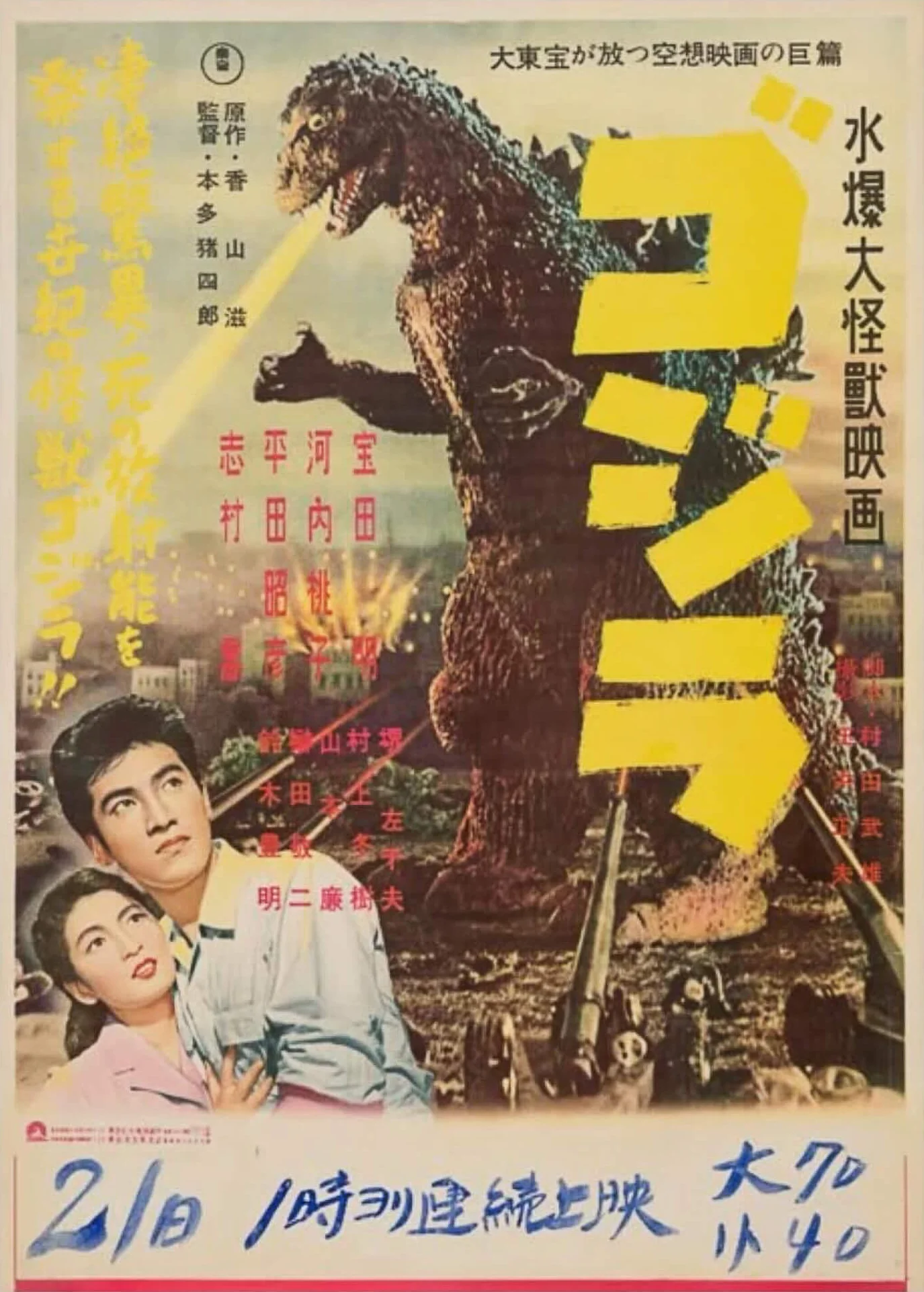
Christie’s recognised its importance as well. During the exhibition at Rockefeller Center, the Godzilla poster was displayed on its own at the entrance to the poster section, effectively becoming the centrepiece of the entire exhibition. We contributed several posters to the sale, but this was undoubtedly the standout piece.
Of course, achieving a benchmark result was exciting, but for us the real achievement was something else. It demonstrated that Japanese film posters deserve to stand alongside the world’s most important collectibles and that serious international collectors increasingly recognise their historical and artistic significance.
The full Christie’s case study is available on the Japan Poster Shop website.
As well as the Godzilla poster, you have many other rarities in your collection, including around 300 works by the Japanese graphic artist Tadanori Yokoo, who is often referred to as the ‘Japanese Andy Warhol’. Is there a particular period that your collection focuses on?
Our collection has evolved quite naturally over the years. From the beginning, our focus has always been on first-release, museum-grade posters of exceptional rarity, regardless of period. Rather than specialising in a single decade, we’re interested in objects that represent important moments in Japanese graphic design and film history.
Naturally, the classics form the foundation of the collection. Directors such as Akira Kurosawa, Yasujirō Ozu and Kenji Mizoguchi, together with subjects like Godzilla, Star Wars, James Bond, Alfred Hitchcock or Stanley Kubrick, are central to almost every major Japanese poster collection. These are the works that generations of collectors have spent their lives searching for, and they remain essential.
At the same time, we’re equally interested in more contemporary material. A good example is Akira. While the standard B2 film poster is already highly collectible, we’re particularly fascinated by the much rarer promotional material that predates the film itself. Before Akira became a movie, it appeared as a manga serial and was later published in individual volumes. Each stage generated its own promotional posters, many of which were printed in extremely small numbers. Some were produced only for railway stations, bookstores or magazine promotions, making them considerably rarer than the film poster itself.
That’s what makes collecting so exciting. Once you begin researching a subject, you discover layer after layer of increasingly rare material. A well-known film poster may only be the starting point. Behind it are different formats, advance posters, publisher’s posters, railway advertising, promotional material for individual manga volumes and even posters produced when the series first appeared as a small feature inside a weekly magazine. Those earliest promotional pieces are often the true museum-grade rarities.
The market has changed dramatically in recent years as well. While we achieved a benchmark result with the Godzilla poster at Christie’s, we’ve also seen an enormous surge in demand for original manga material. Early Akira publications, Dragon Ball comics and other original Japanese pop-culture artefacts have reached extraordinary prices internationally. That growing interest inevitably influences poster collecting too, because collectors increasingly want to own the original promotional material associated with these cultural landmarks.
Ultimately, though, we don’t collect according to fashion. Whether it’s a 1950s Kurosawa poster or an exceptionally rare Akira subway poster from the 1980s, our interest is always the same: rarity, historical importance and outstanding graphic design.
Western typography often sought to extract a pictorial quality from the letters on film posters. Given that Kanji characters are, in a sense, images in themselves, to what extent do typographical considerations influence poster design?
Typography is absolutely fundamental to Japanese poster design because writing itself is regarded as an art form. Traditional Japanese calligraphy, or shodō, is something every child learns at school, but mastering it takes decades. Every brushstroke follows established principles—the pressure, the angle, where the brush pauses and how the stroke leaves the paper are all carefully controlled. On many classic film posters, the lettering was created by master calligraphers, so the typography isn’t simply text; it’s an essential part of the artwork.
That becomes particularly evident on historical films. Samurai films, for example, often use expressive brush lettering that immediately evokes tradition and history. The calligraphy carries the same emotional weight as the illustration itself. Looking at these posters, you can often recognise the hand of a master calligrapher long before you read the title.
At the same time, Japanese designers adapted typography to suit completely different genres. Science-fiction posters from the 1960s developed futuristic letterforms that reflected the optimism of the space age, while other posters adopted clean, modern typefaces or even designs influenced by Western typography. Every title demanded its own visual language.
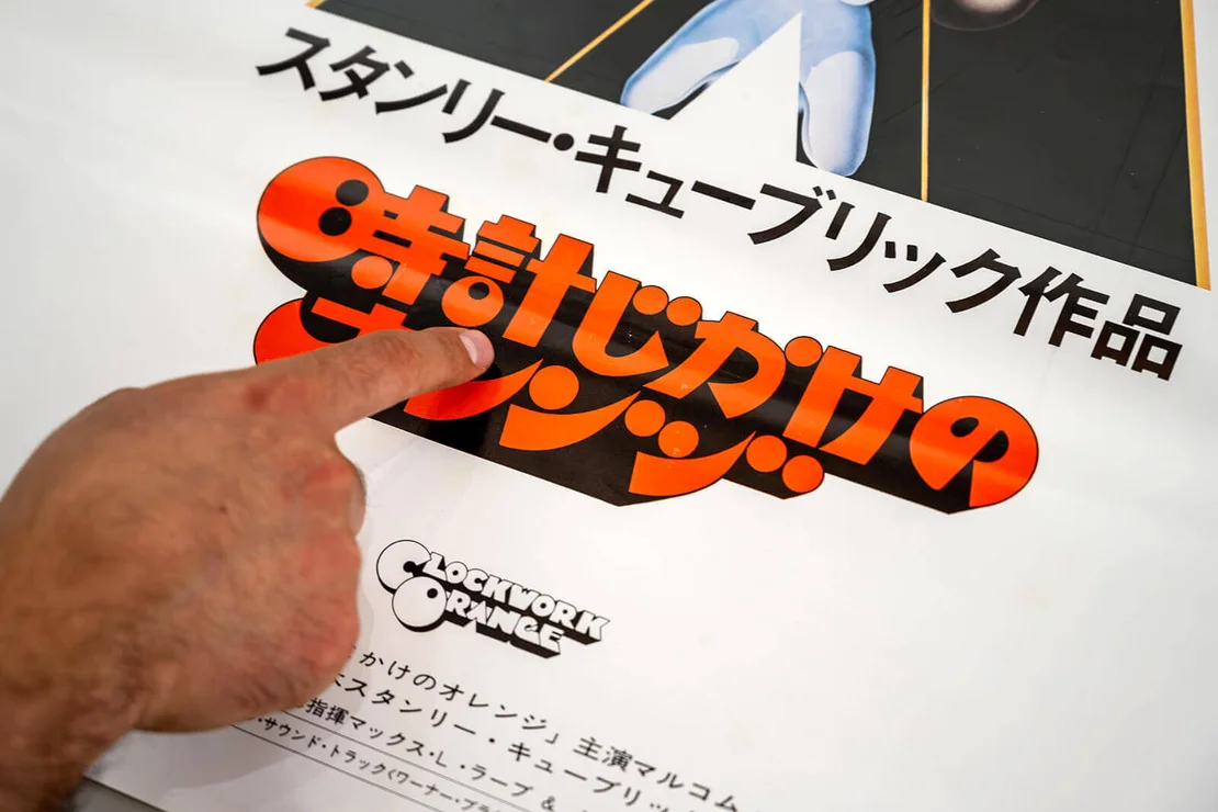
Japanese writing also offers unique creative possibilities because several writing systems can be combined within a single title. A famous example is A Clockwork Orange, where the title combines kanji, hiragana and katakana. The designer had to preserve the recognisable identity of the original English logo while making it work naturally in Japanese. Achieving that balance requires enormous typographic skill.
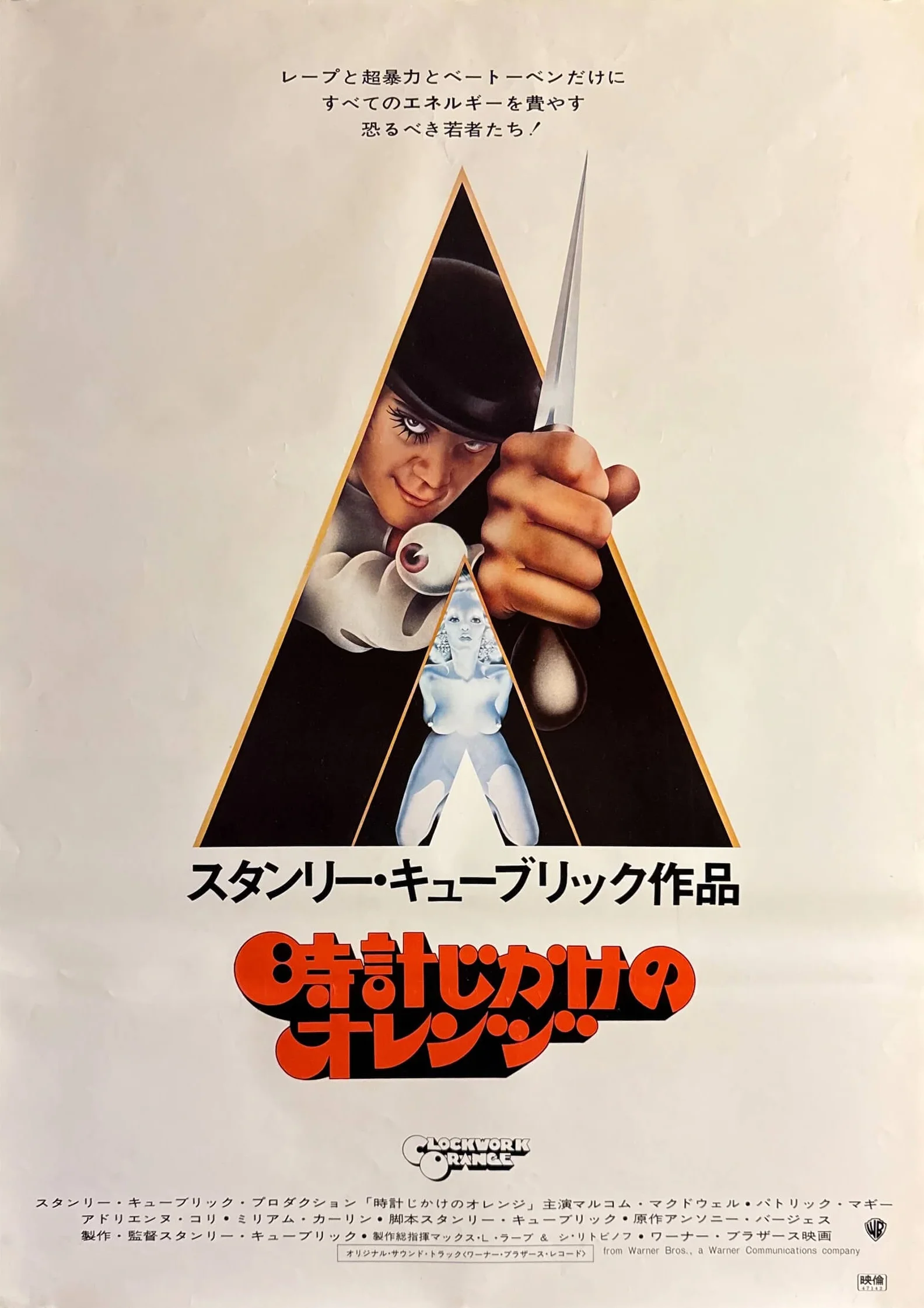
Some logos have become cultural icons in their own right. The Godzilla logo, for example, is instantly recognisable, just as distinctive as the character itself. Others, particularly Disney posters from the 1950s, were created by anonymous in-house artists whose names are now difficult to trace. Unlike in Europe, poster artists in Japan rarely signed their work, although there are exceptions. Occasionally a signature appears, but more often the artistry lies in the work itself rather than in the identity of its creator.
That’s what makes Japanese film posters so fascinating. Typography isn’t simply there to communicate information. It expresses mood, genre, tradition and identity, becoming every bit as important as the imagery surrounding it.
Final Question:
I ask all my interviewees this final question: Can you tell me about a place in Tokyo that is special to you, one that either inspires you or holds particular significance for you?
To my surprise, Max immediately leads me into the adjoining room, where a carefully curated selection of rare posters from different periods is on display. It doesn’t take long to understand why this cinematic treasure trove has become one of his favourite places.
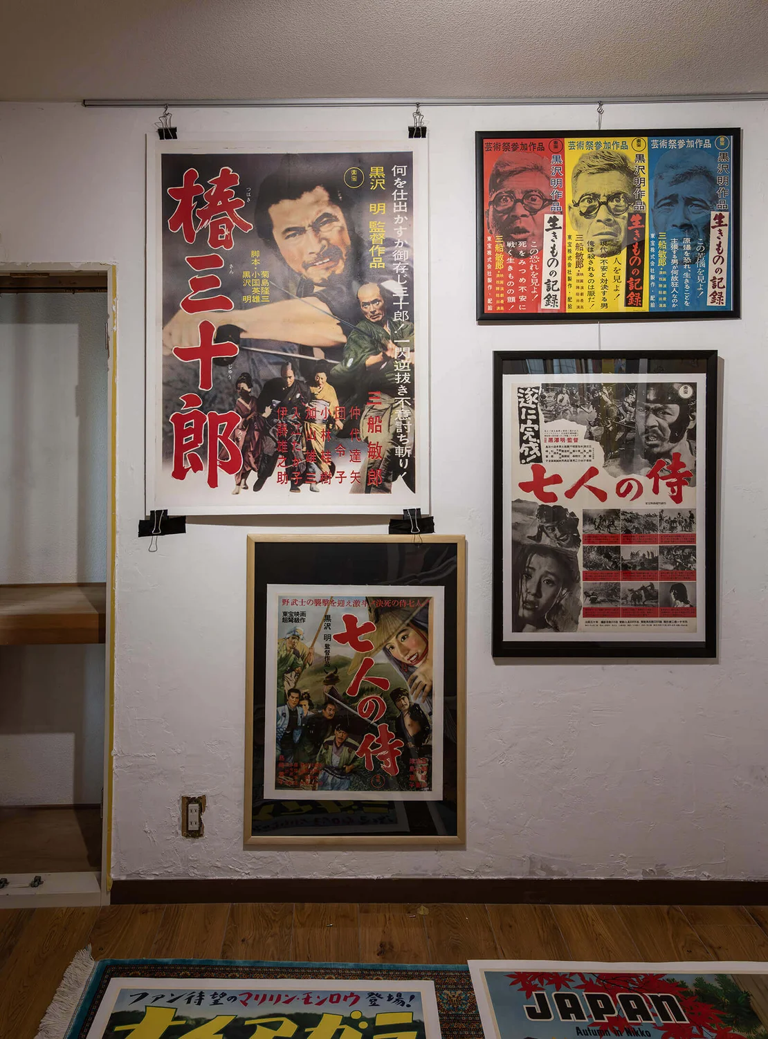
Seven Samurai (1954) – Advance Teaser Poster
Among the rarest pieces in the collection is an advance teaser poster for Akira Kurosawa’s Seven Samurai. Unlike the better-known release poster, this version was produced simply to announce the forthcoming film, carrying the message that Seven Samurai was “coming soon“. According to Max, it is at least ten times rarer than the standard theatrical poster and ranks among the most difficult Kurosawa posters to acquire.
The design is remarkably restrained. Rather than promoting the film with dramatic artwork or detailed credits, it focuses on the title and principal cast, serving purely as an early announcement. Unlike many Japanese cinema posters of the period, this example has no attached snipe—a separate strip that would normally display local cinema information, screening dates or ticket prices.
The poster also illustrates the complexity of Japanese poster production during the 1950s. While the standard national release was printed in the familiar B2 format, regional distributors occasionally produced their own variants with modified layouts or different formats. These local editions were often printed in much smaller numbers, making them considerably rarer today.
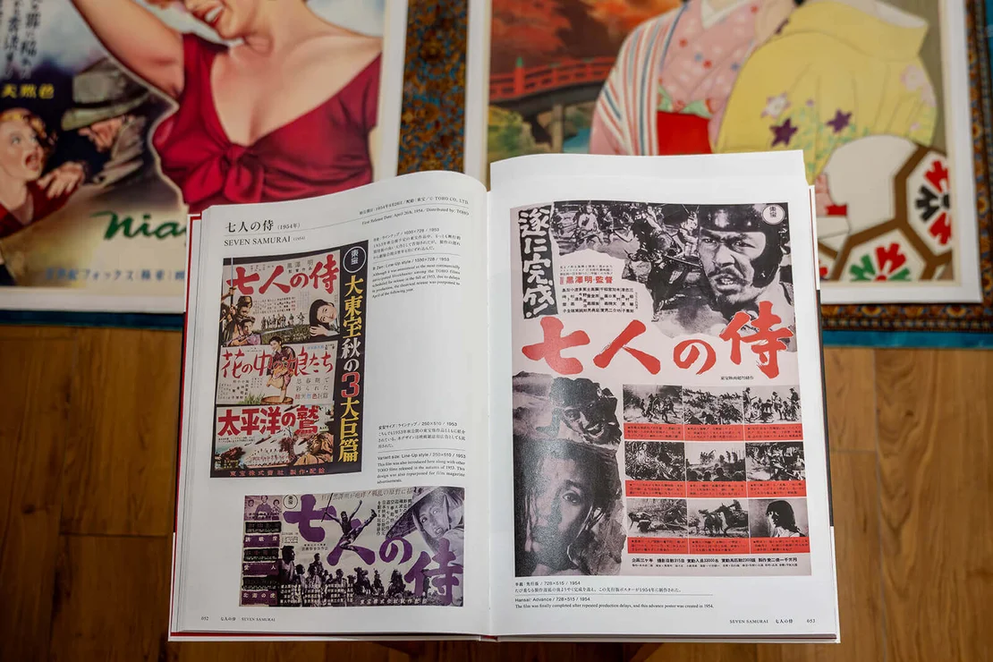
Max points to the recently published reference book by Yoshikazu Inoue, Japan’s foremost authority on Kurosawa posters. The volume documents virtually every known poster issued for Kurosawa’s films and has become an essential reference for collectors. Even among the remarkable works reproduced there, this advance Seven Samurai poster stands out as one of the collection’s most exceptional pieces.
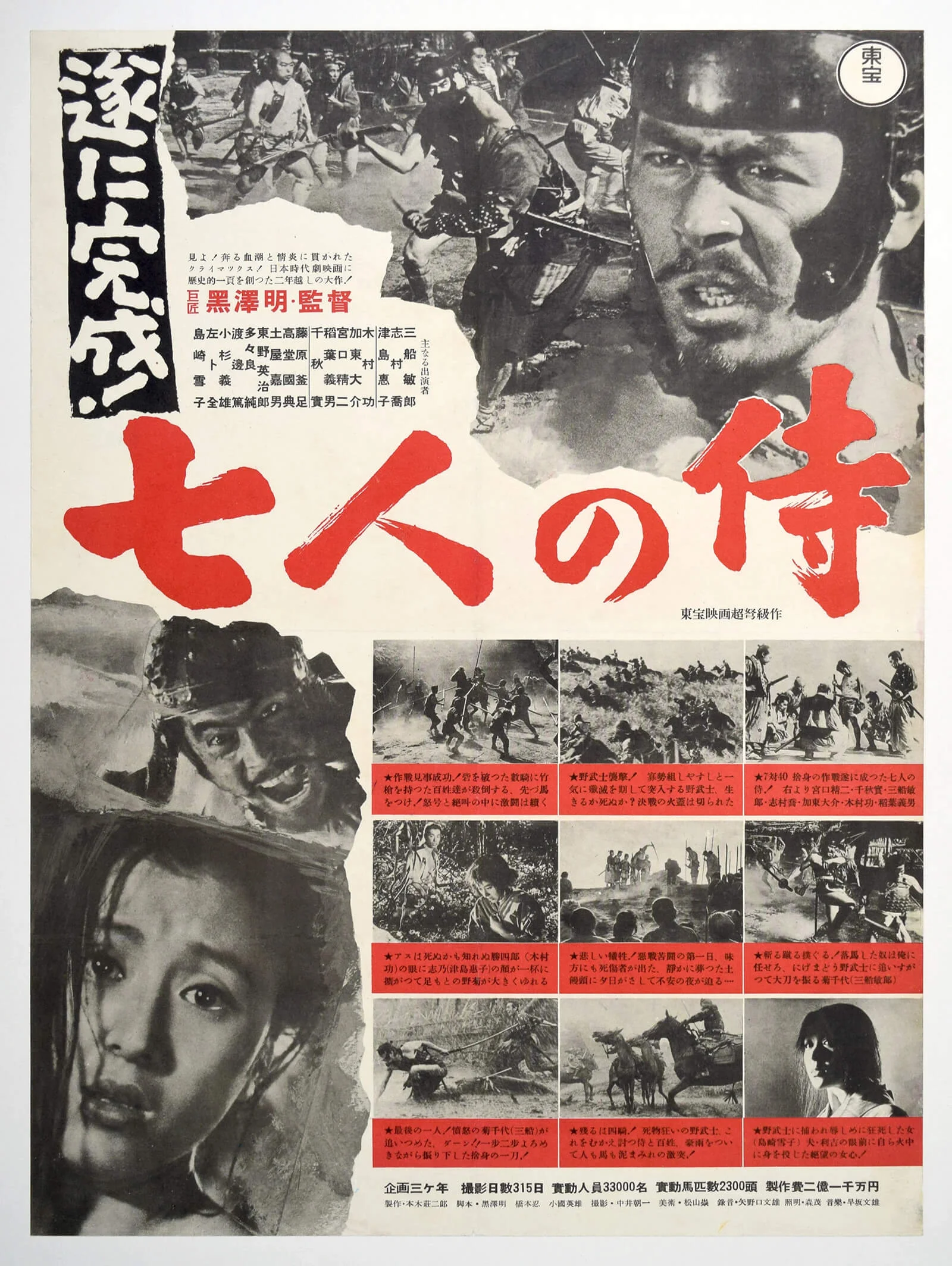
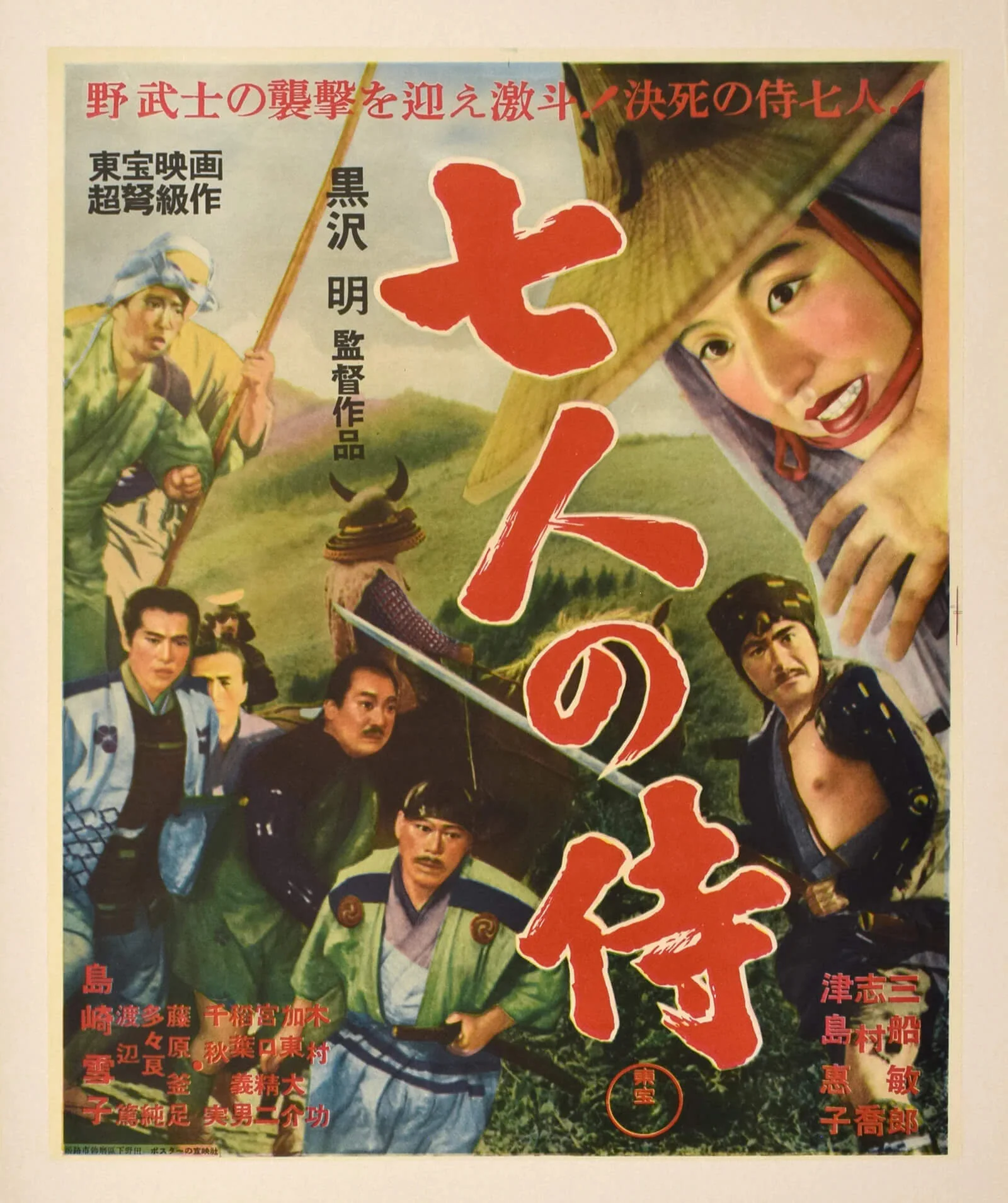
Seven Samurai (1954) – Regional Kansai Variant
Alongside the advance teaser, the collection also includes a fascinating regional variant of Seven Samurai. At first glance it appears similar to the standard release poster, yet it reveals an important aspect of Japanese film distribution during the 1950s.
Whereas the standard Japanese cinema poster was produced in the familiar B2 format, this version was printed in the smaller B3 size for the Kansai region, including Kyoto, Osaka and the surrounding prefectures. At the time, regional distributors were often permitted to produce their own versions of a poster, resulting in subtle differences in layout, typography and overall design. These local editions may have been a cost-saving measure or simply reflected the decentralised nature of film distribution in post-war Japan.
Because they were printed in far smaller quantities than the nationwide releases, regional variants are considerably rarer today. For collectors, they provide valuable insight into how individual distributors adapted studio publicity for local audiences.
The poster itself is remarkably restrained. Across the top it features the film’s title, a promotional tagline and the names of the principal cast. Had it been displayed in a cinema, it might also have carried a removable snipe—a narrow paper strip announcing screening dates, ticket prices or the name of the venue. As with many surviving examples, however, that temporary addition has long since disappeared.
For Max, these regional editions represent far more than simple design variations. They document the practical realities of Japan’s cinema network during the 1950s and illustrate how even iconic films such as Seven Samurai could appear in subtly different forms depending on where they were shown.
Tokyo Story (1953)
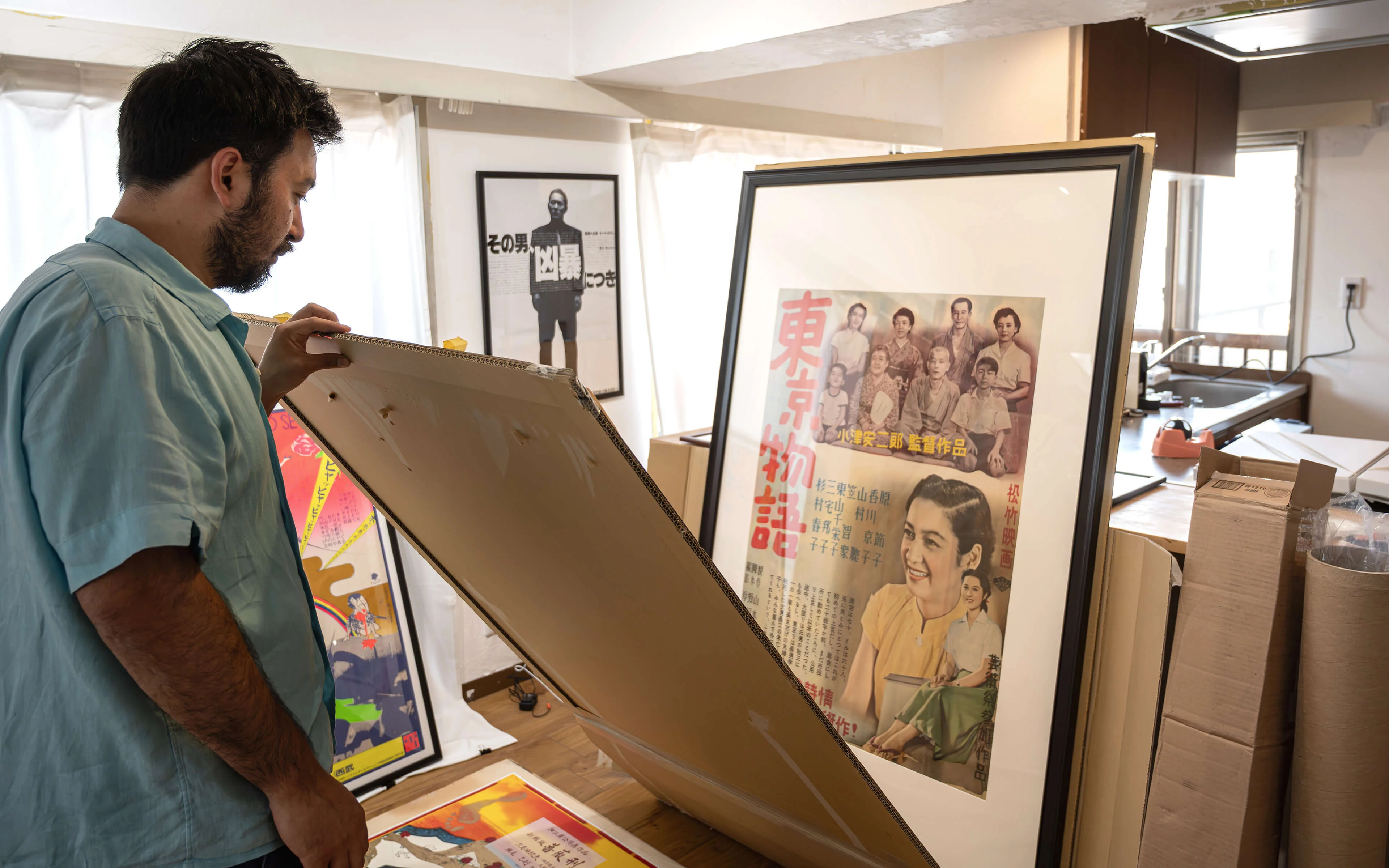
Among Yasujirō Ozu’s films, Tokyo Story occupies a special place in the Japan Poster Shop Collection. Widely regarded as one of the greatest films ever made, it is also one of the titles most frequently requested by collectors and cinephiles from around the world.
The collection includes several exceptionally rare first-release posters, among them a regional Kansai variant from 1953. Produced for local distribution rather than the national release, it differs from the standard design and survives in far smaller numbers. Like many posters from the period, it displays the warm tonal ageing characteristic of post-war Japanese paper, adding to its historical character.
One of the central figures depicted is Setsuko Hara, whom Max describes as “the Audrey Hepburn of Japan”—not as a direct comparison, but as a way of conveying her extraordinary status in Japanese cinema during the 1950s. Hara and Ozu collaborated on several of his most celebrated films, creating one of the defining director–actor partnerships in Japanese film history.
The collection’s greatest treasure, however, is an exceptionally rare B1-format first-release poster. According to Max, it is the only example currently known to exist. Even veteran dealers and collectors who have spent decades in the Japanese poster trade have never encountered another copy. The poster had remained in a private collection for many years before eventually becoming part of the Japan Poster Shop archive.
For Max, the significance of Tokyo Story extends far beyond its rarity. Watching the film has become a deeply personal experience that has changed as his own life has evolved. Having become a father himself, he now finds himself paying attention to details that once escaped him—the family relationships, the changing generations, the household objects and everyday routines of post-war Japan. What once seemed like a quiet family drama has become an increasingly profound reflection on ageing, family and the passage of time.
Perhaps for that reason, the poster occupies a unique place within the collection. Although it represents one of its rarest and most valuable pieces, Max has no desire to sell it quickly. Professionally framed and carefully preserved, it is a work he considers a privilege to look after—an object whose cultural and emotional significance reaches far beyond its market value.
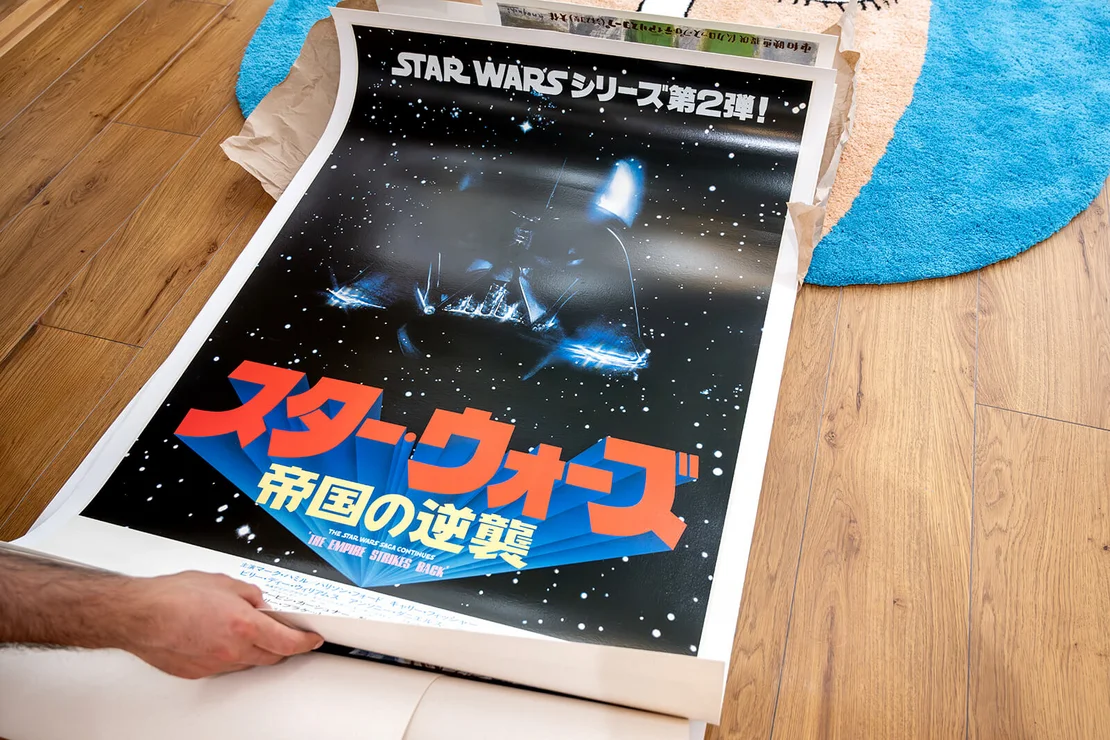
Star Wars
While Japanese Star Wars posters are among the most sought-after pieces in the collection, Max is particularly interested in the unusual formats and promotional material that accompanied the films rather than the standard theatrical releases.
One of the highlights is an exceptionally rare advance poster measuring twice the size of a standard Japanese cinema poster. According to information shared with the Japan Poster Shop, only very few examples have appeared on the public market over the past three decades. Finding another in comparable condition would be extremely difficult.
Even rarer are the enormous billboard formats produced for cinema displays. Unlike the standard B2 posters, these oversized sheets were printed in very limited numbers and were intended for prominent display outside cinemas. Because of their size, they were seldom preserved, making surviving examples exceptionally scarce today.
One of the collection’s most impressive pieces is a large Star Wars billboard currently undergoing professional conservation in the United States. Another features C-3PO promoting Panasonic products—a fascinating example of how one of the world’s most successful film franchises was adapted for the Japanese advertising market. Combining a globally recognised film with Japanese commercial design, these promotional posters occupy a unique position between cinema history and advertising.
Restoration plays an important role in preserving such large-format works. One billboard, for example, arrived with a tear measuring almost sixty centimetres, requiring extensive conservation. Unlike lighter restorations, where the emphasis is on stabilising the original paper, billboard restoration often involves reconstructing large damaged areas and carefully matching colours using traditional airbrush techniques. Max works with a specialist conservation studio in California, with whom he has collaborated for almost a decade. Their philosophy is to preserve the poster’s visual integrity while respecting as much of the original material as possible.
For Max, the rarity of these posters lies not only in their limited production but also in their original purpose. They were designed as temporary advertising material, displayed outdoors or in cinemas before being discarded. Their survival today is therefore largely accidental, making them among the most desirable objects for collectors of Japanese Star Wars memorabilia.
Tadanori Yokoo
Alongside Japanese film posters, Tadanori Yokoo occupies a central place within the Japan Poster Shop Collection. Over the years, Max has assembled around 200 works by the celebrated graphic designer, making it one of the most significant private holdings of Yokoo’s posters. While a number of pieces have since found new homes, the collection still represents a broad cross-section of the artist’s extraordinary career.
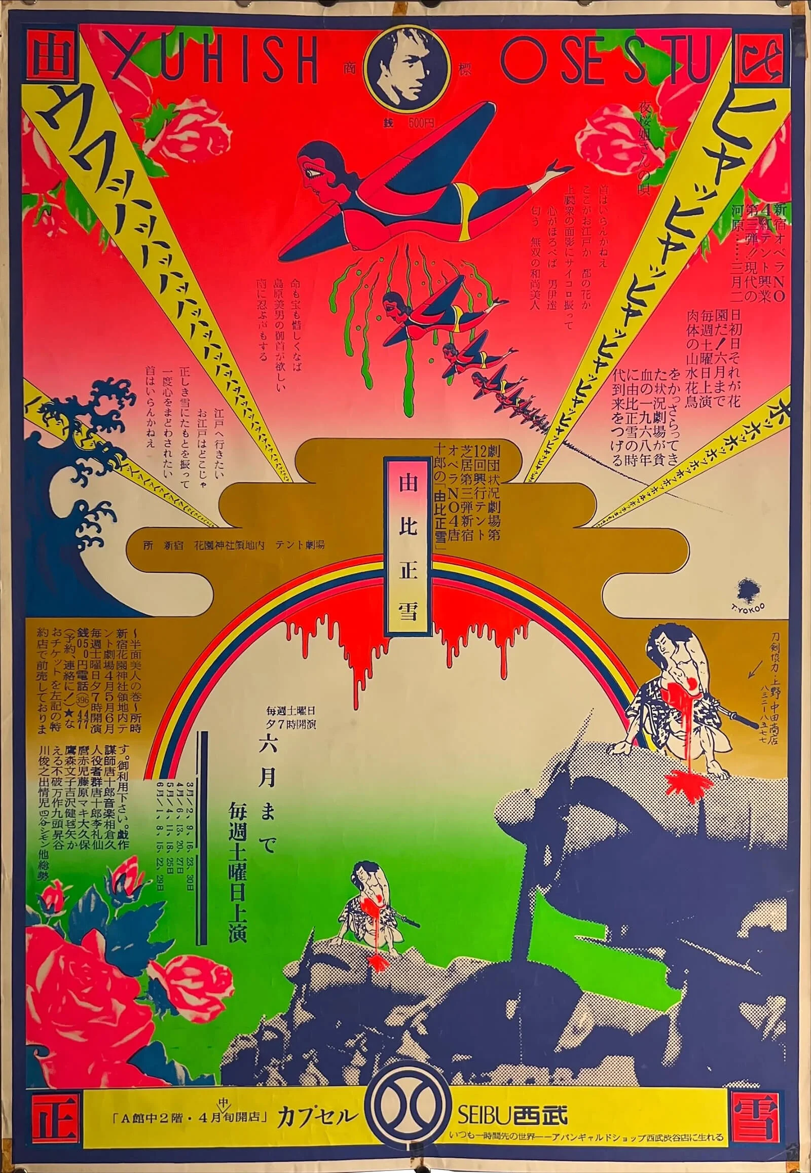
For Max, Yokoo’s appeal lies in both his artistic range and his influence on post-war Japanese graphic design. Throughout a career spanning more than six decades, he has produced well over 800 designs, extending far beyond posters to include maps, book covers, album artwork and numerous commercial commissions. Yet it is his posters from the late 1960s that remain especially sought after.
One particularly striking example in the collection dates from 1967, shortly after Yokoo returned from the United States. Reflecting the political and cultural atmosphere of the period, the work bears traces of the anti-Vietnam War movement while simultaneously demonstrating the bold visual language for which Yokoo became internationally recognised. Rich in symbolism, layered imagery and vibrant colour, it marks a decisive moment in the development of contemporary Japanese graphic design.
Another remarkable work, created in 2007, centres on the writer Yukio Mishima. Based on the famous photograph by Eikoh Hosoe, the poster was issued in a strictly limited edition of just 150 copies, each individually signed by Yokoo. Every print also incorporates a unique footprint, making each impression subtly different from the next. Many examples entered museum collections soon after publication, leaving very few in private hands. Despite its comparatively recent date, it commands prices comparable to Yokoo’s most desirable posters from the 1960s.
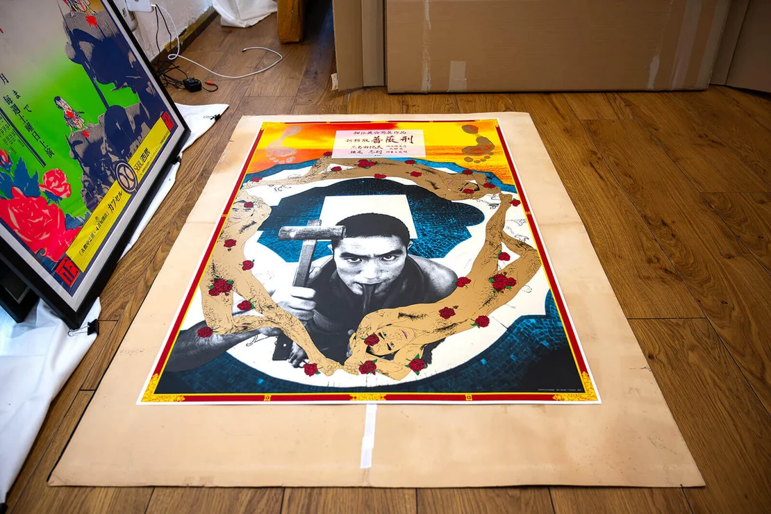
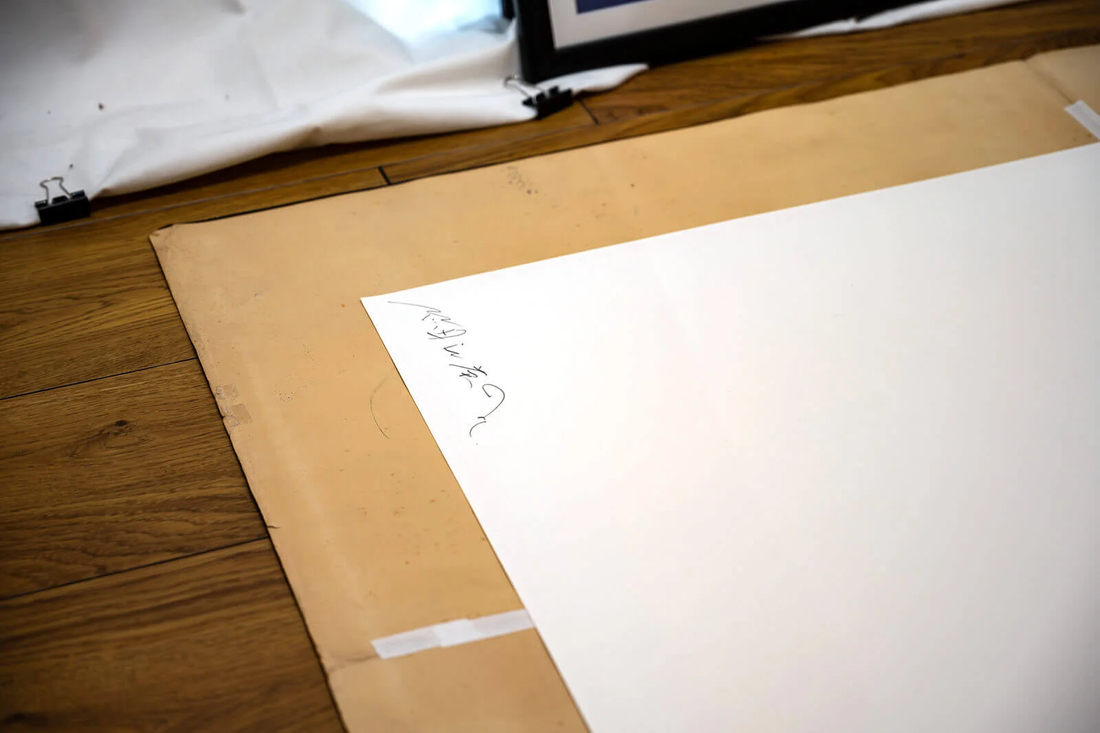
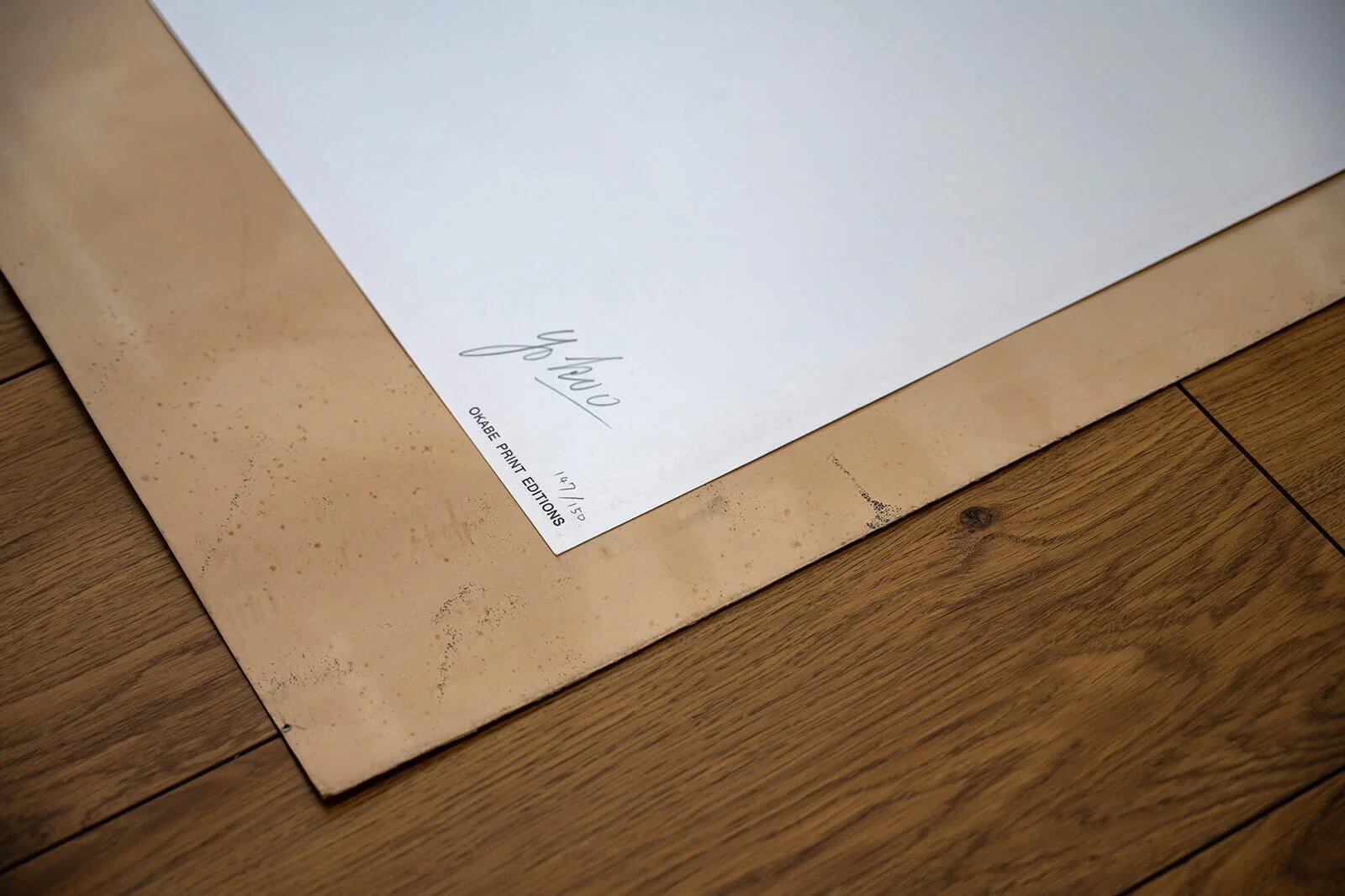
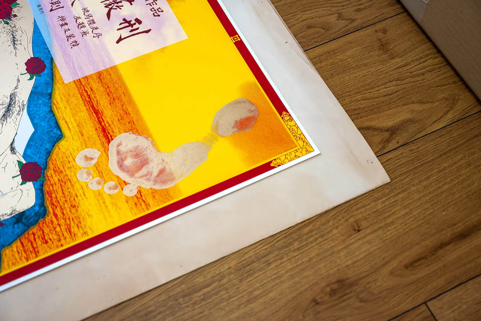
Max continues to expand the collection by travelling throughout Japan to meet long-established collectors, many of whom have spent decades assembling important Yokoo holdings. Building these relationships takes time and trust, but it has enabled the Japan Poster Shop Collection to preserve a body of work that documents one of Japan’s most influential graphic designers in exceptional depth.
At the time of writing, a search for Tadanori Yokoo returns around 230 original posters in the Japan Poster Shop web shop.
Early Beer and Advertising Posters
Although the Japan Poster Shop is best known for its exceptional collection of Japanese film posters, Max Fujiwara-Lieven has also built a small but remarkable collection of pre-war advertising posters. Dating primarily from the late 1920s and 1930s, these works are considerably rarer than many film posters and provide a fascinating insight into Japan’s emerging commercial graphic design.
Among the highlights are early beer advertisements, which Max particularly admires for their strong Art Deco influence. While collectors today are familiar with countless modern reproductions inspired by this period, original examples are exceptionally difficult to find. His collection includes only around ten authentic pre-war advertising posters, all acquired from one of Japan’s leading specialists in rare historical documents.
Several of these posters also illustrate the evolution of Japanese typography. Before the Second World War, text was commonly read from right to left, a convention that changed during the post-war period. Company logos, product names and the overall layout therefore provide useful clues for dating individual posters. Even later beer advertisements from the 1950s reveal subtle changes in branding and typography that reflect the rapid modernisation of Japanese consumer culture.
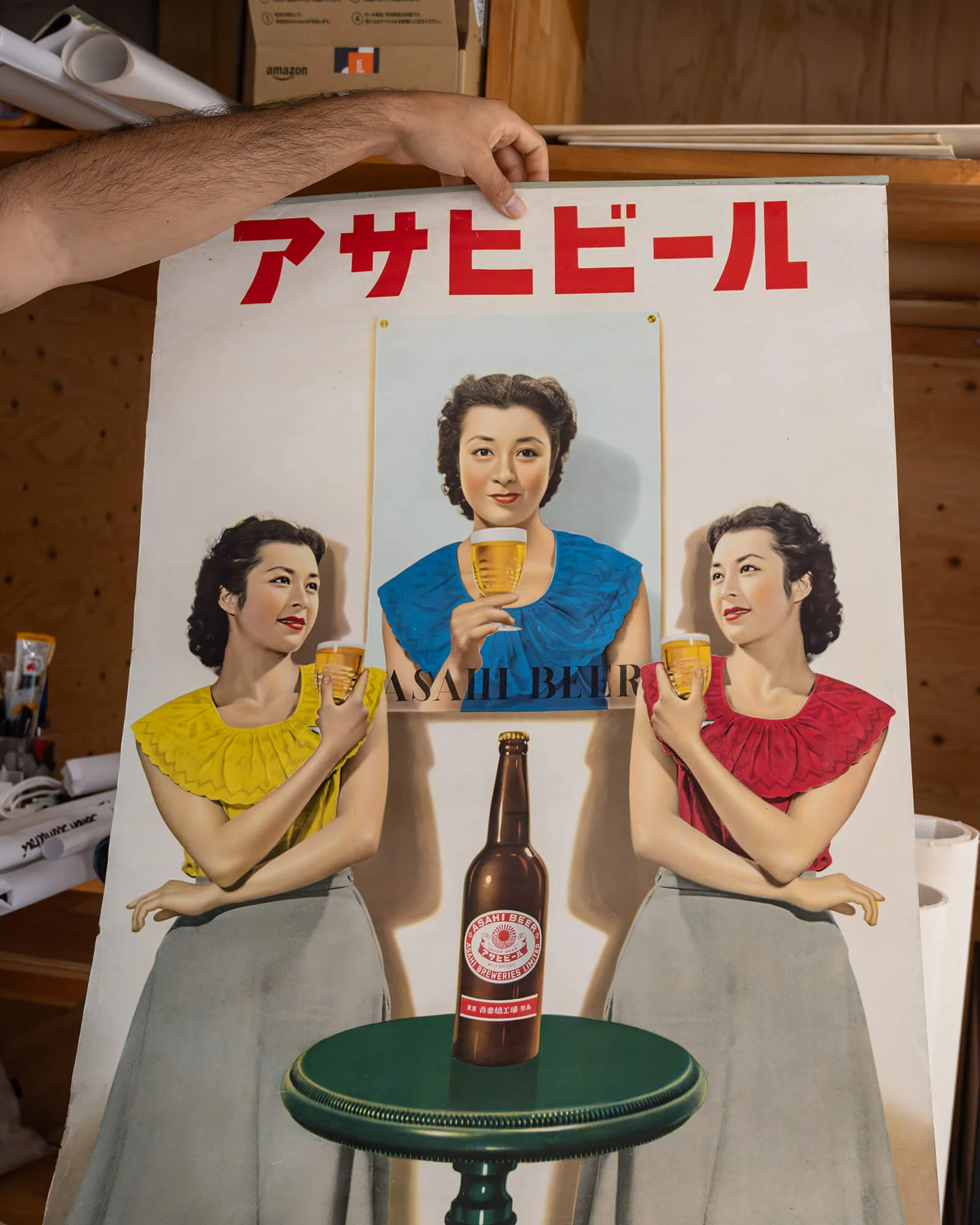
For Max, these posters are significant not only because of their graphic quality but also because they document everyday life. Unlike film posters, which promoted fictional worlds, commercial advertising captured the products, fashions and visual language of their own time. They therefore represent an important chapter in Japan’s design history that is often overlooked by collectors.
Many of the finest examples survive only because they passed through the hands of dedicated private collectors. Max recalls acquiring several of these posters from an elderly specialist who had spent decades preserving rare historical documents. Encounters like these are an essential part of his work, revealing not only exceptional objects but also the personal histories behind them.
The history of beer advertising in Japan is explored in a blog post on the Japan Poster Shop website.
About Japanese Poster Formats and Regional Variants
One of the most distinctive features of Japanese film posters is the remarkable variety of formats in which they were produced. While the standard cinema poster has traditionally been the B2 format, distributors also issued posters in a range of other sizes, each serving a specific purpose within the marketing campaign.
The smaller B3 format was often used for regional distribution. During the 1950s, local distributors—particularly in regions such as Kansai, including Kyoto and Osaka—were permitted to produce their own versions of a studio’s advertising material. These regional variants frequently differ in layout, typography or illustration and were printed in far smaller quantities than the nationwide releases. As a result, they are often considerably rarer today.
Larger B1 posters were intended for more prominent display, typically inside or outside cinemas. Produced in much smaller numbers than the standard B2 sheets, they have become some of the most desirable formats for collectors. In some cases, only a single example is known to survive.
Beyond these standard sizes, Japan also produced enormous billboard formats assembled from multiple sheets. Intended for large outdoor displays, they were almost always discarded after use, making surviving examples exceptionally scarce.
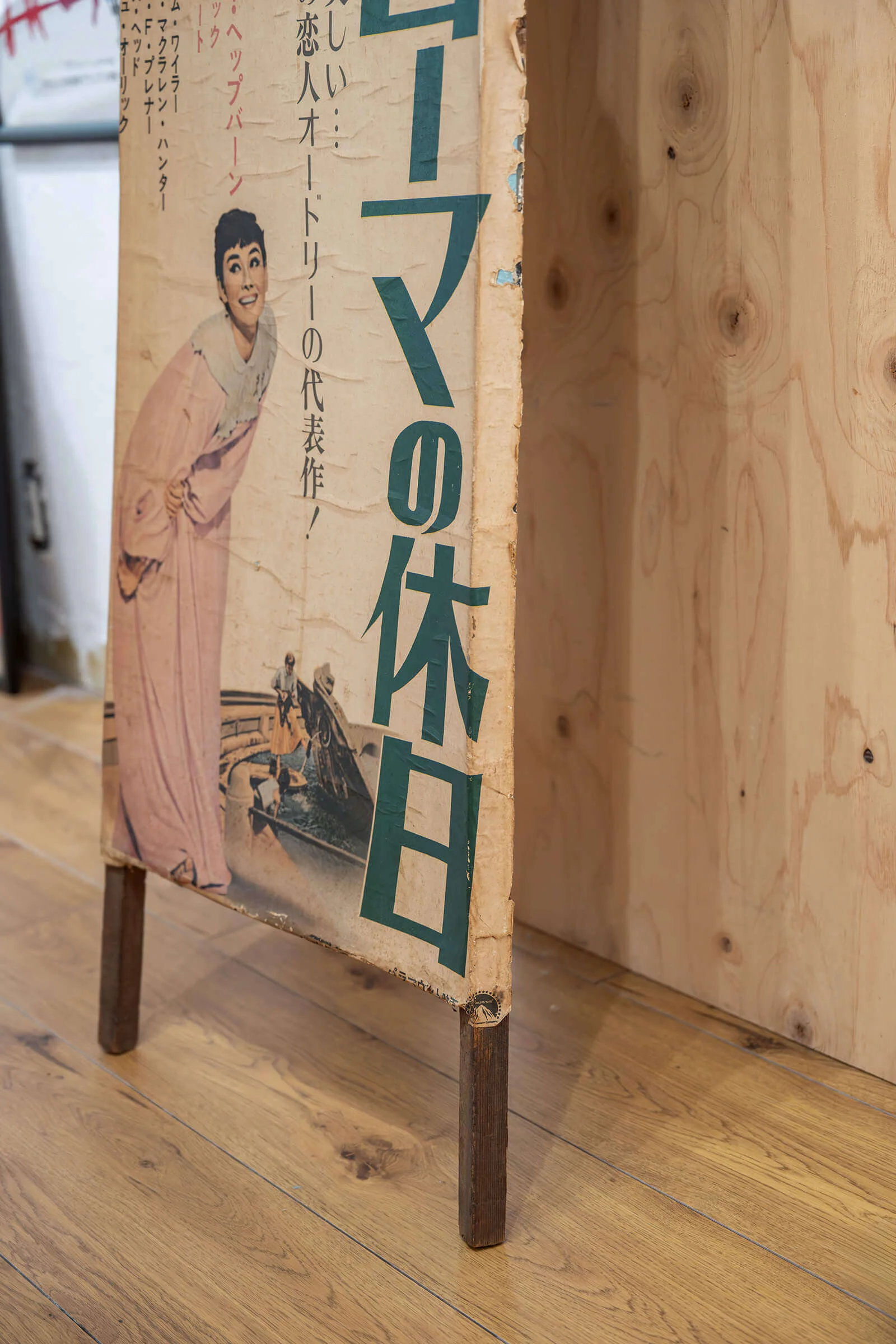
Equally distinctive is the Tatekan format—a tall, narrow poster designed for roadside display. Rather than being pasted directly onto walls, these posters were mounted on wooden boards and placed along busy streets, often at road junctions where they could easily be seen by passing cyclists and pedestrians. Because they were produced in relatively small numbers and exposed to the elements, original Tatekan posters from the 1950s and 1960s are among the rarest surviving Japanese cinema posters.
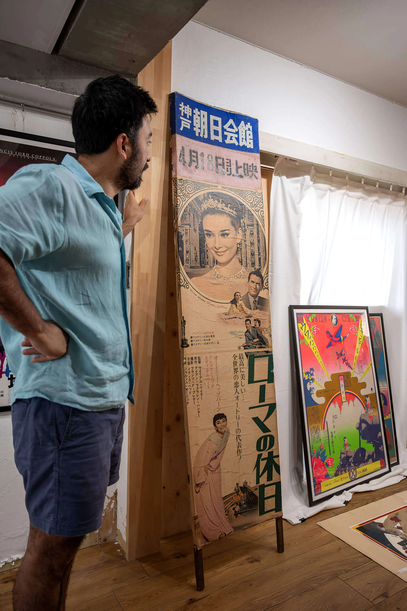
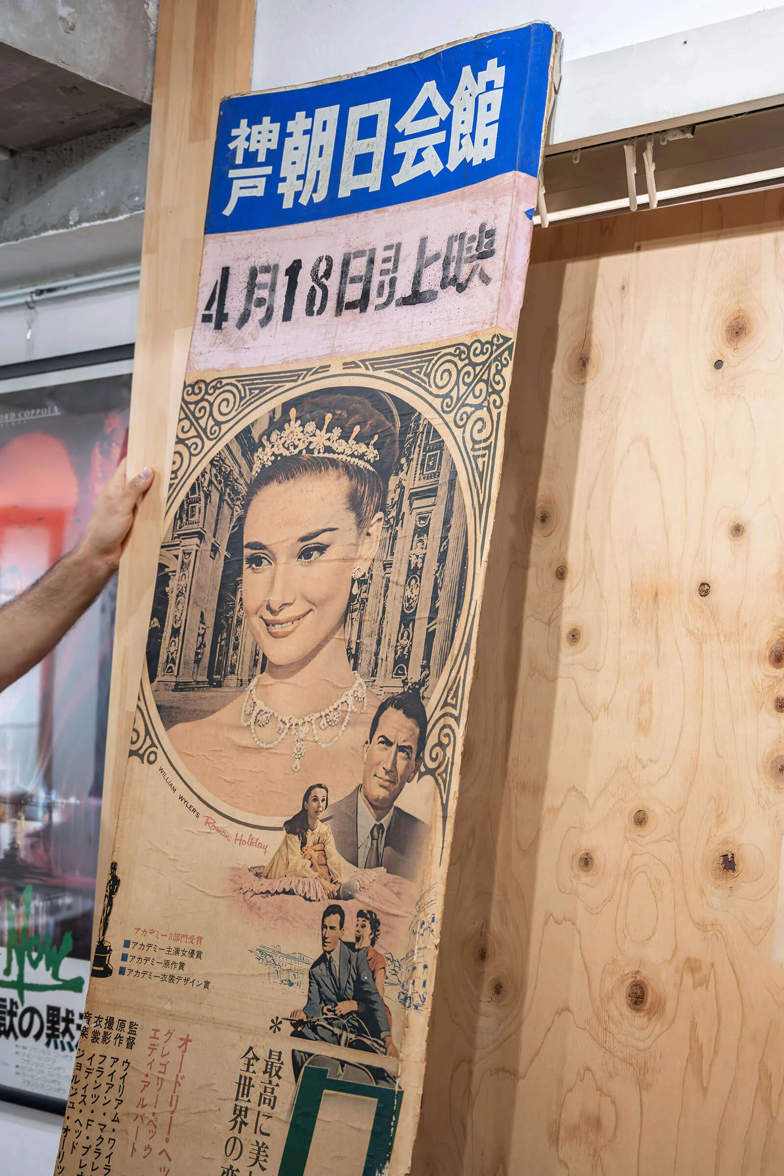
Many Japanese posters originally carried an additional paper strip known as a snipe. Attached to the bottom or top of the poster, it displayed local information such as the cinema, opening date or ticket prices. Since these strips were intended only for temporary use, very few have survived. When found intact today, they provide valuable evidence of a poster’s original exhibition history.
For collectors, these different formats represent far more than variations in size. They reflect the highly decentralised nature of Japan’s post-war film distribution system and reveal how individual cinemas and regional distributors adapted national publicity campaigns to local audiences. They also explain why rarity is determined not only by the popularity of a film but often by the format in which its posters were originally printed.


Write comment
Write comment
Comments
No Comments