Typography is an omnipresent element of the urban environment. It comes to the fore or recedes into the background; it advertises, informs, guides and comments – at times loudly and directly, elsewhere almost imperceptibly.
In my book Ghostletters Vienna, I explored typography as a defining element of urban visual identity. Alongside formalised systems of urban signage – such as those used in public transport or street signage – it is above all informal typography that contributes significantly to the atmosphere and distinctive character of a place.
Since travelling nomadically through Asian metropolises, this awareness has become even more pronounced. Different writing systems, local design conventions, improvised solutions and traces of everyday use form a typographic layer of the city that is in a constant state of change.
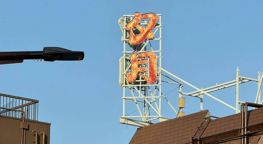
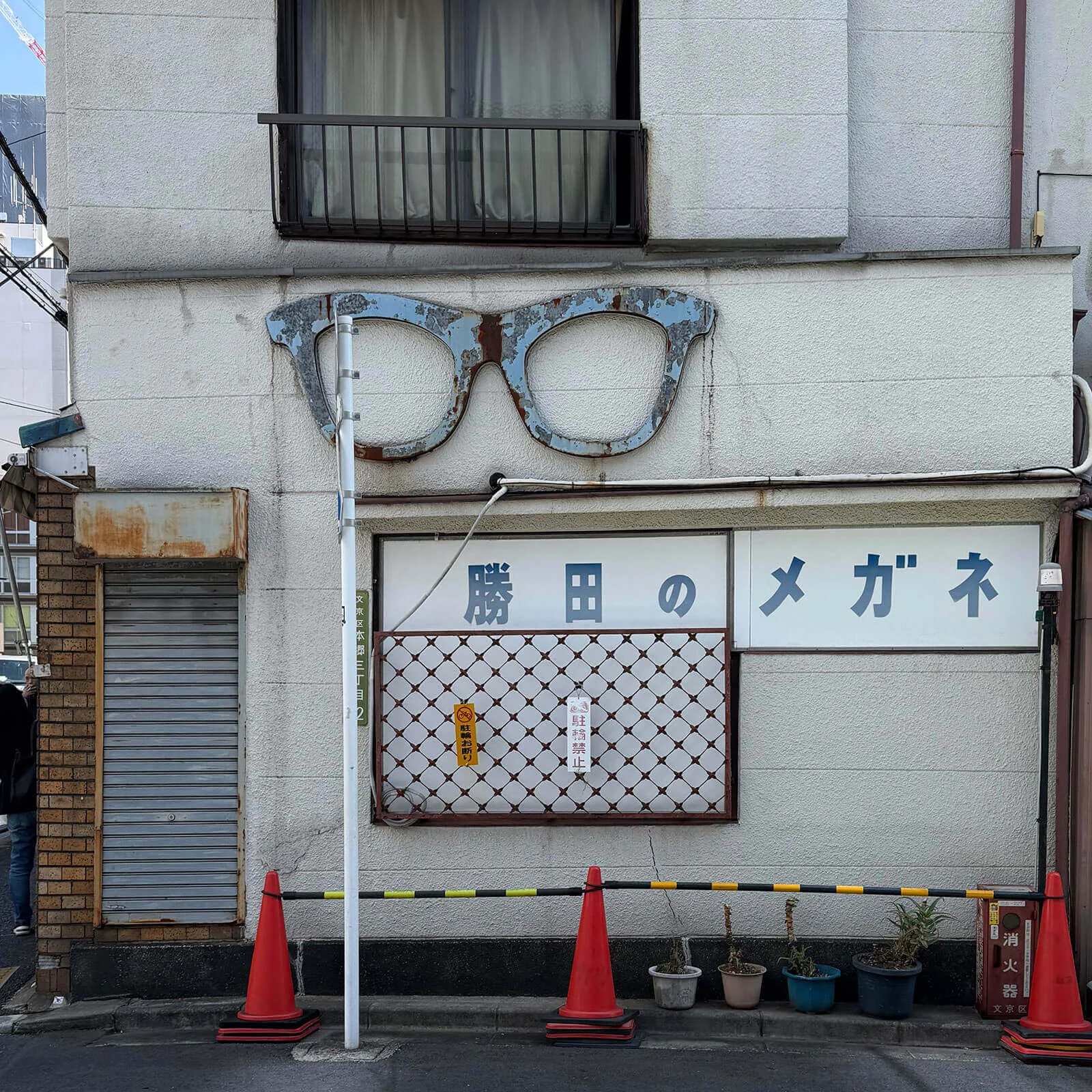
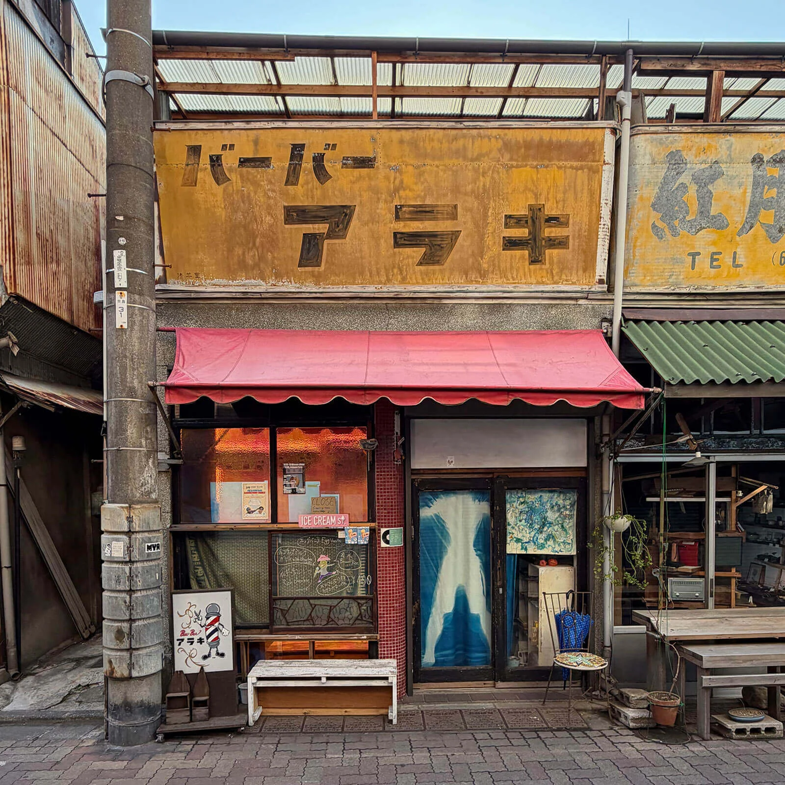
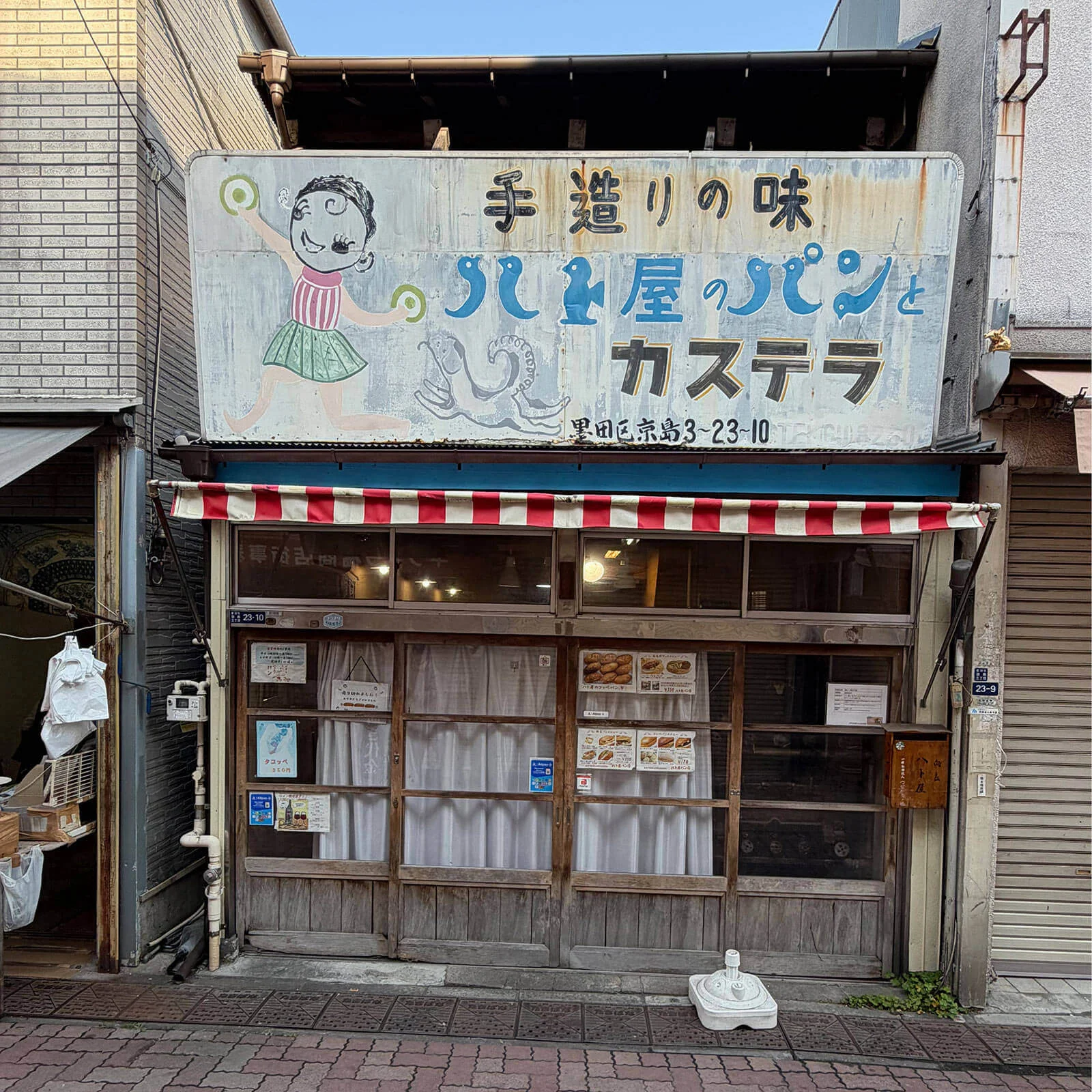
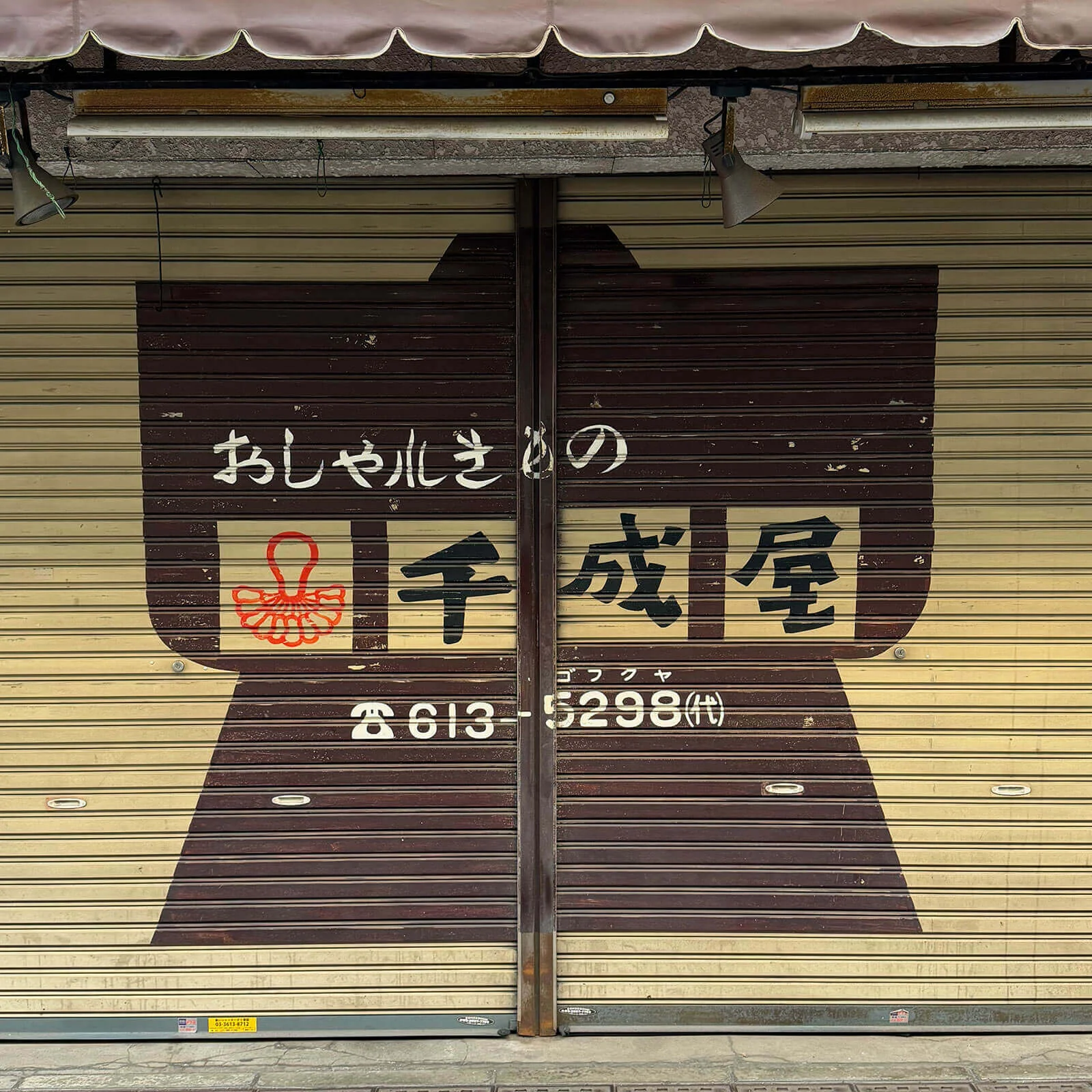
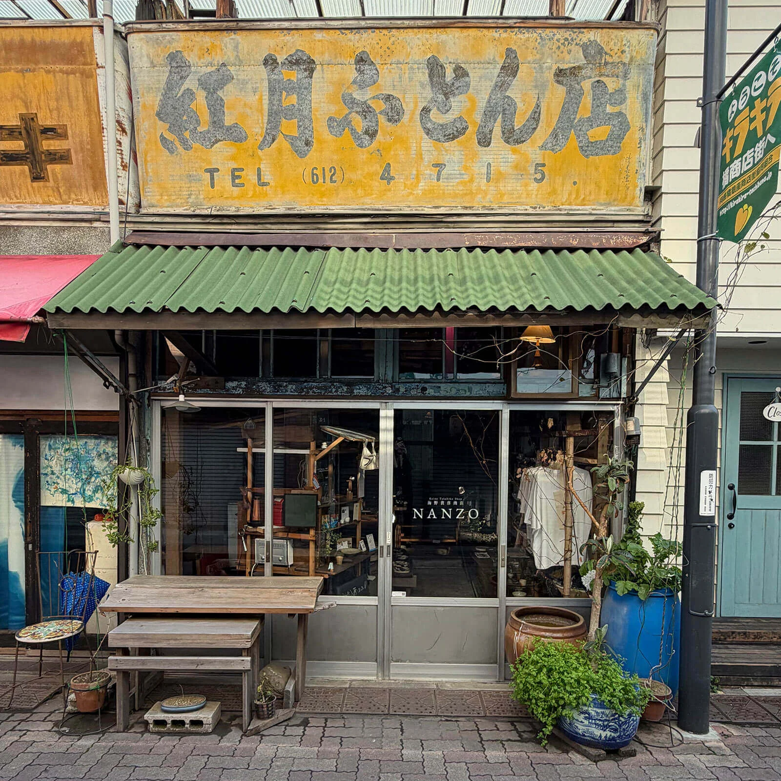
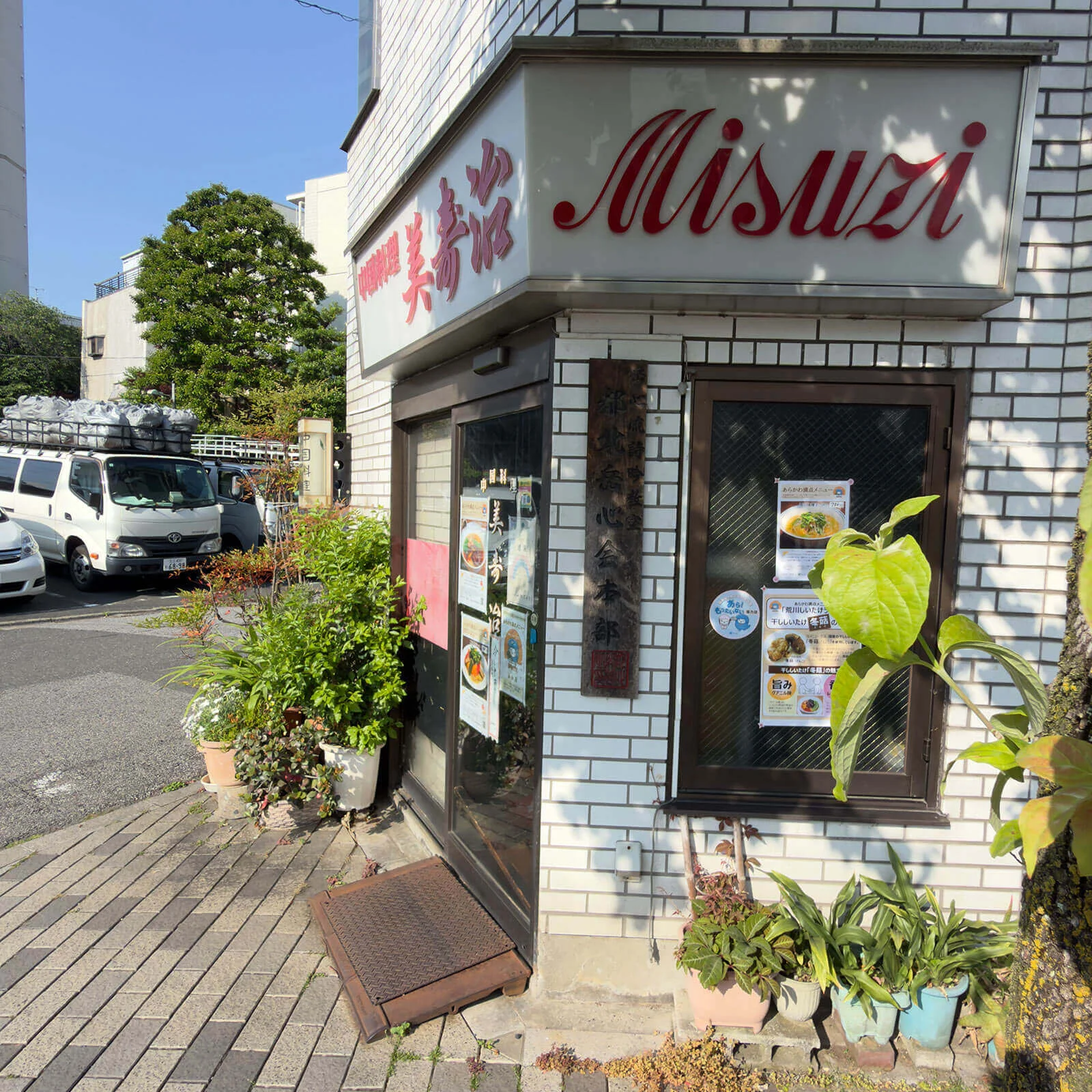
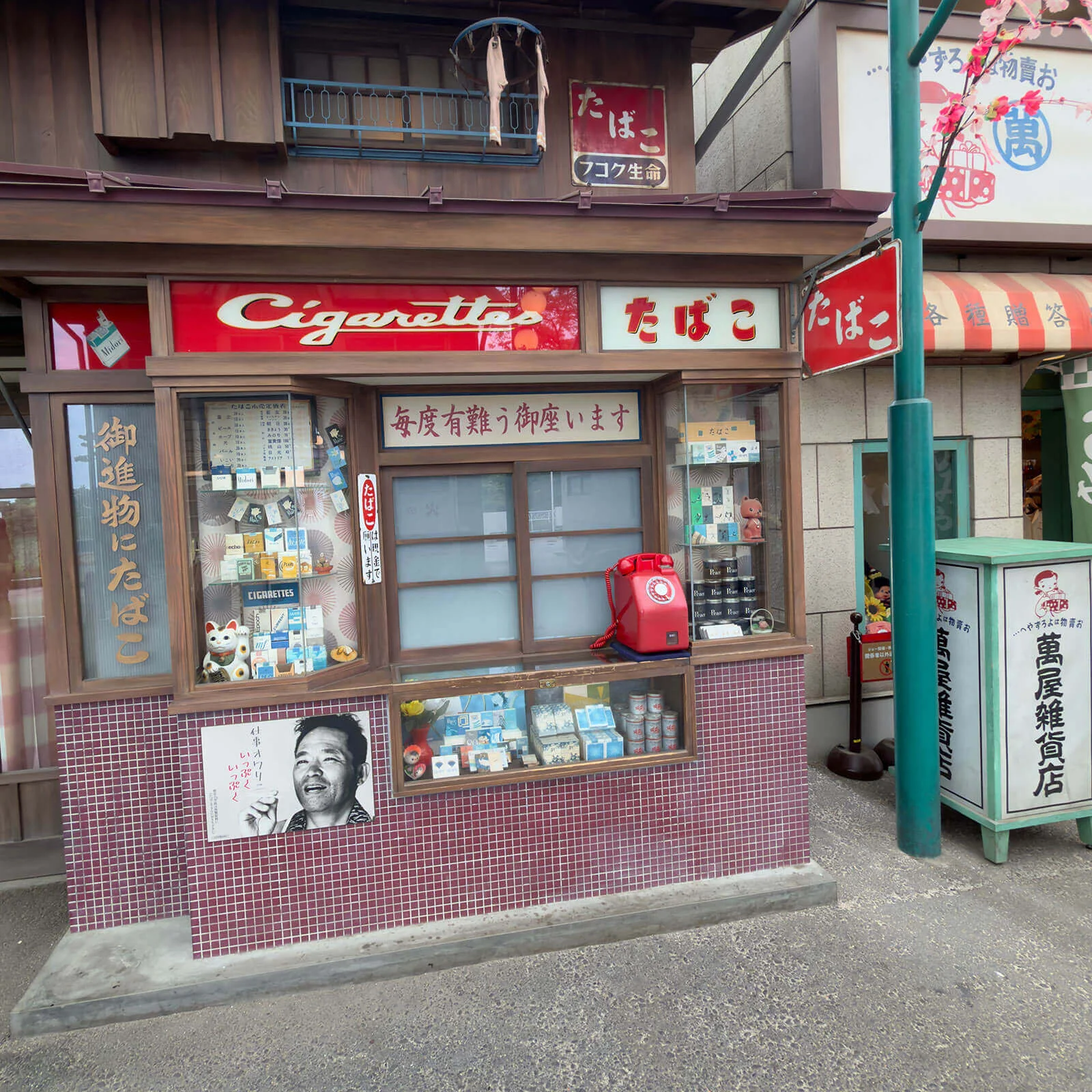
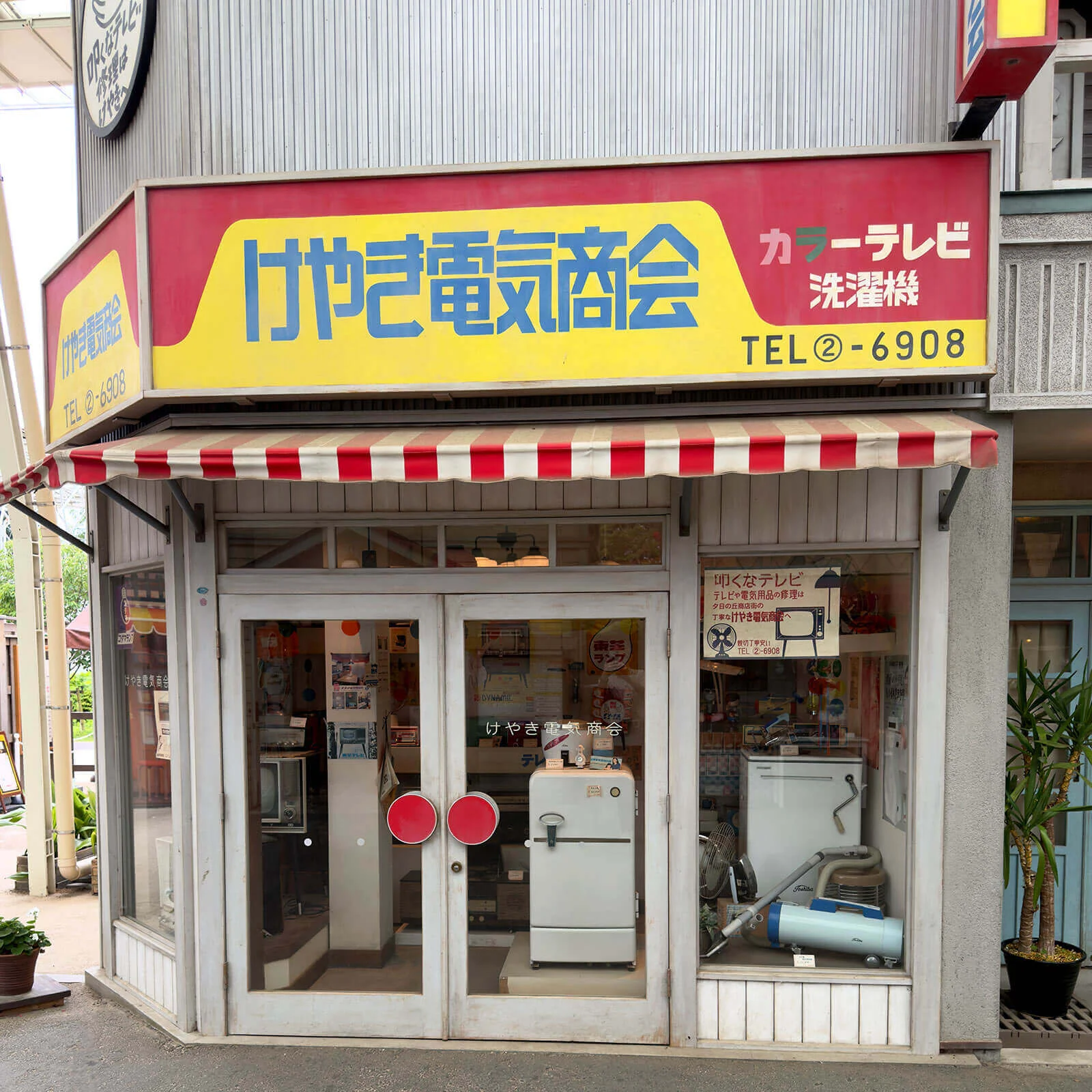
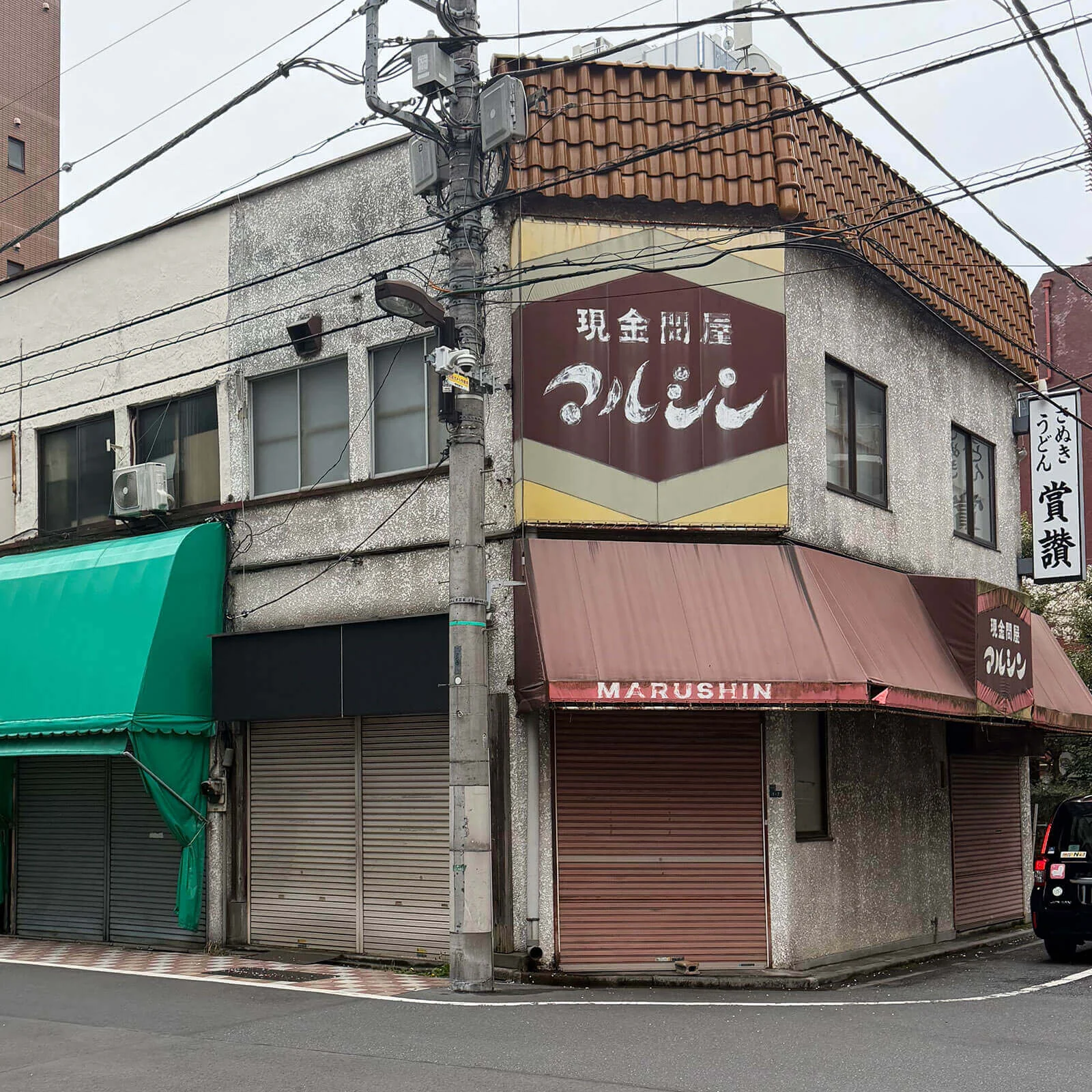
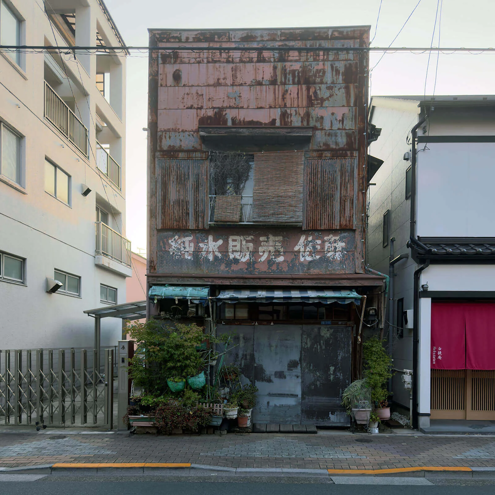
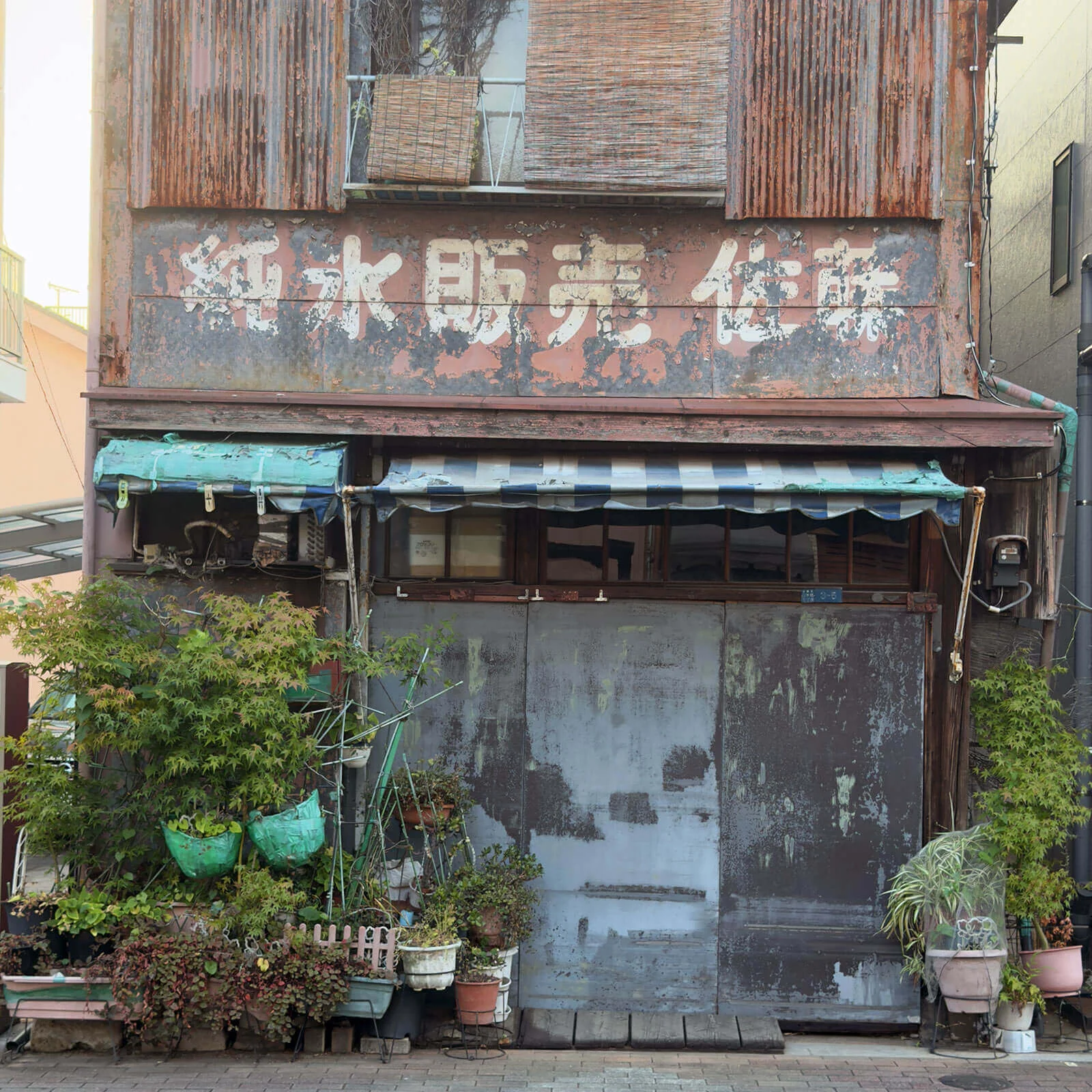
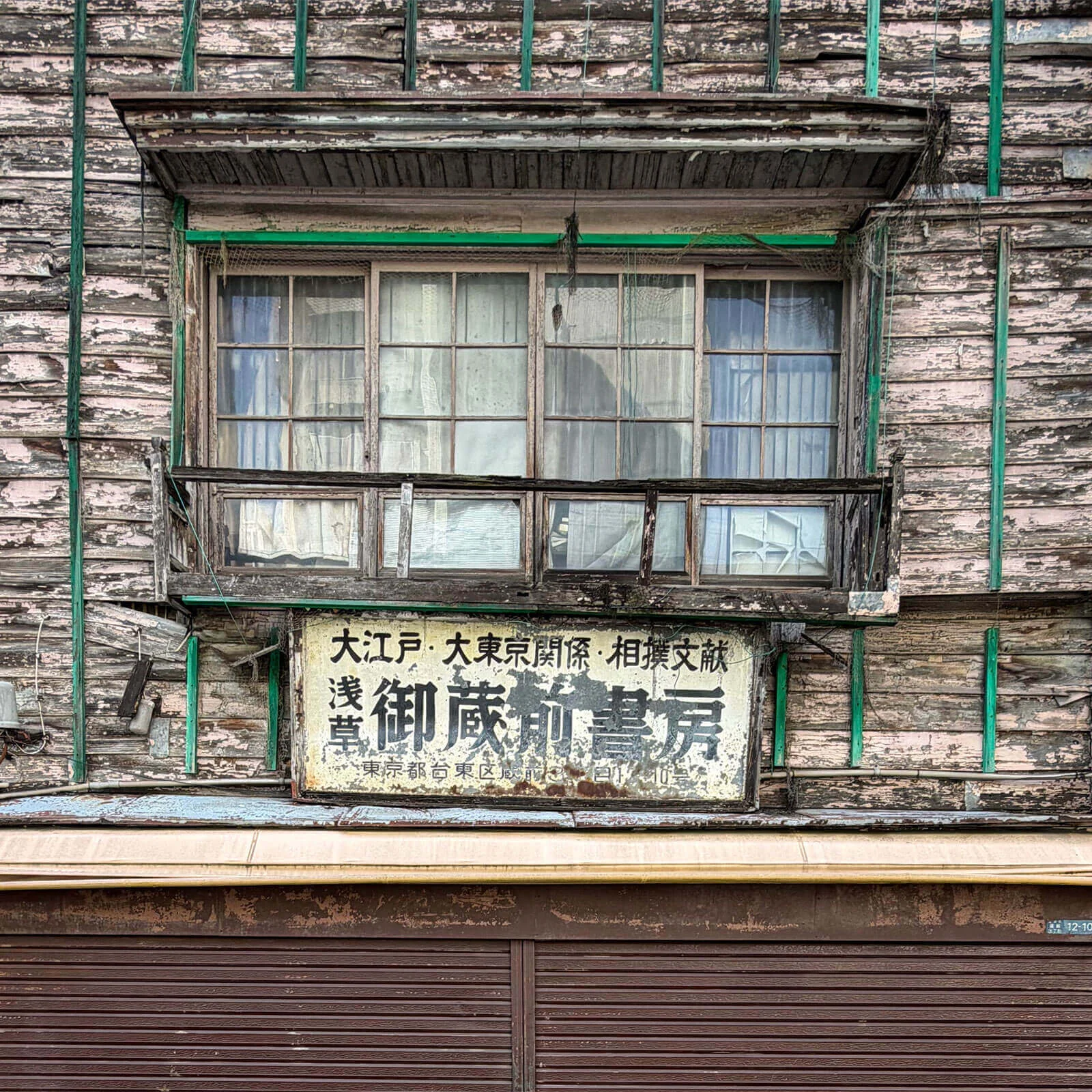
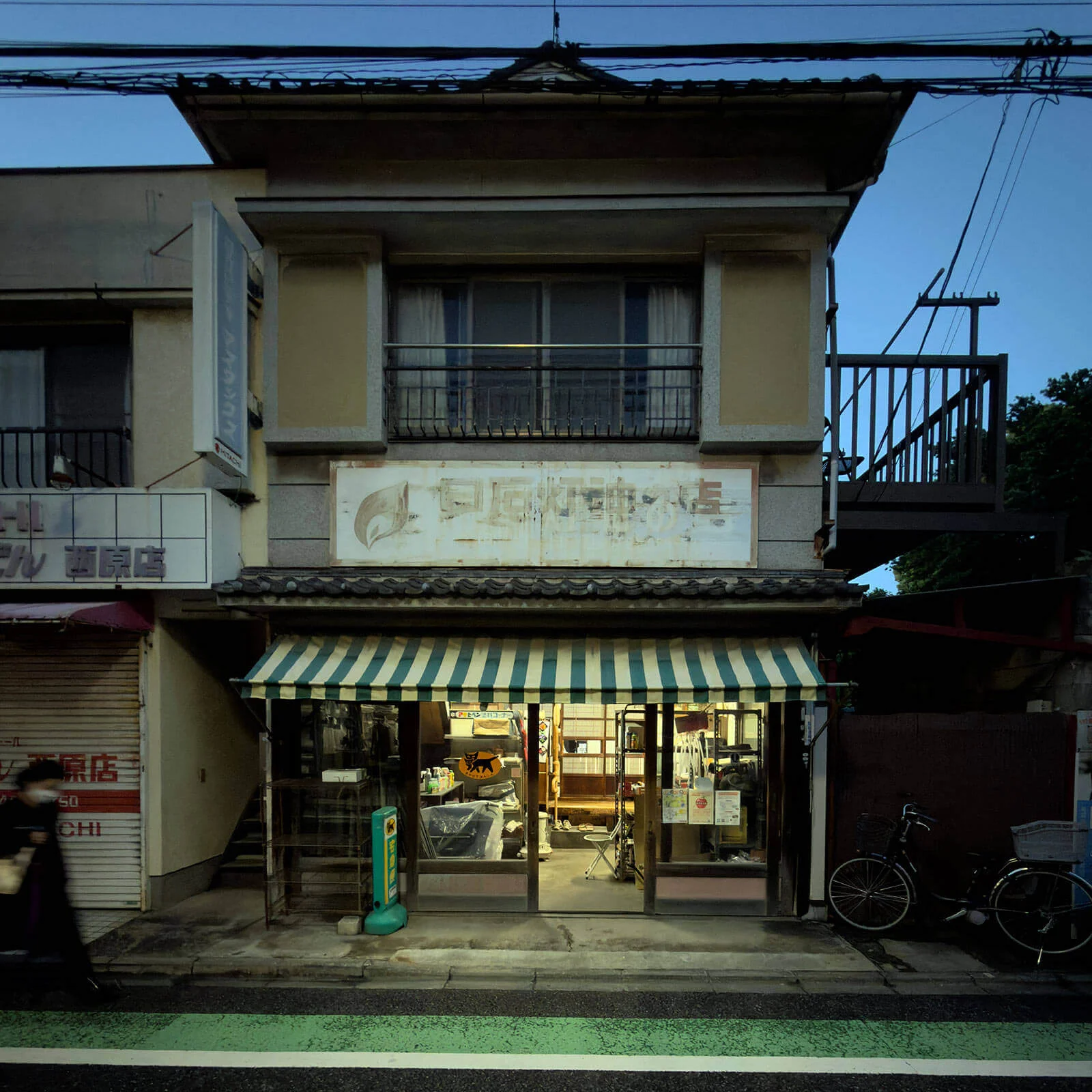
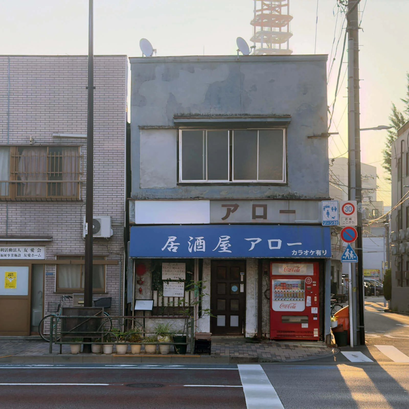
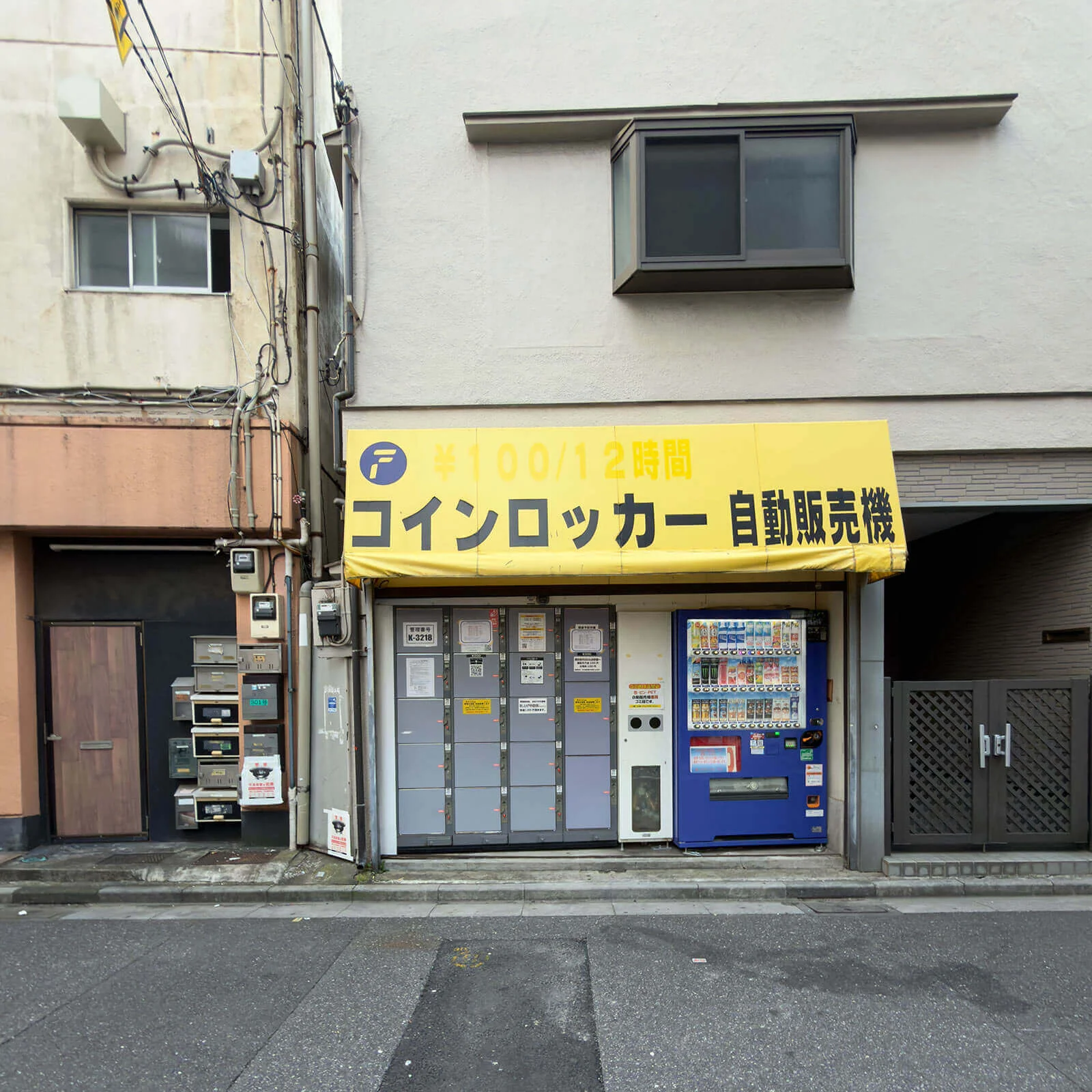
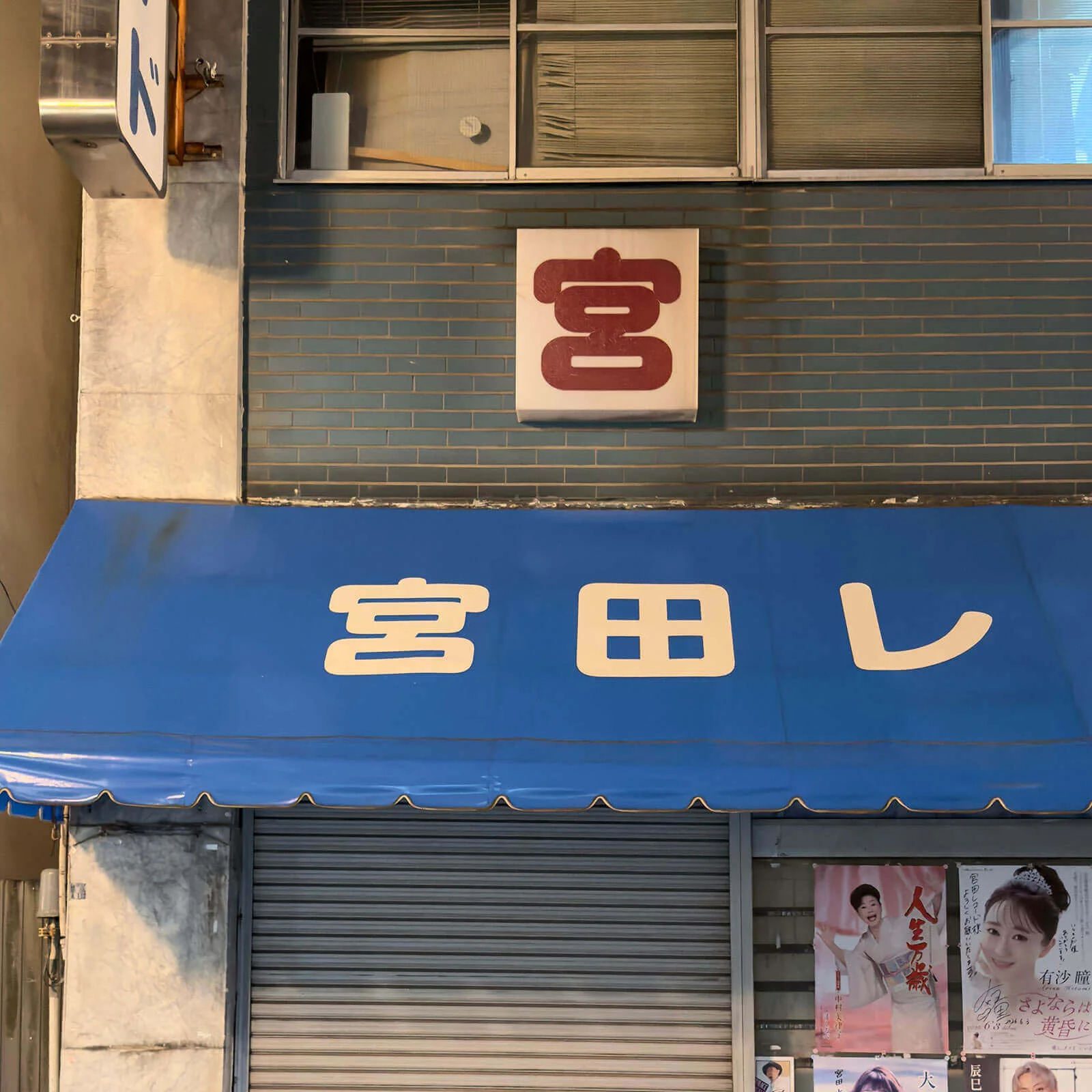
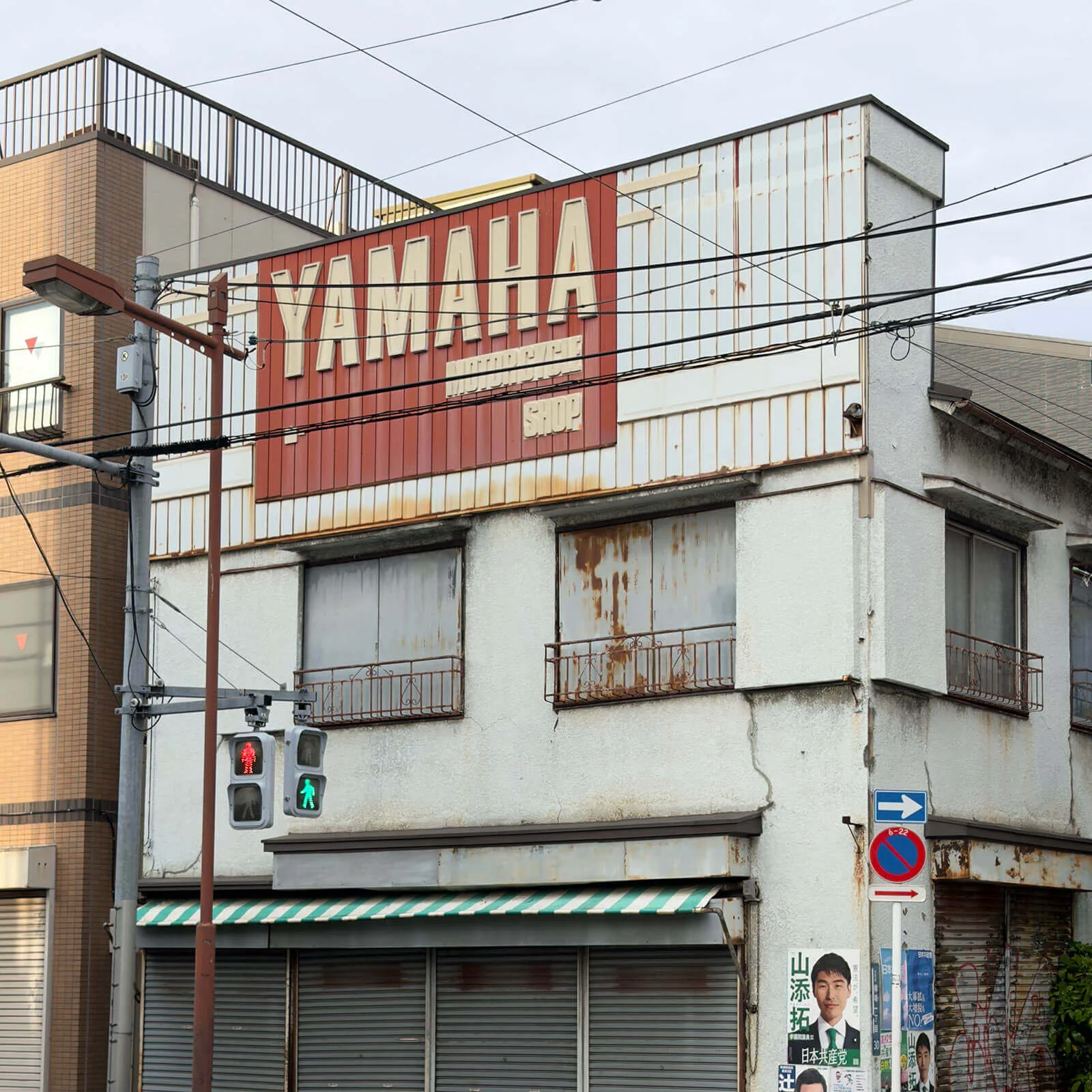
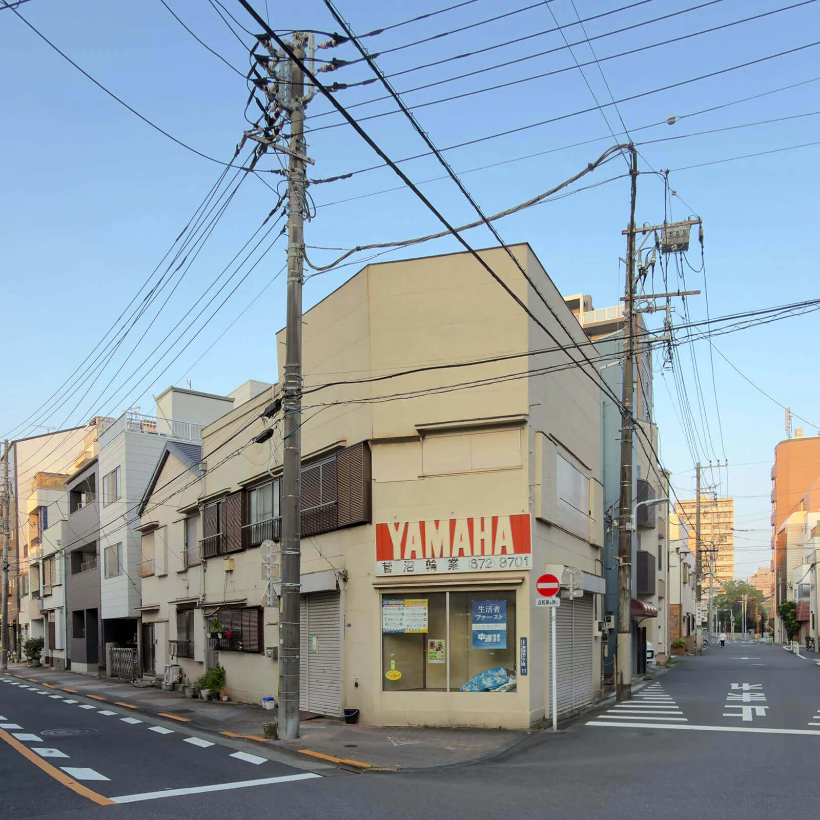
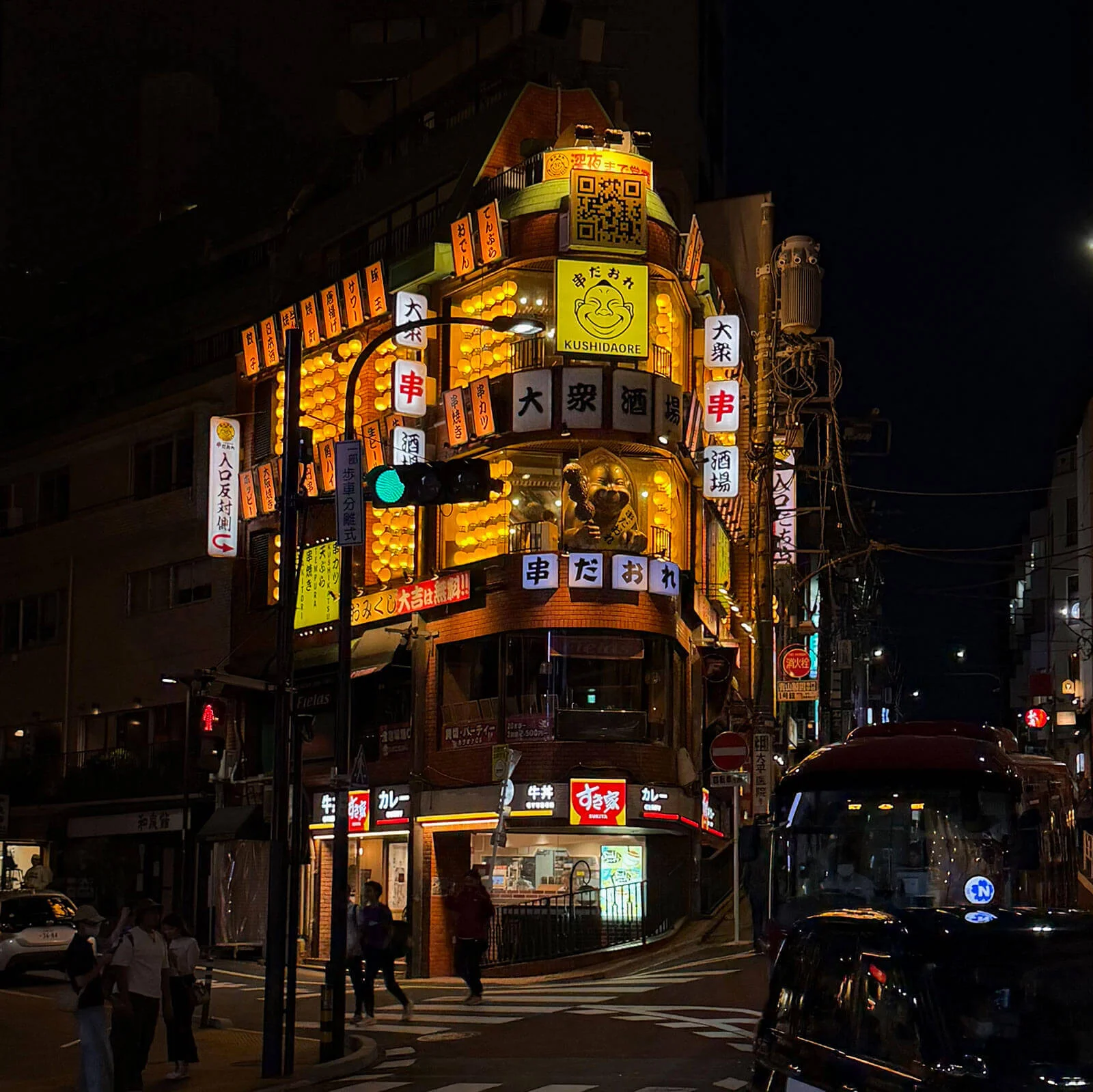
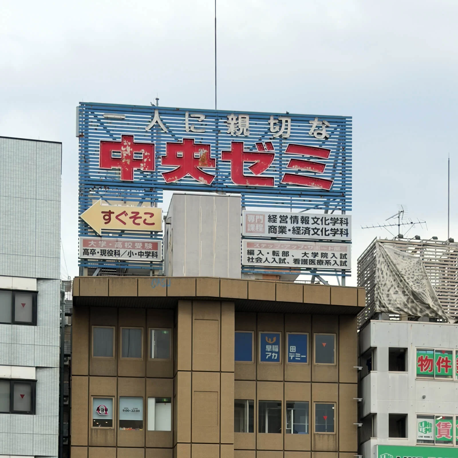
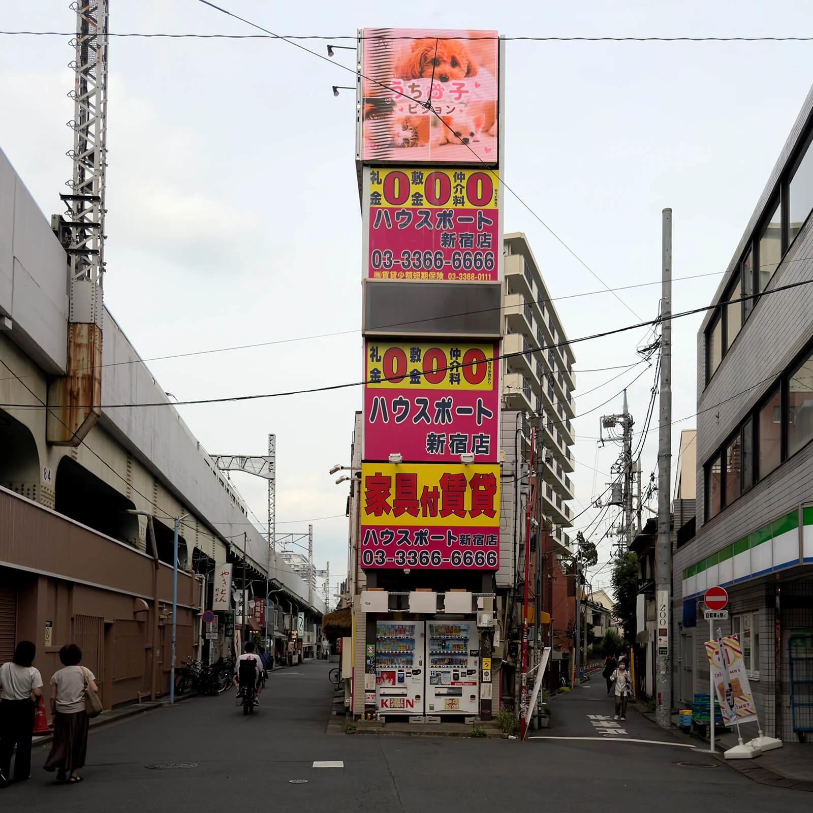
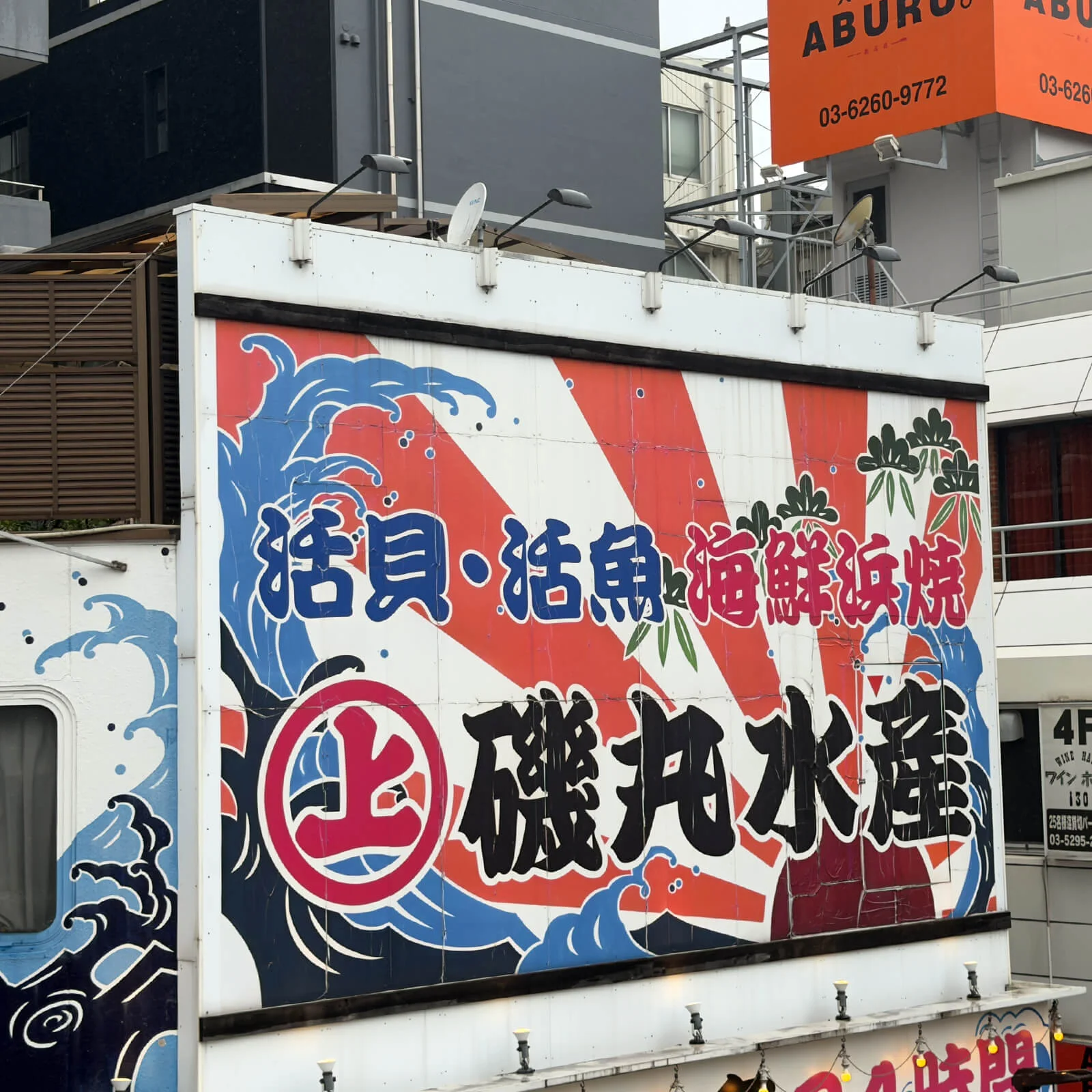
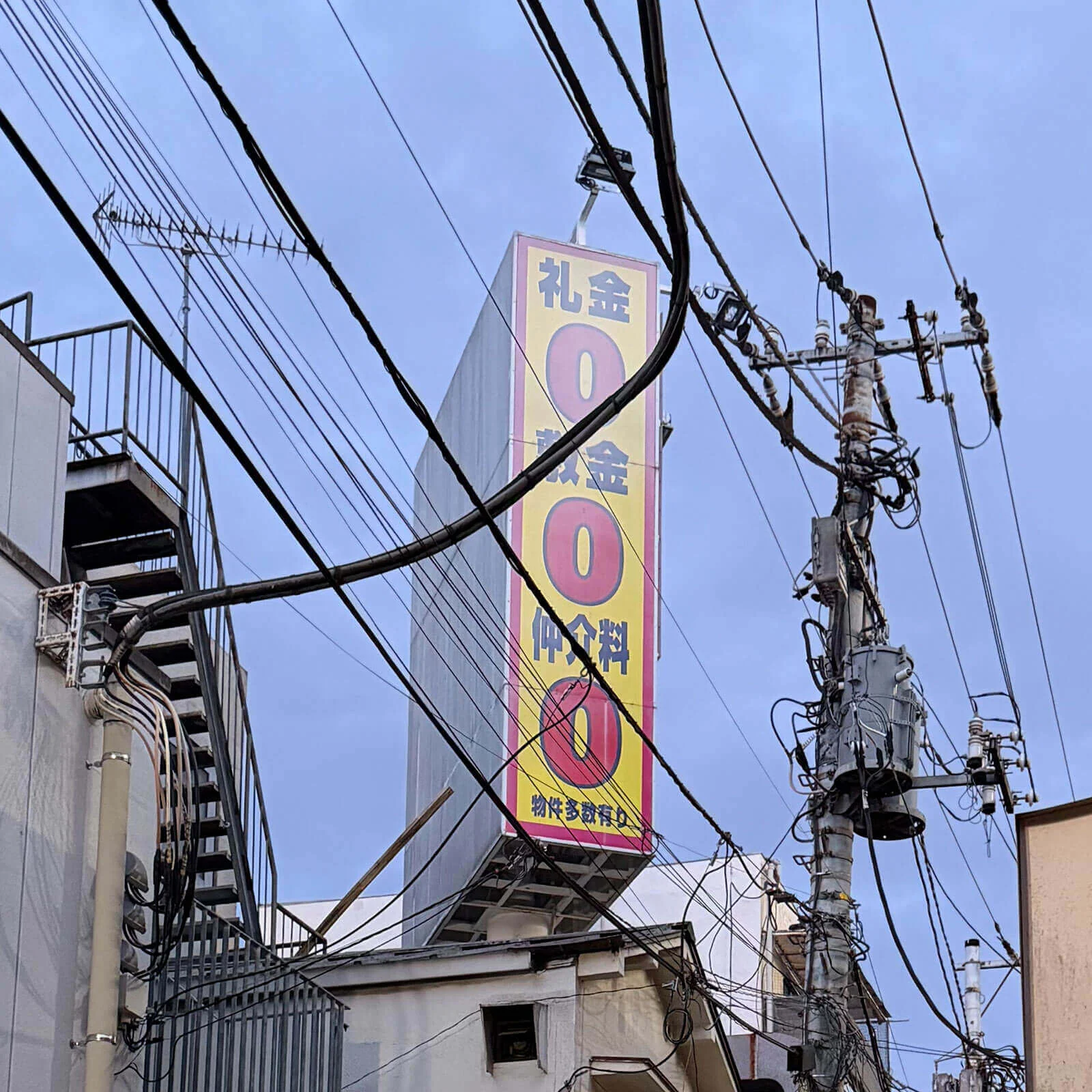
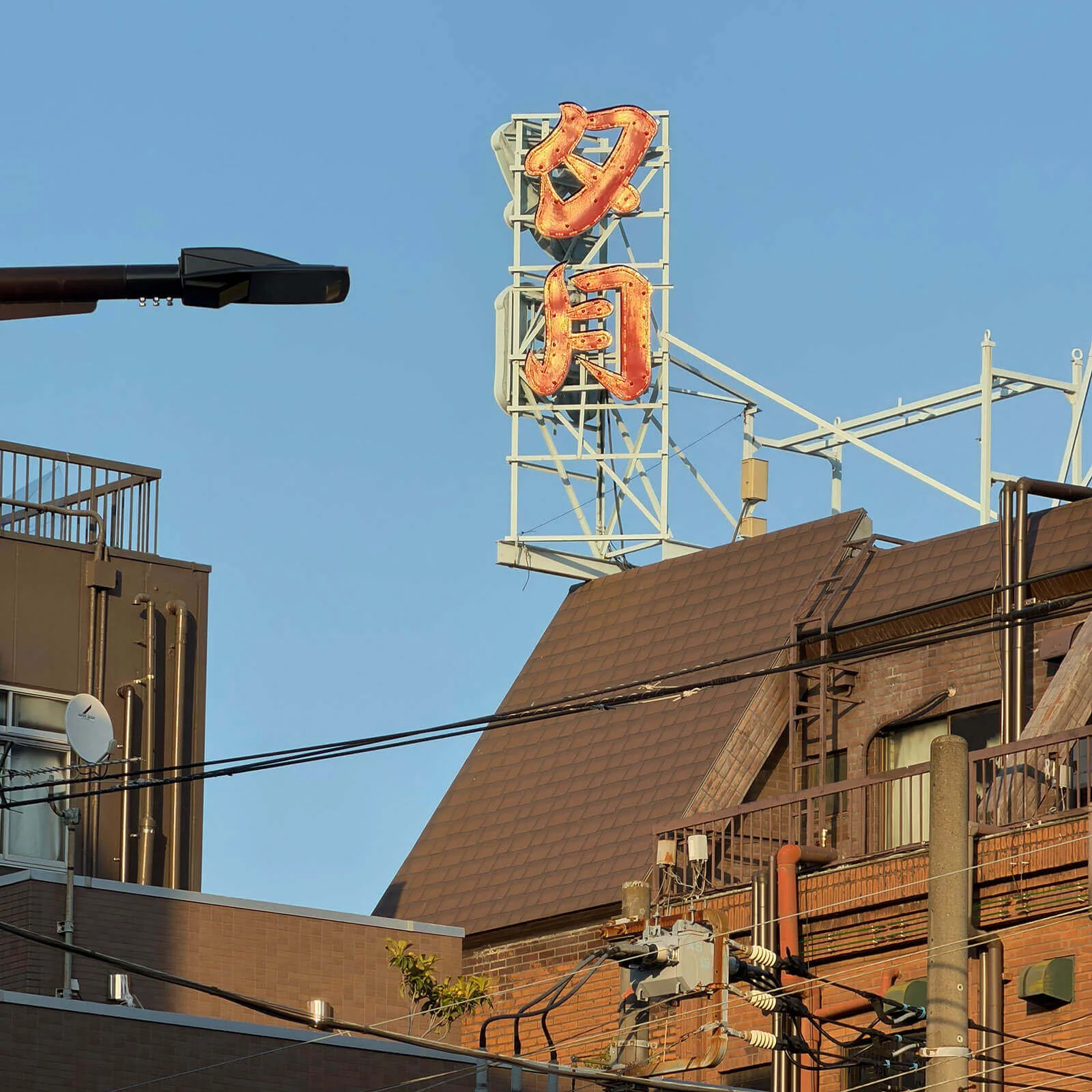
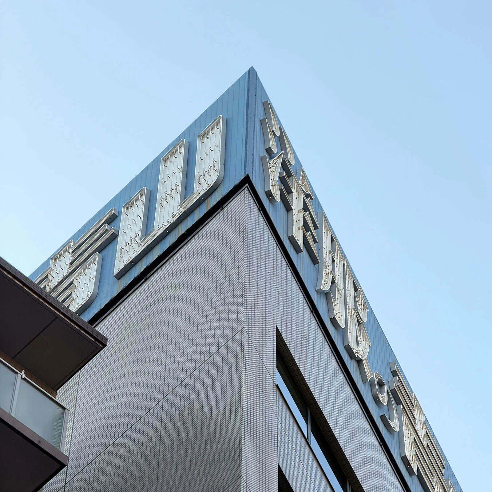
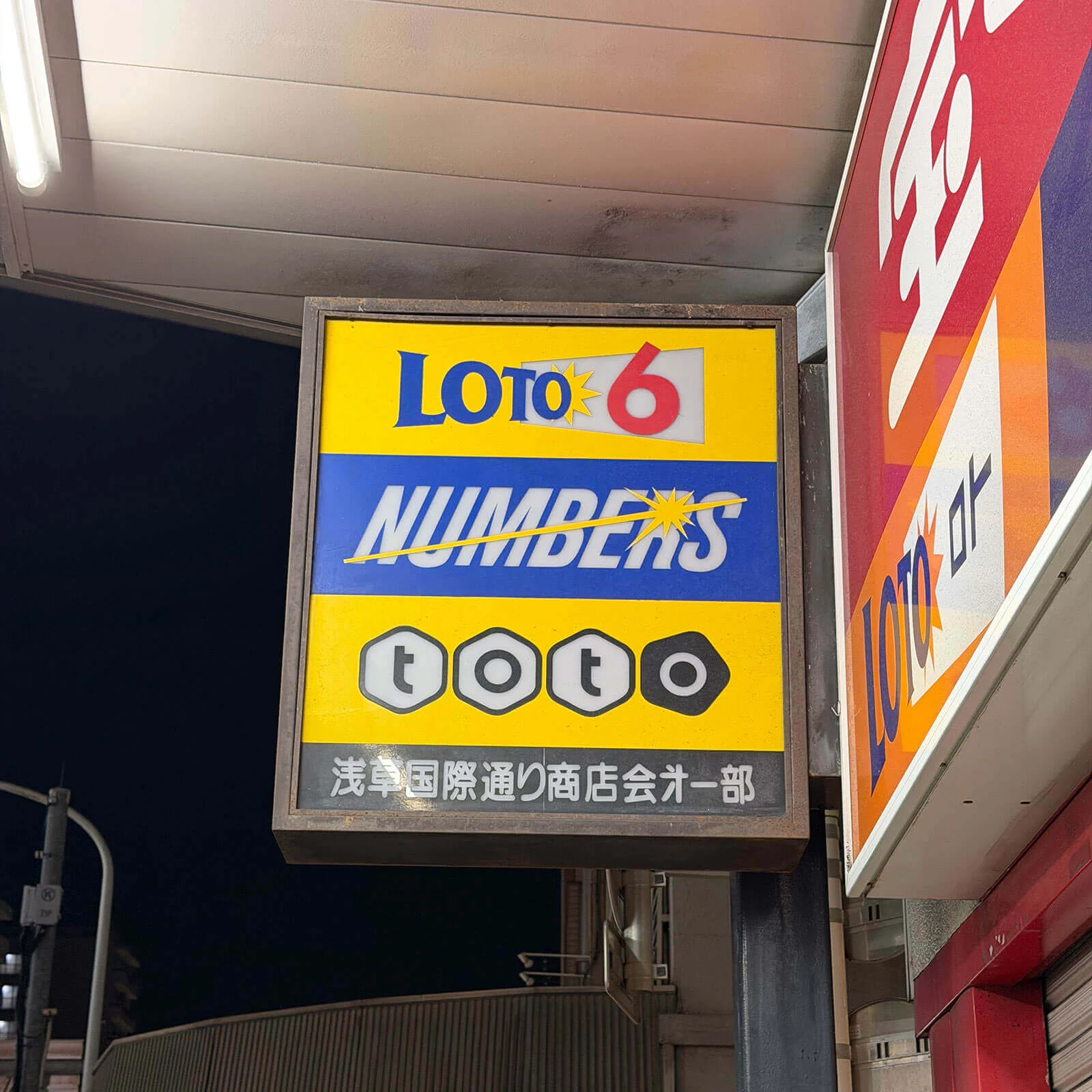
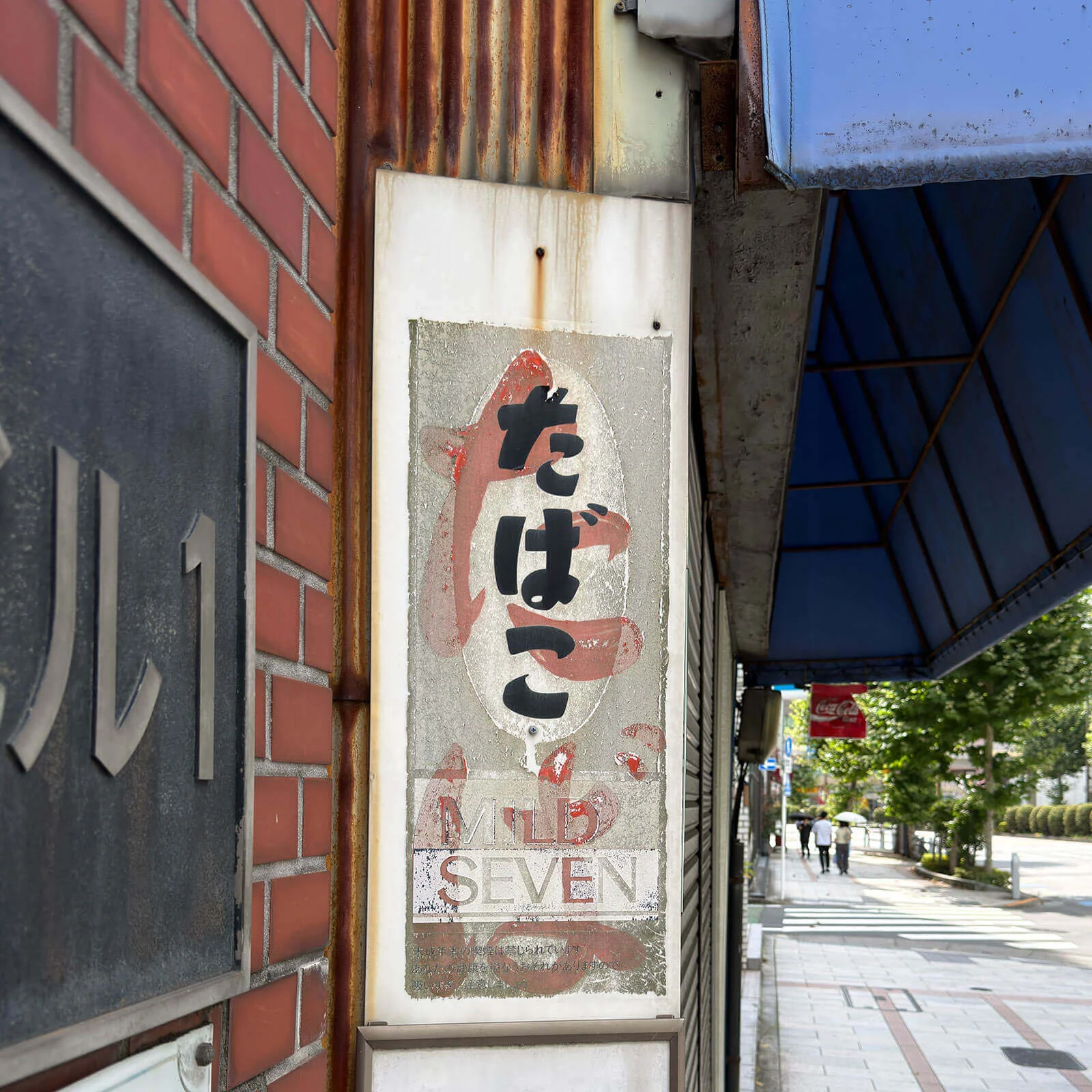
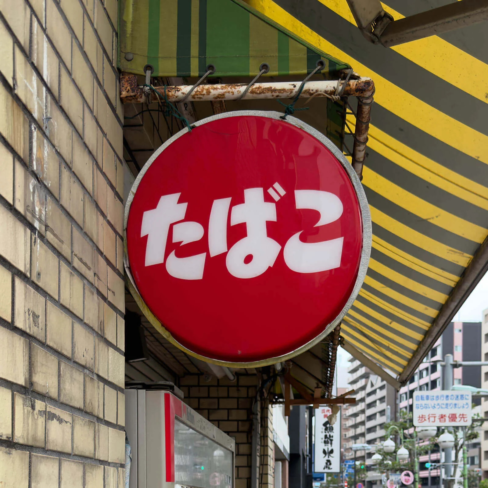
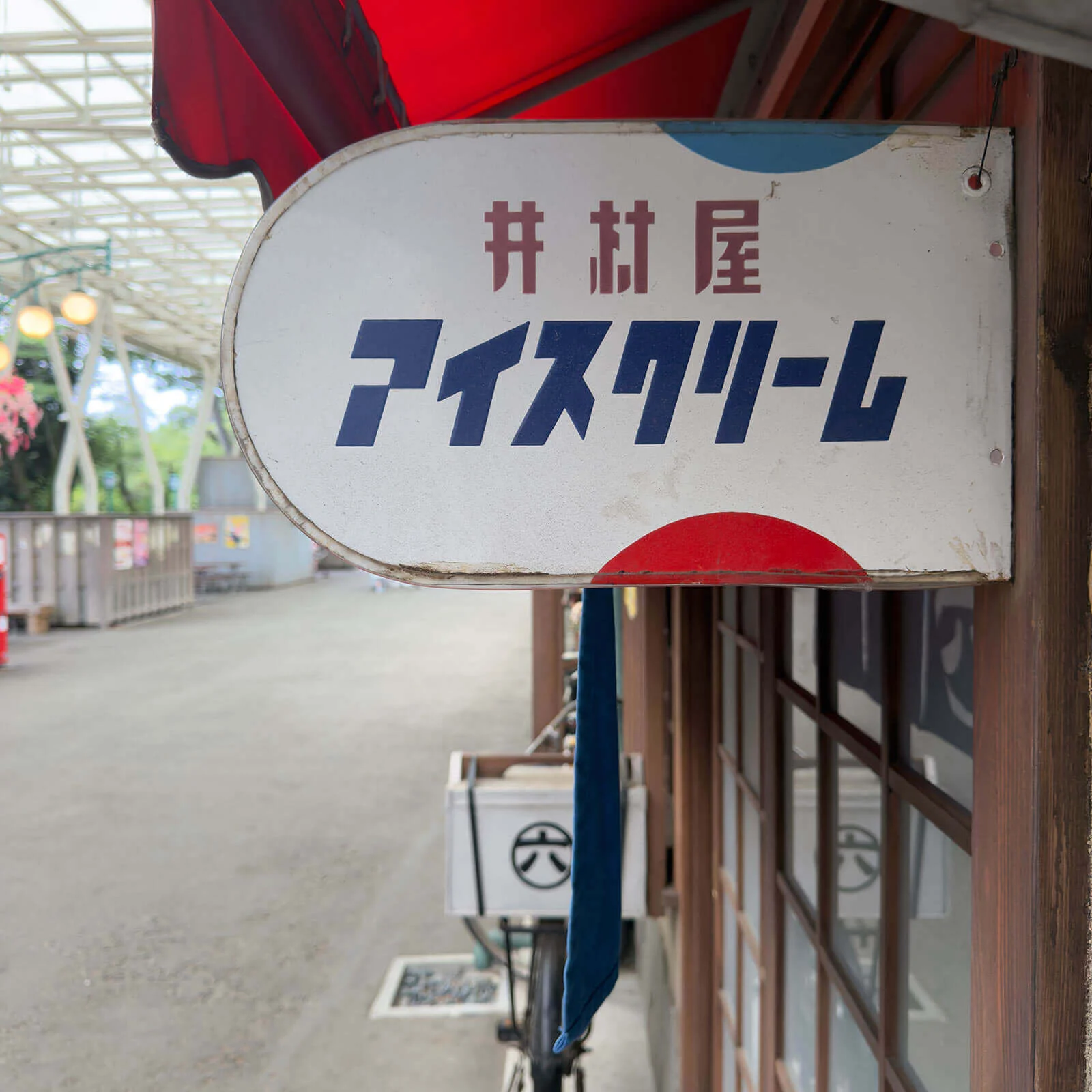
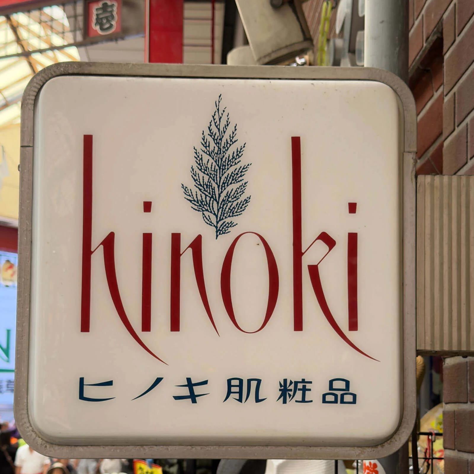
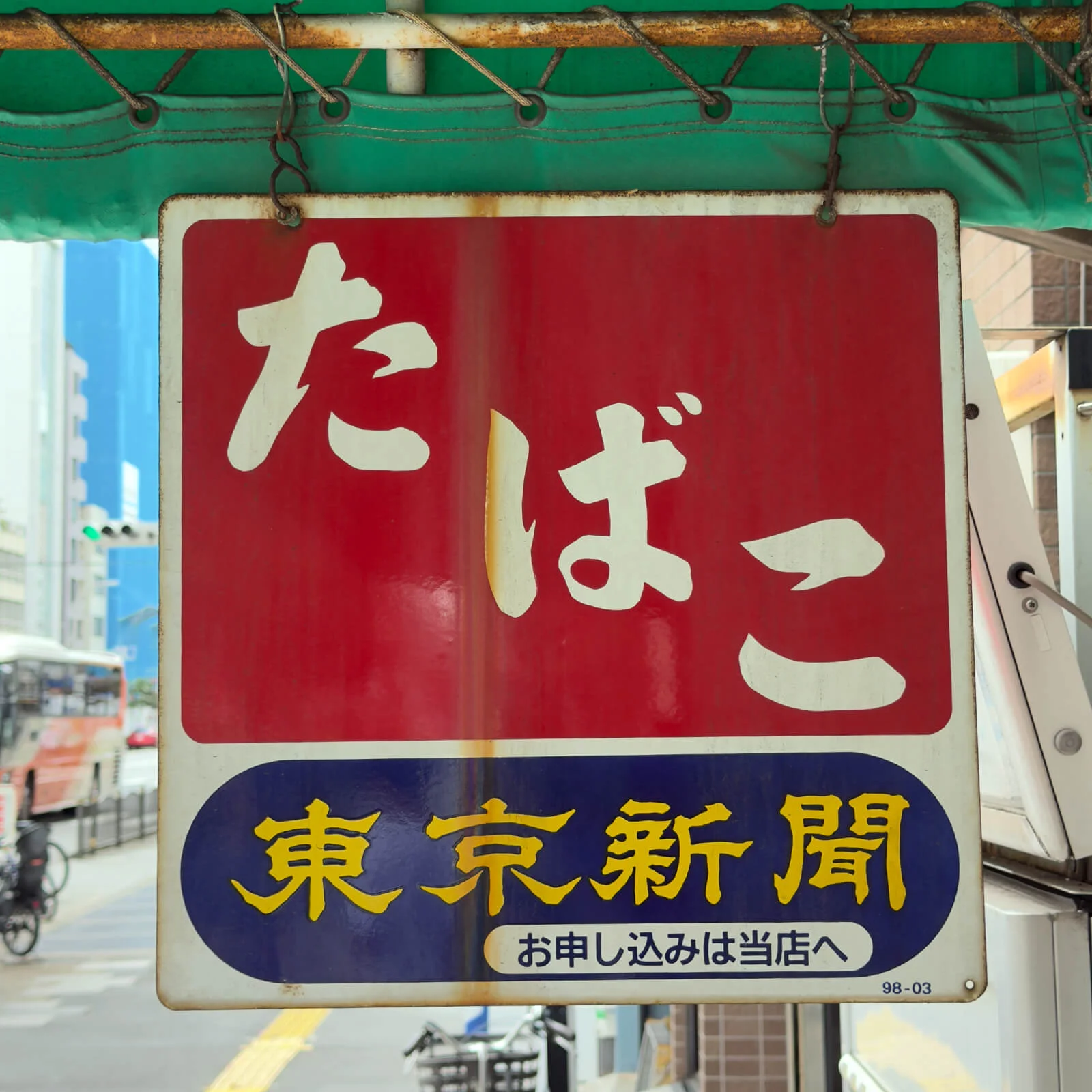
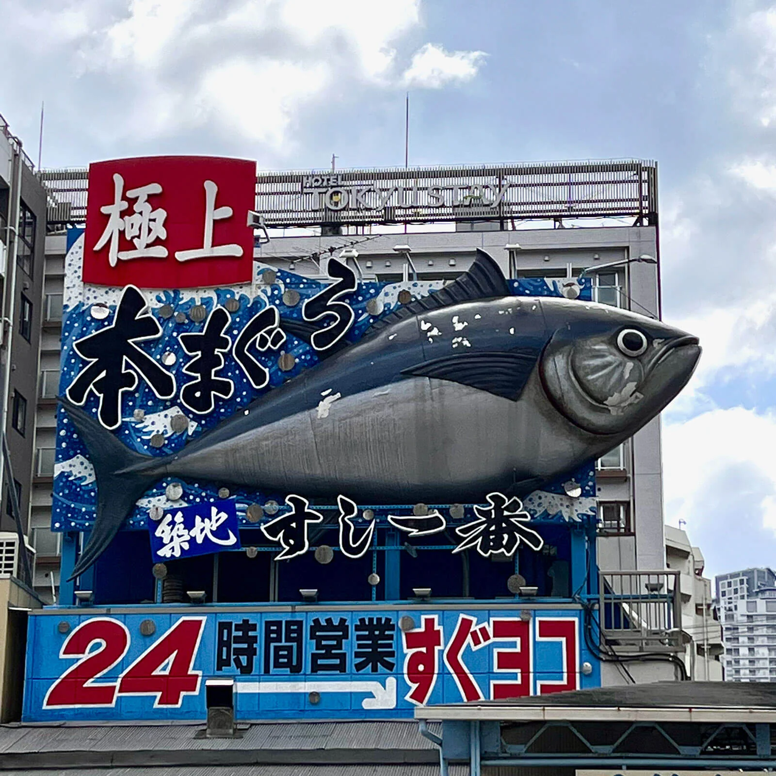
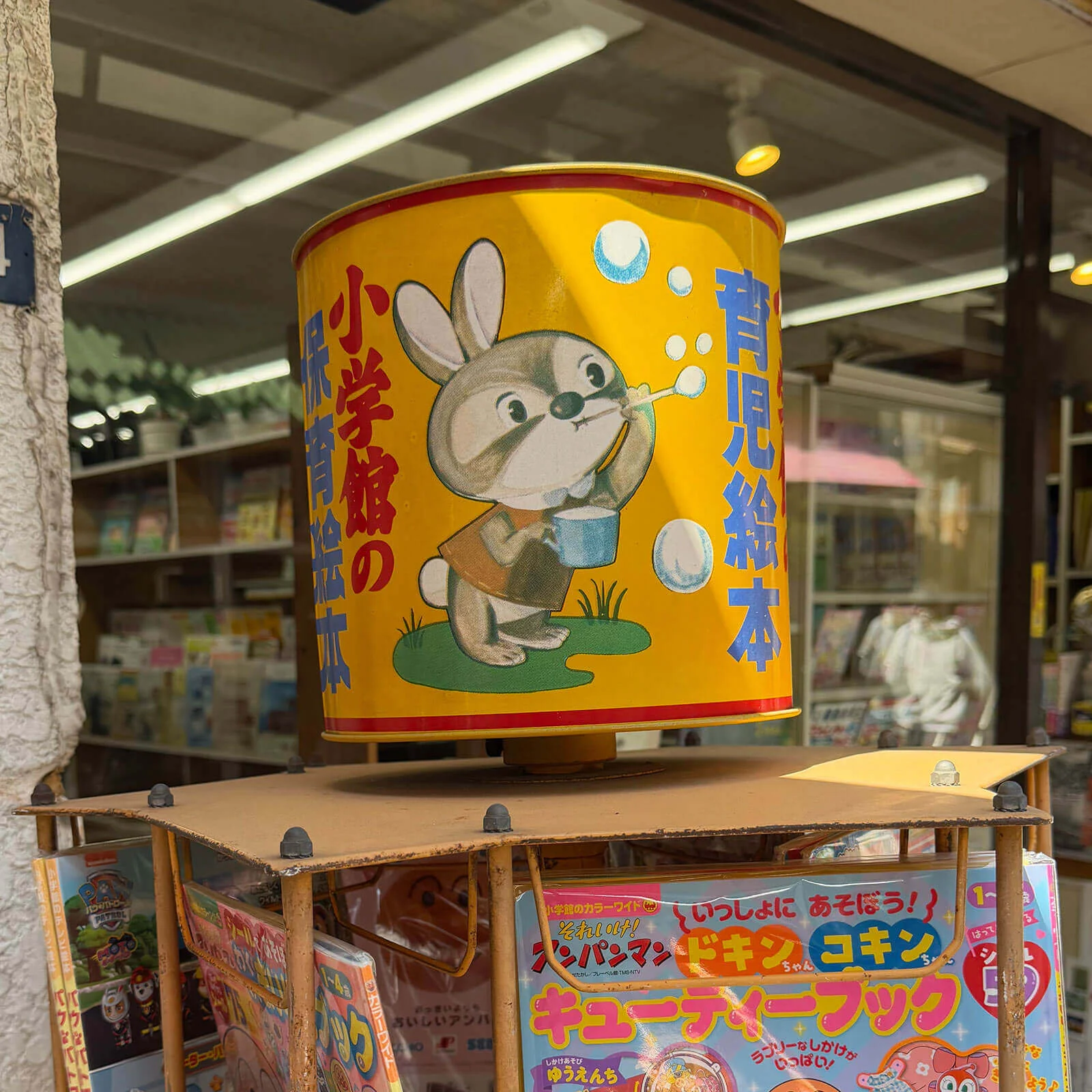
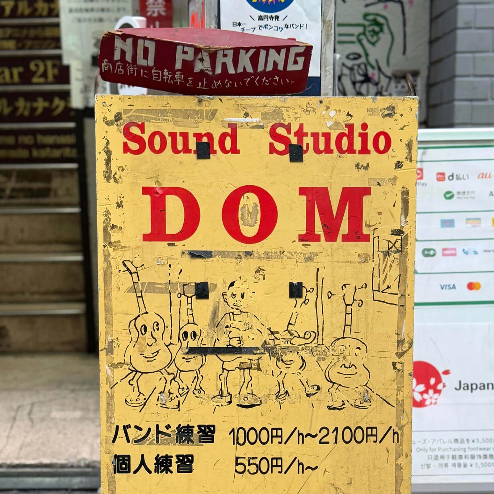
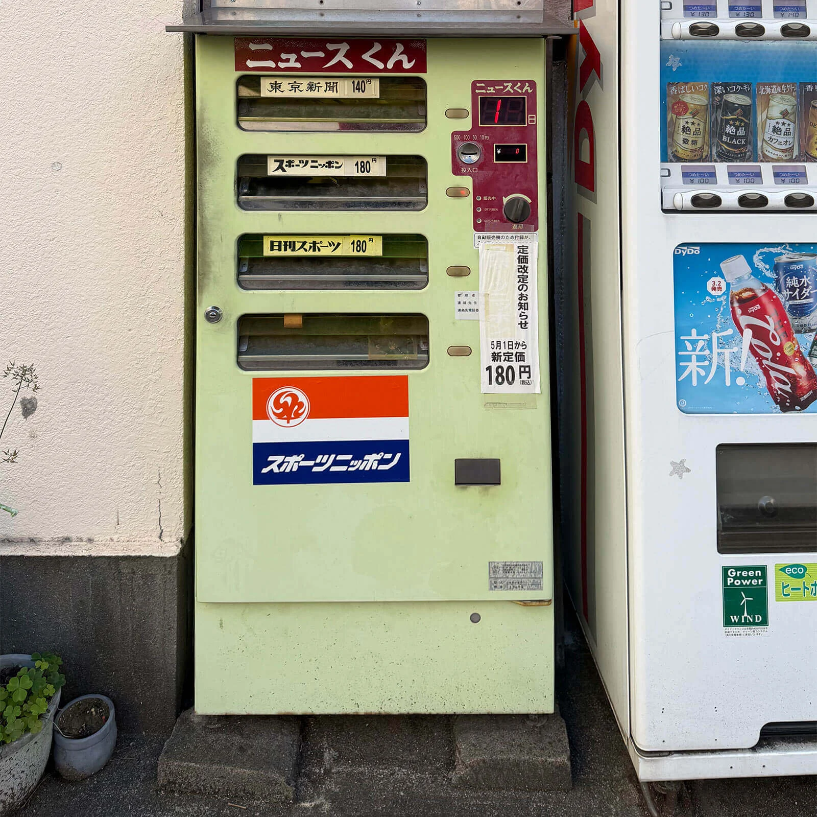
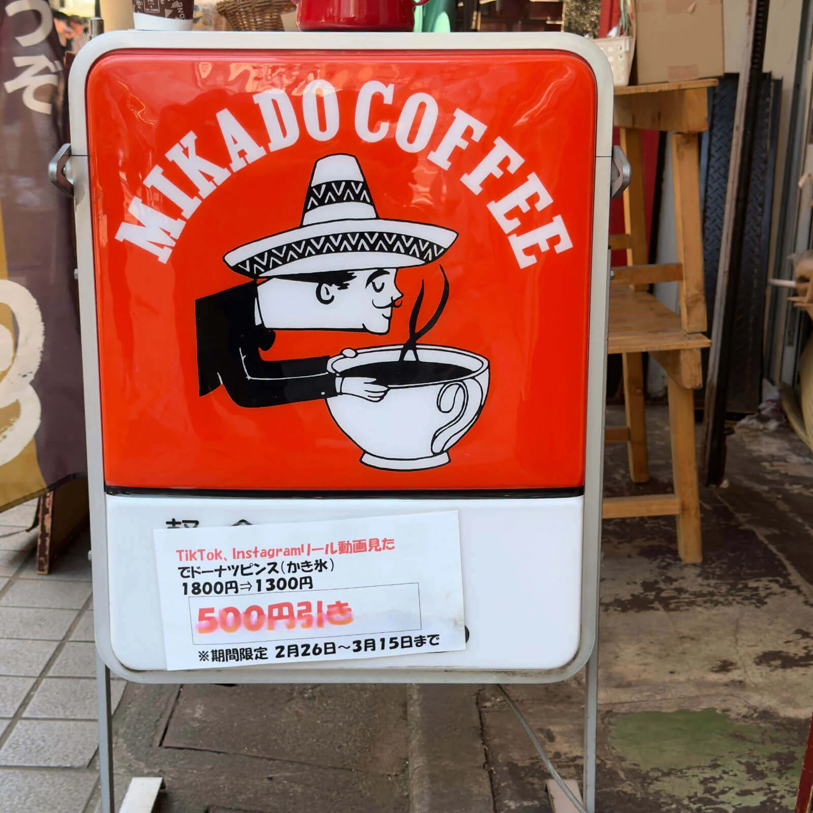
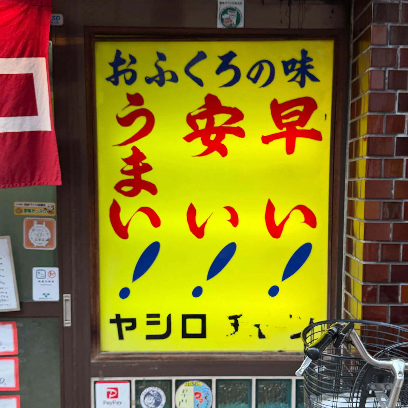
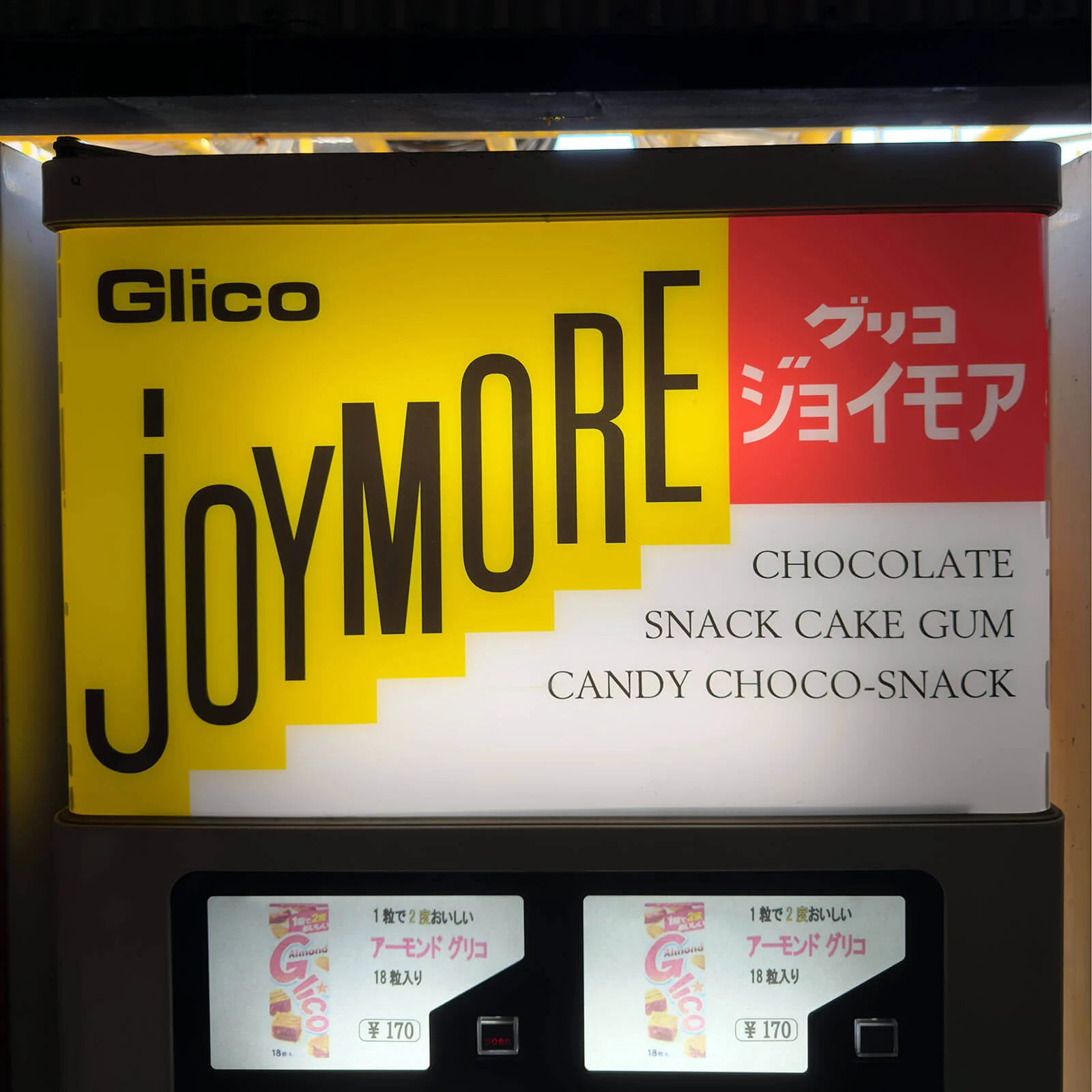
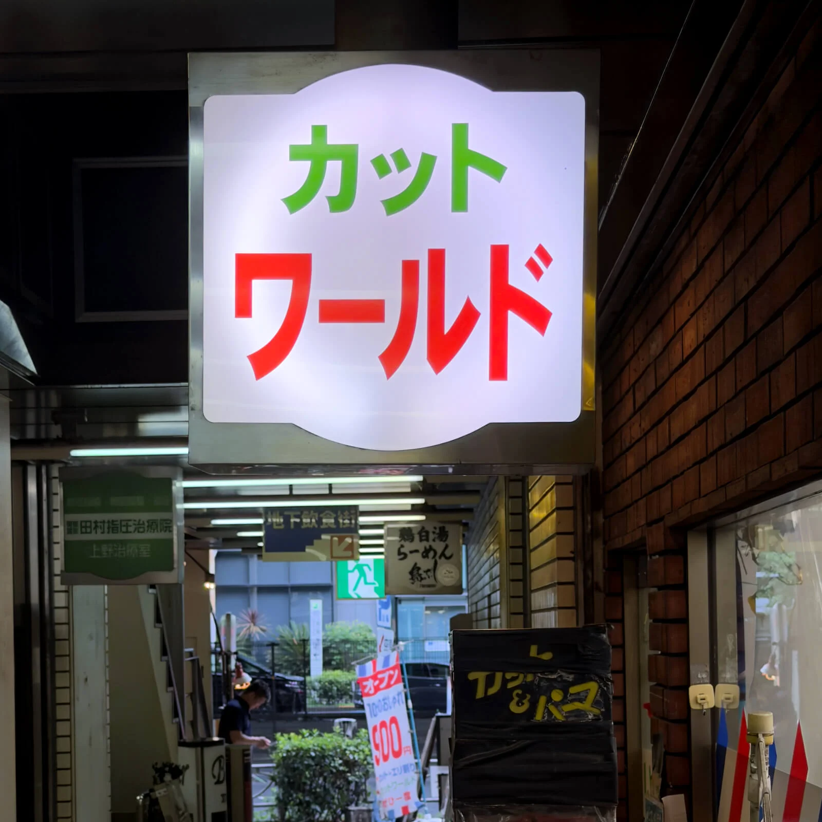
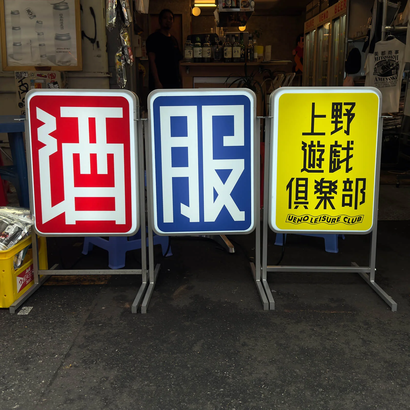
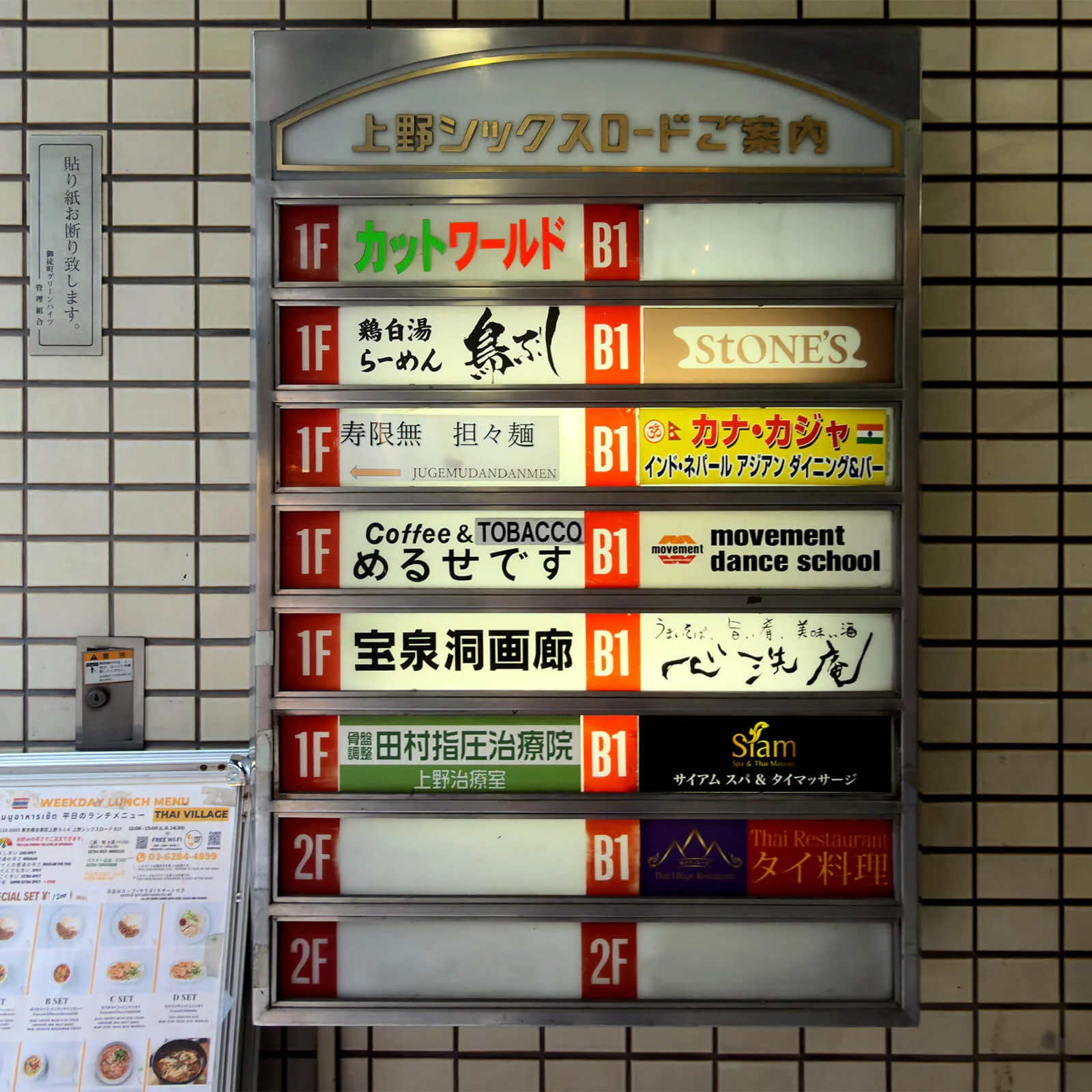
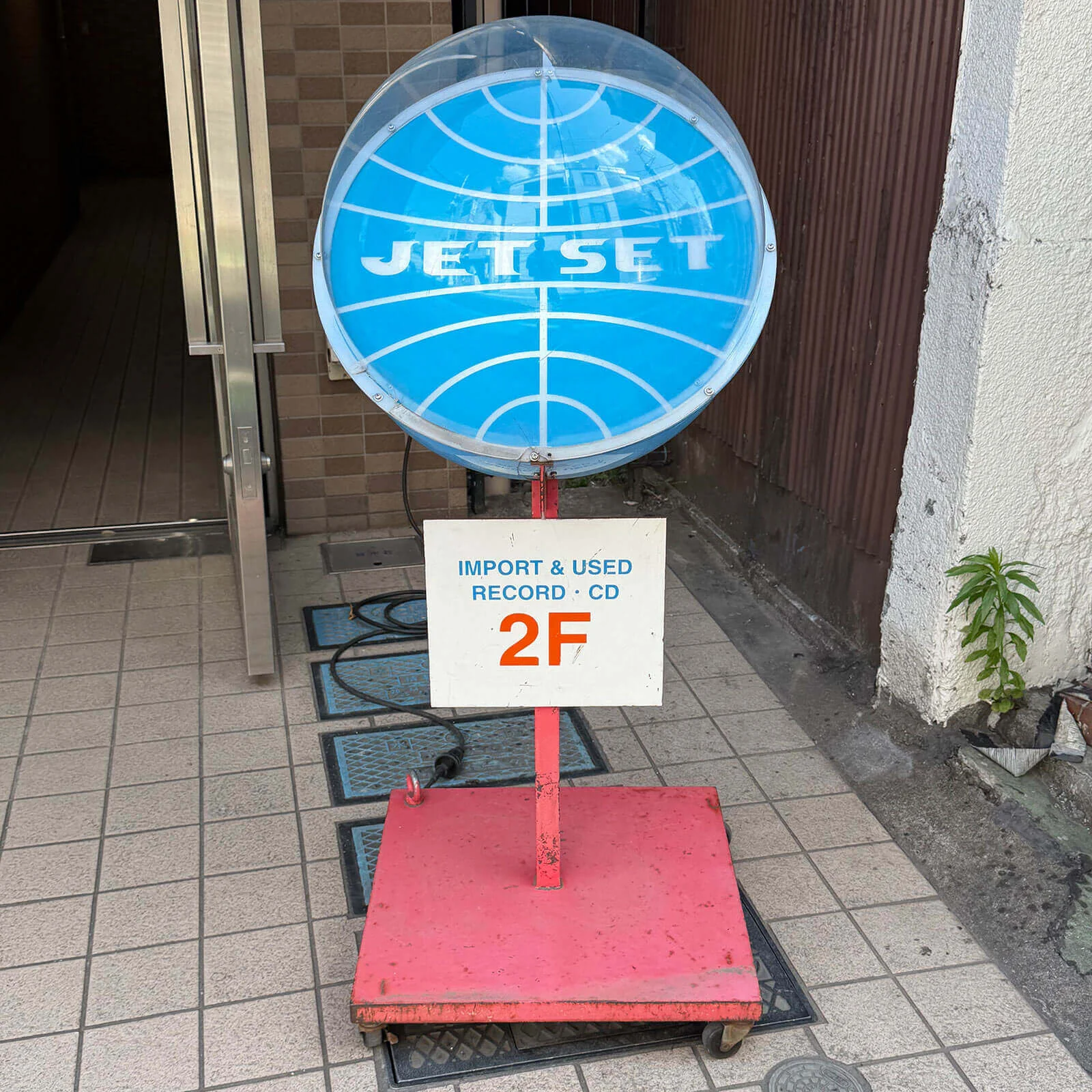
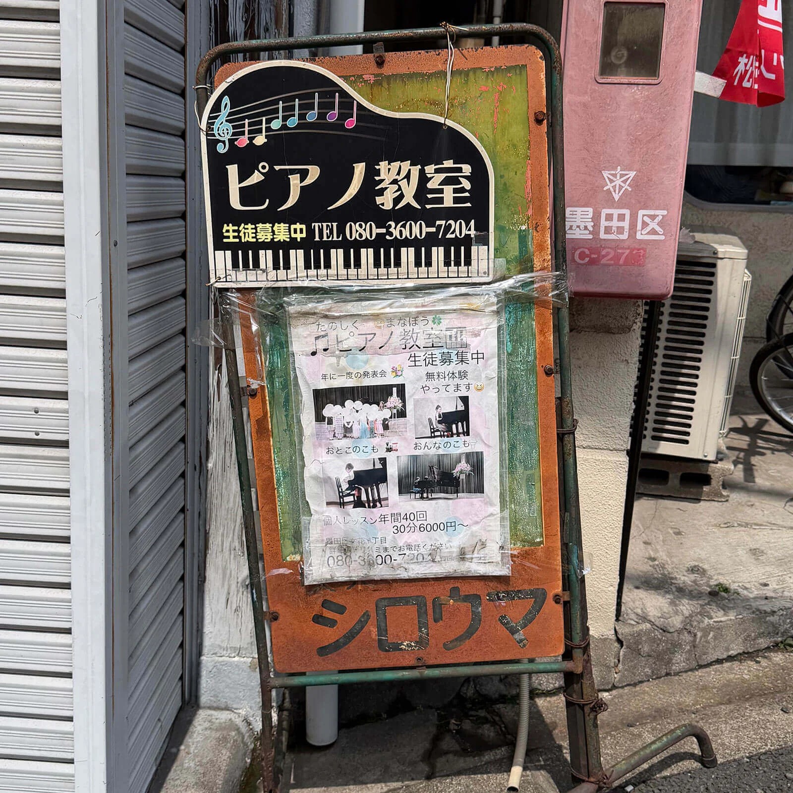
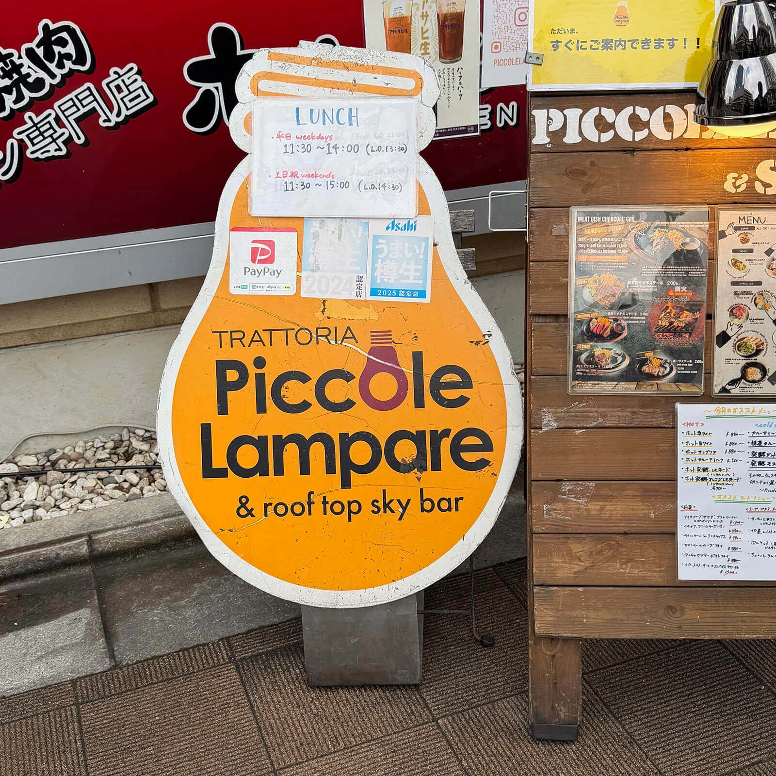
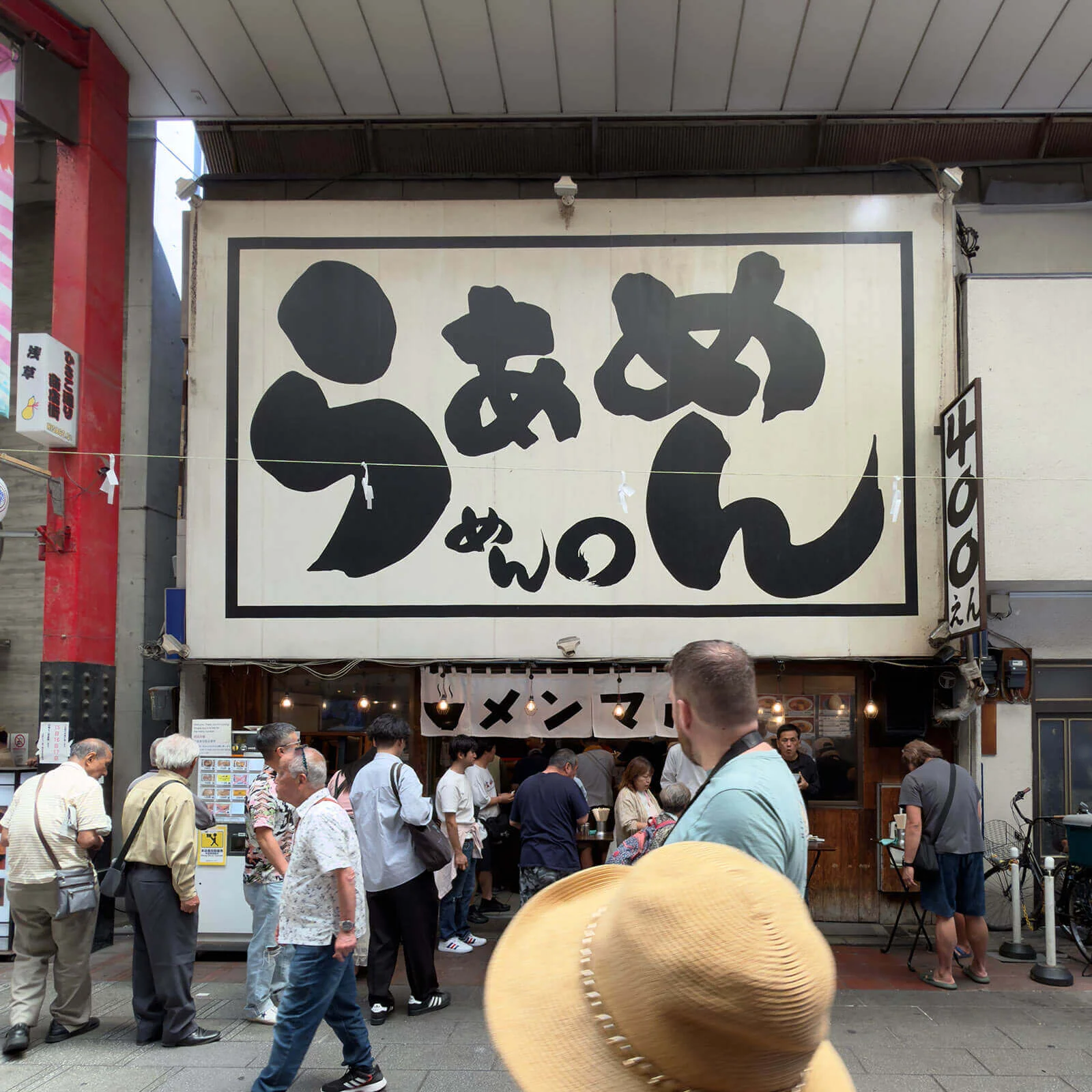
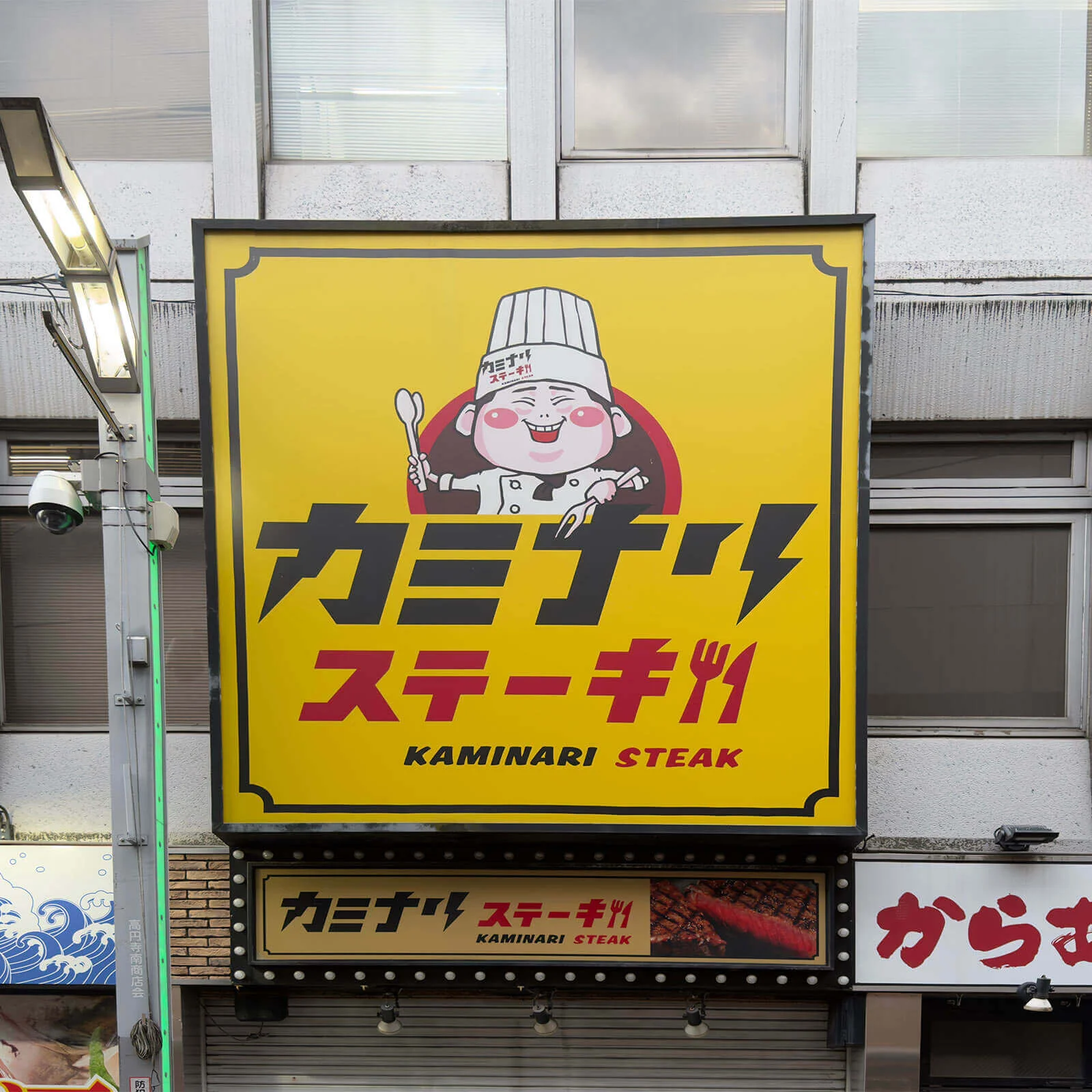
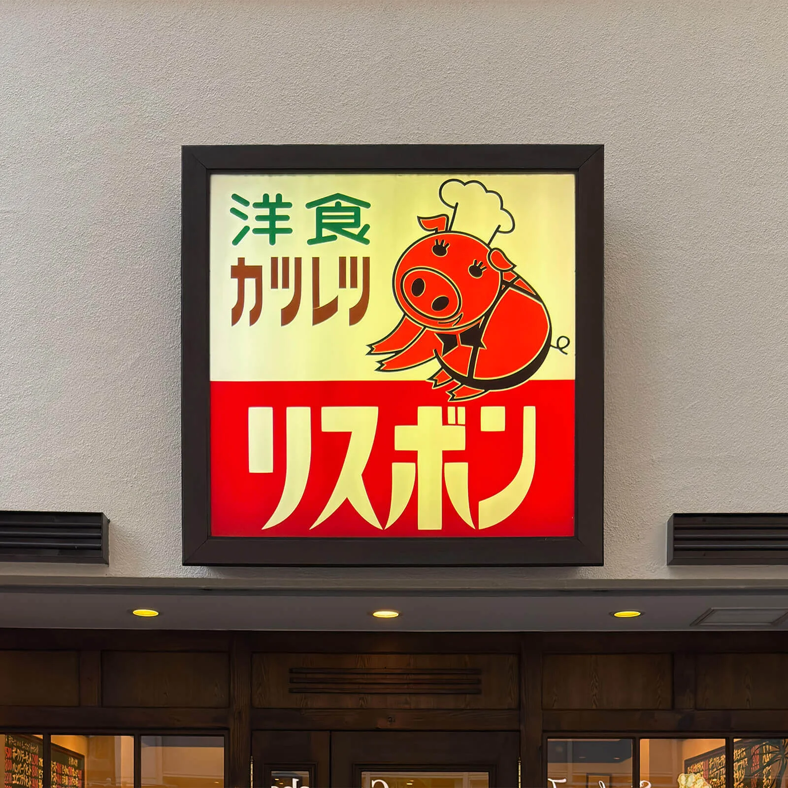
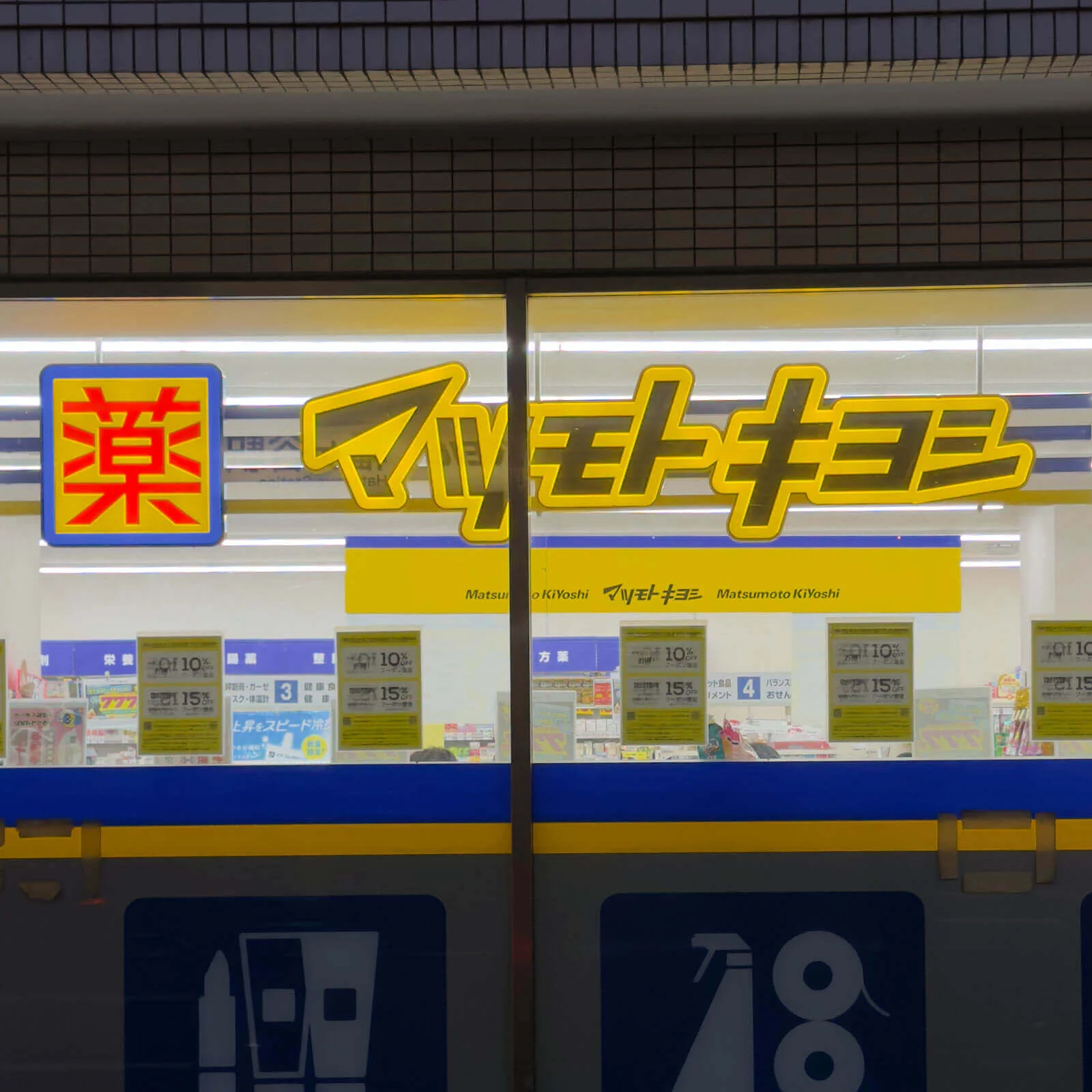
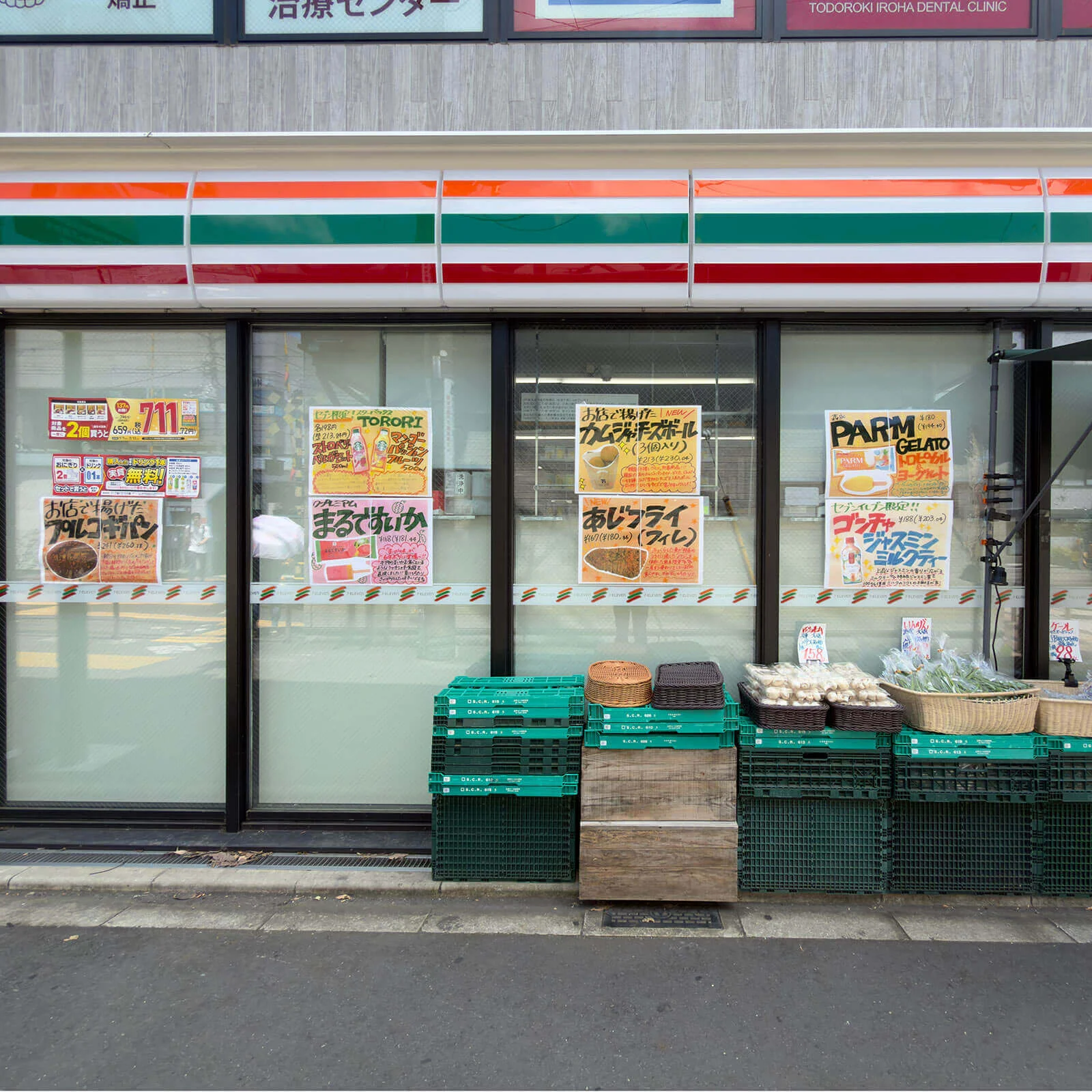
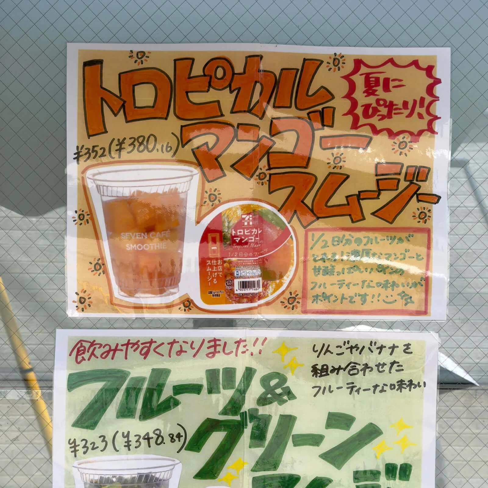
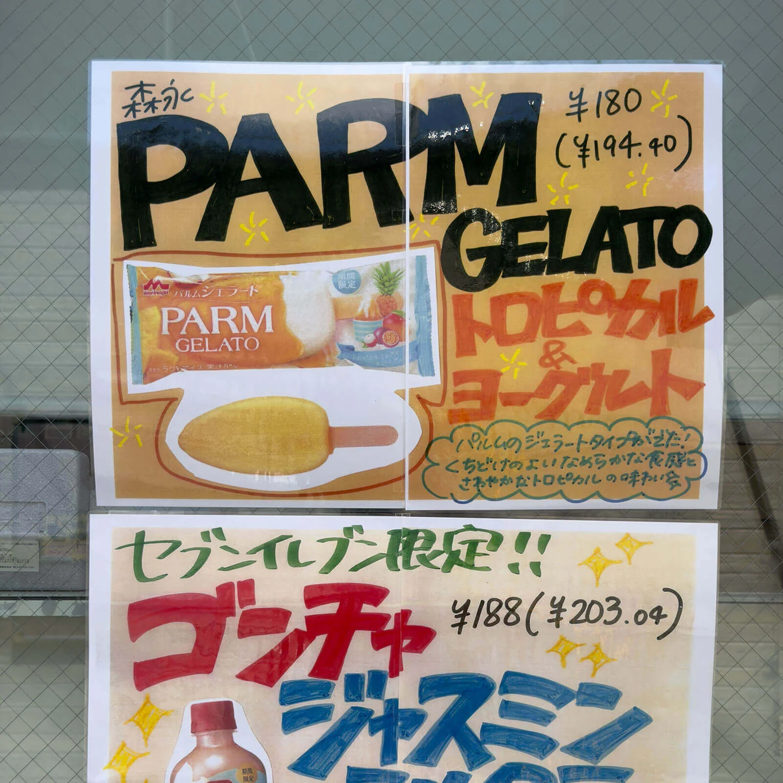
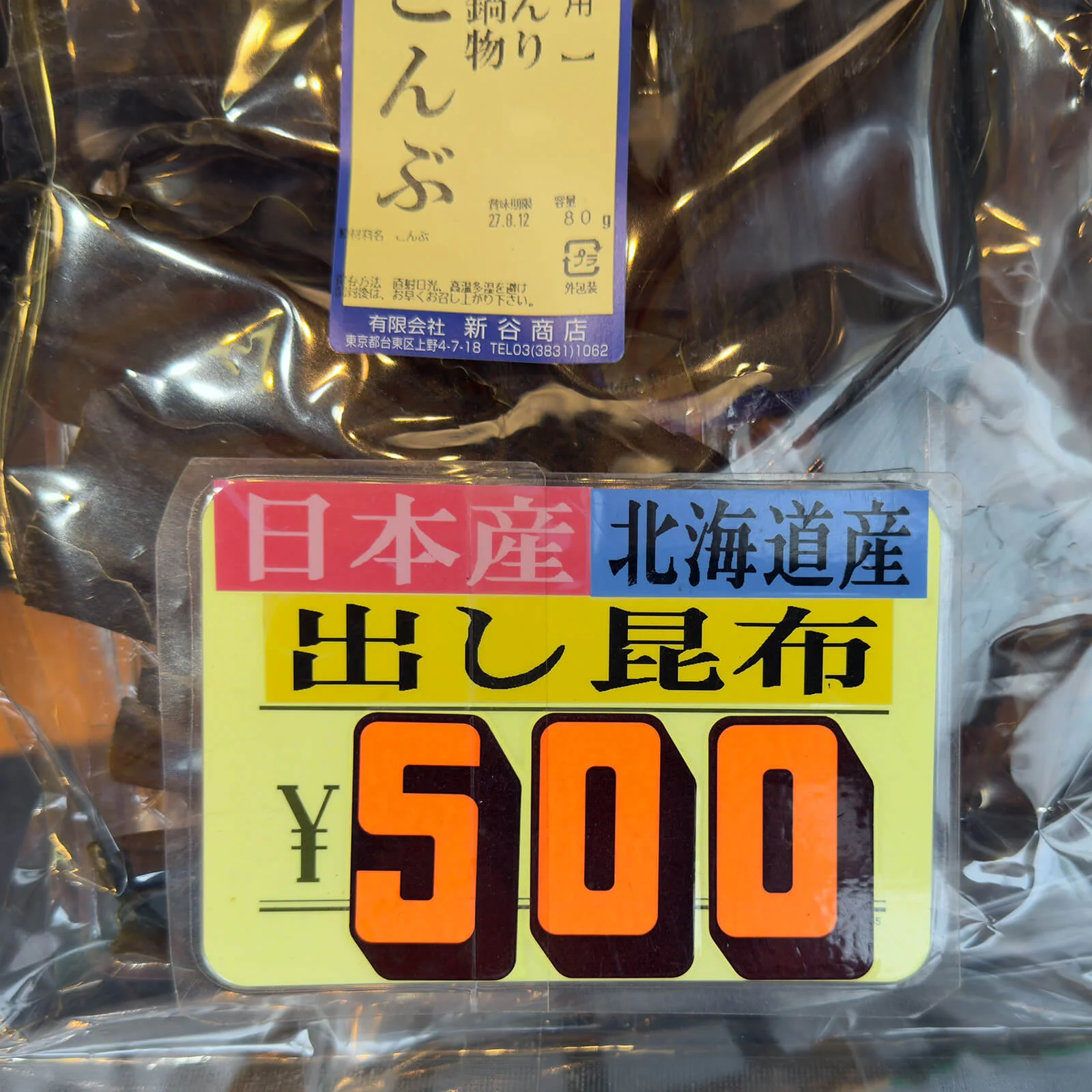
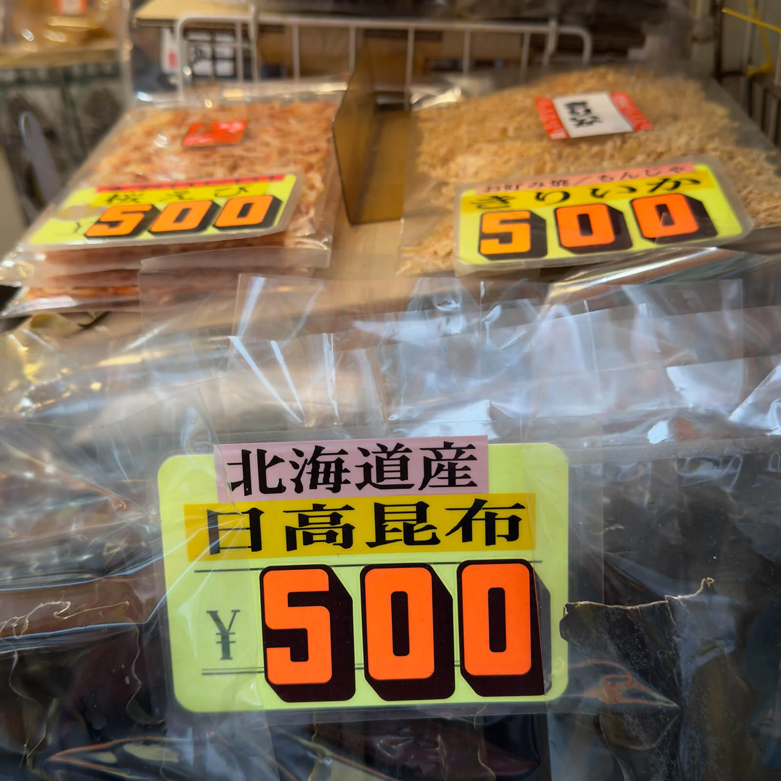
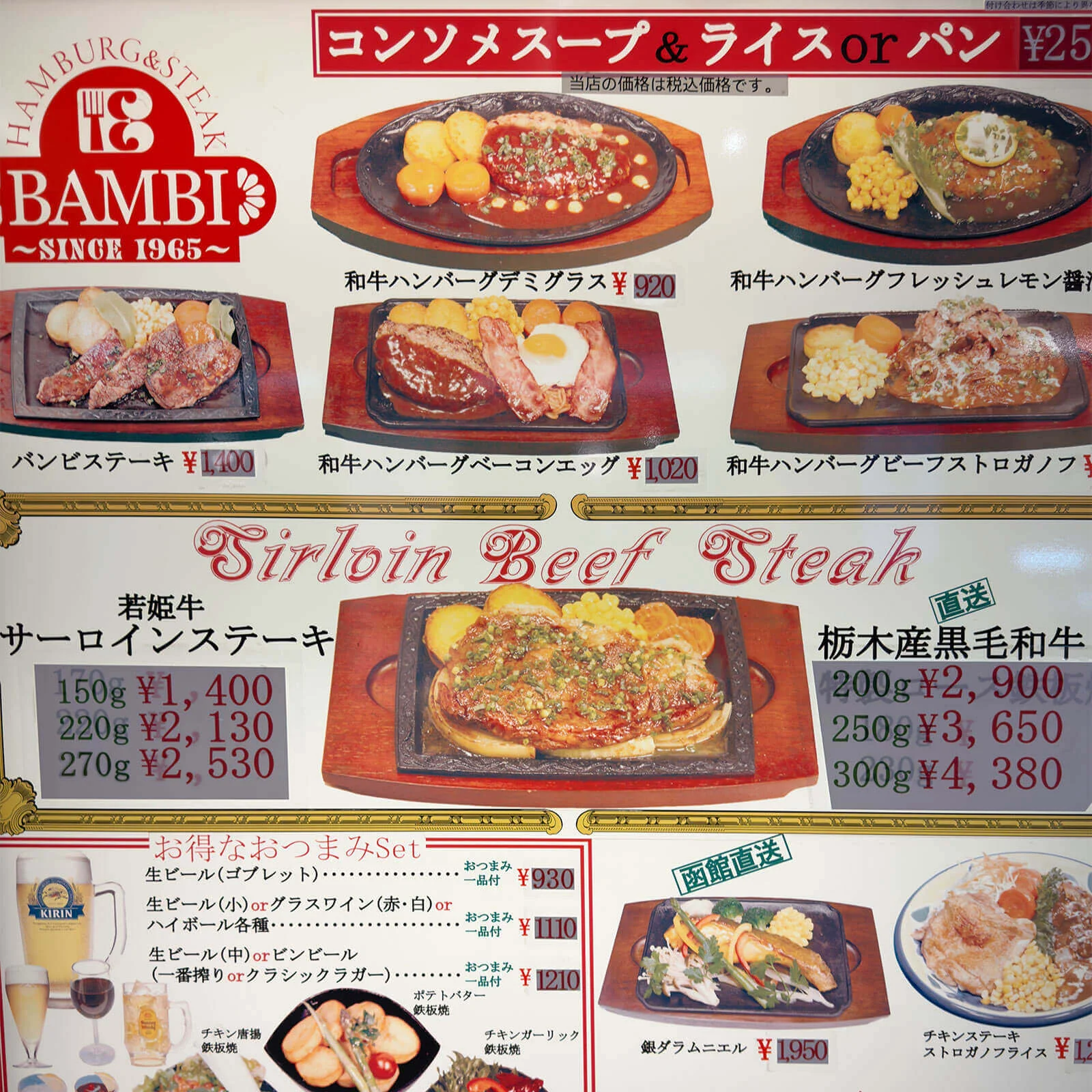
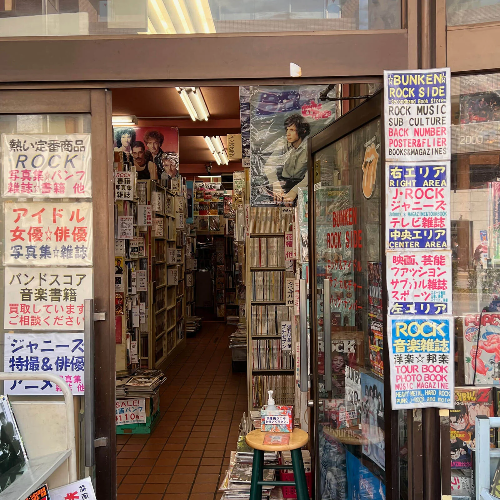
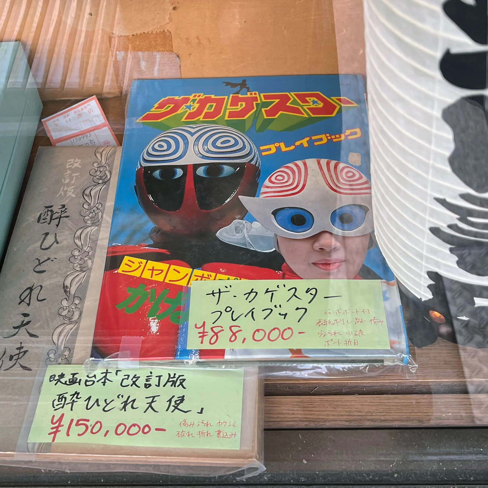
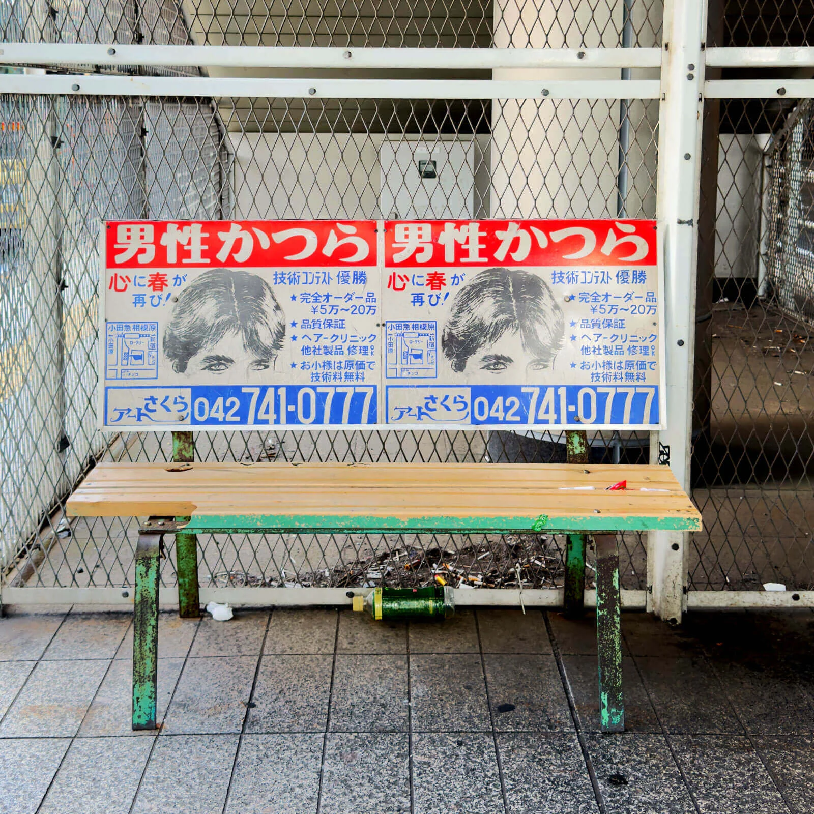
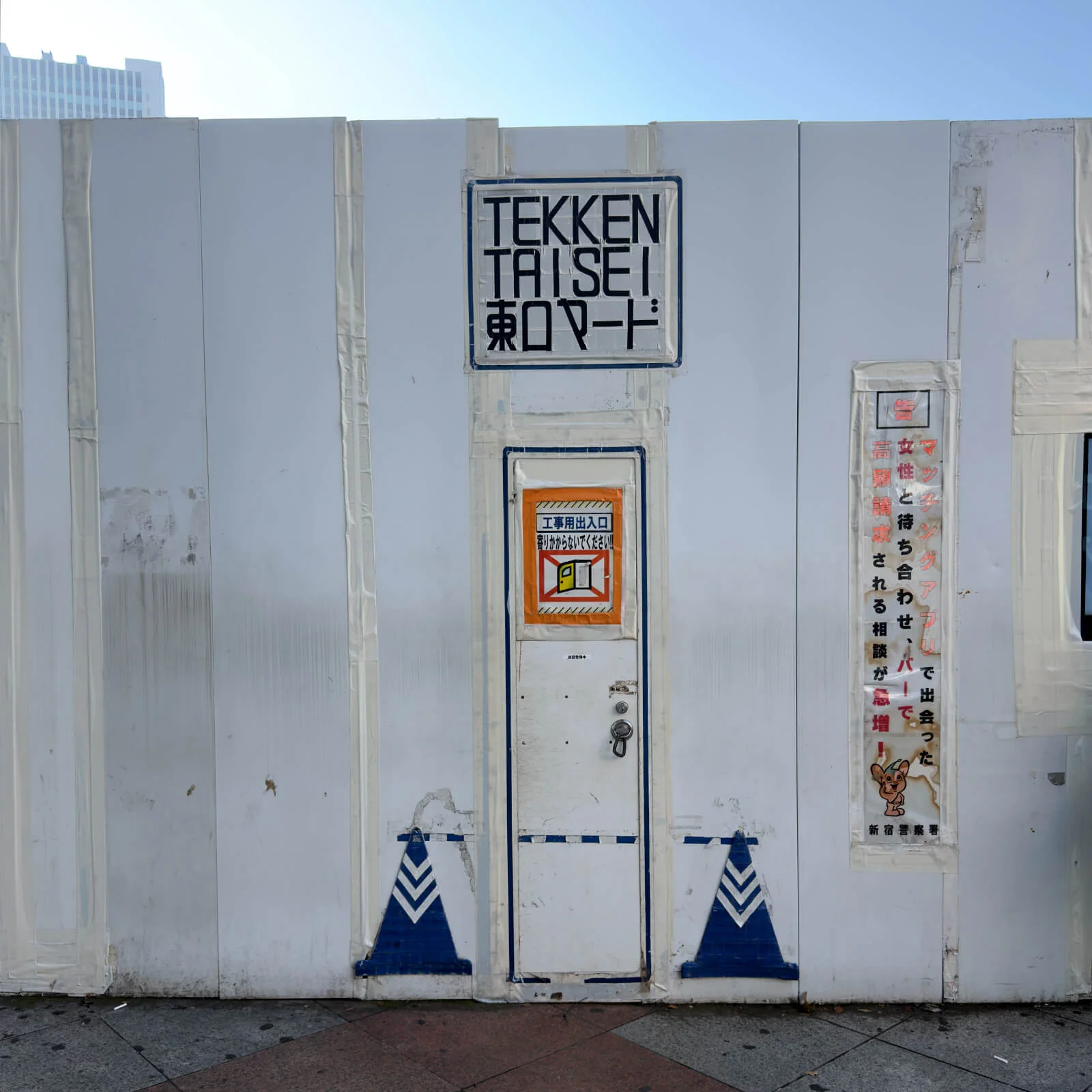
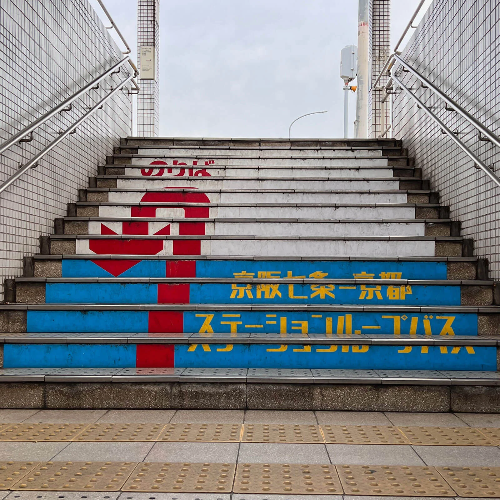
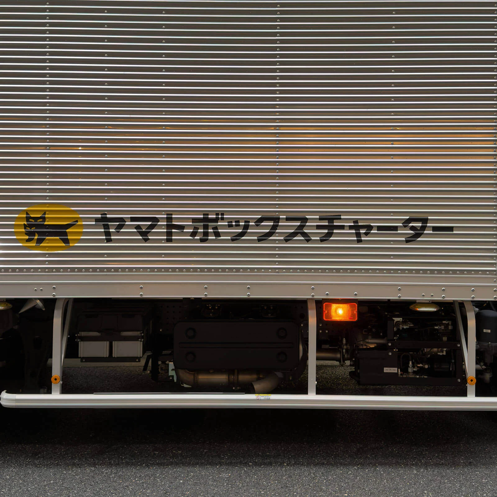
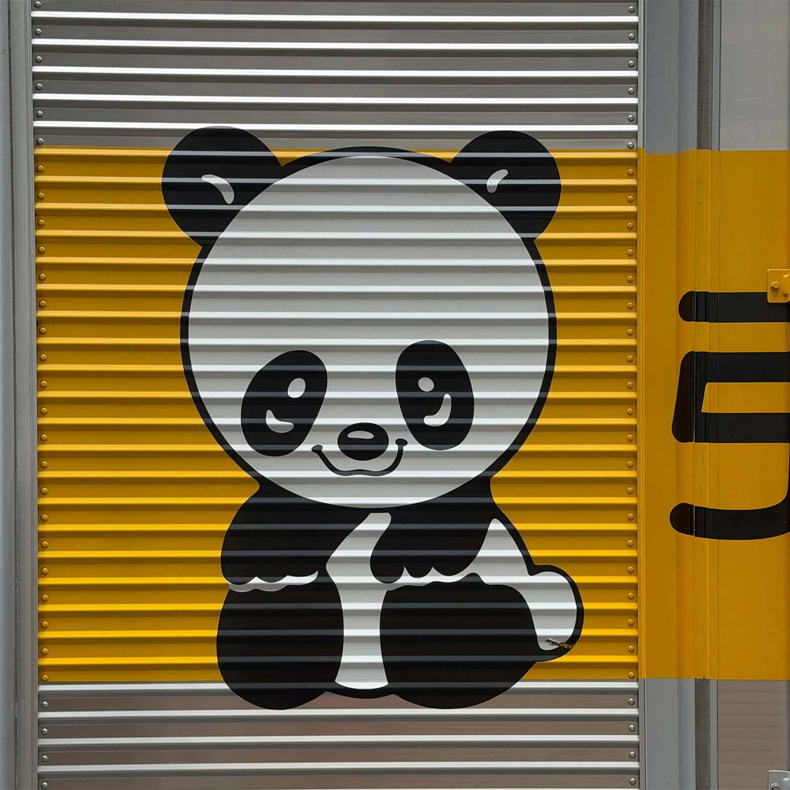
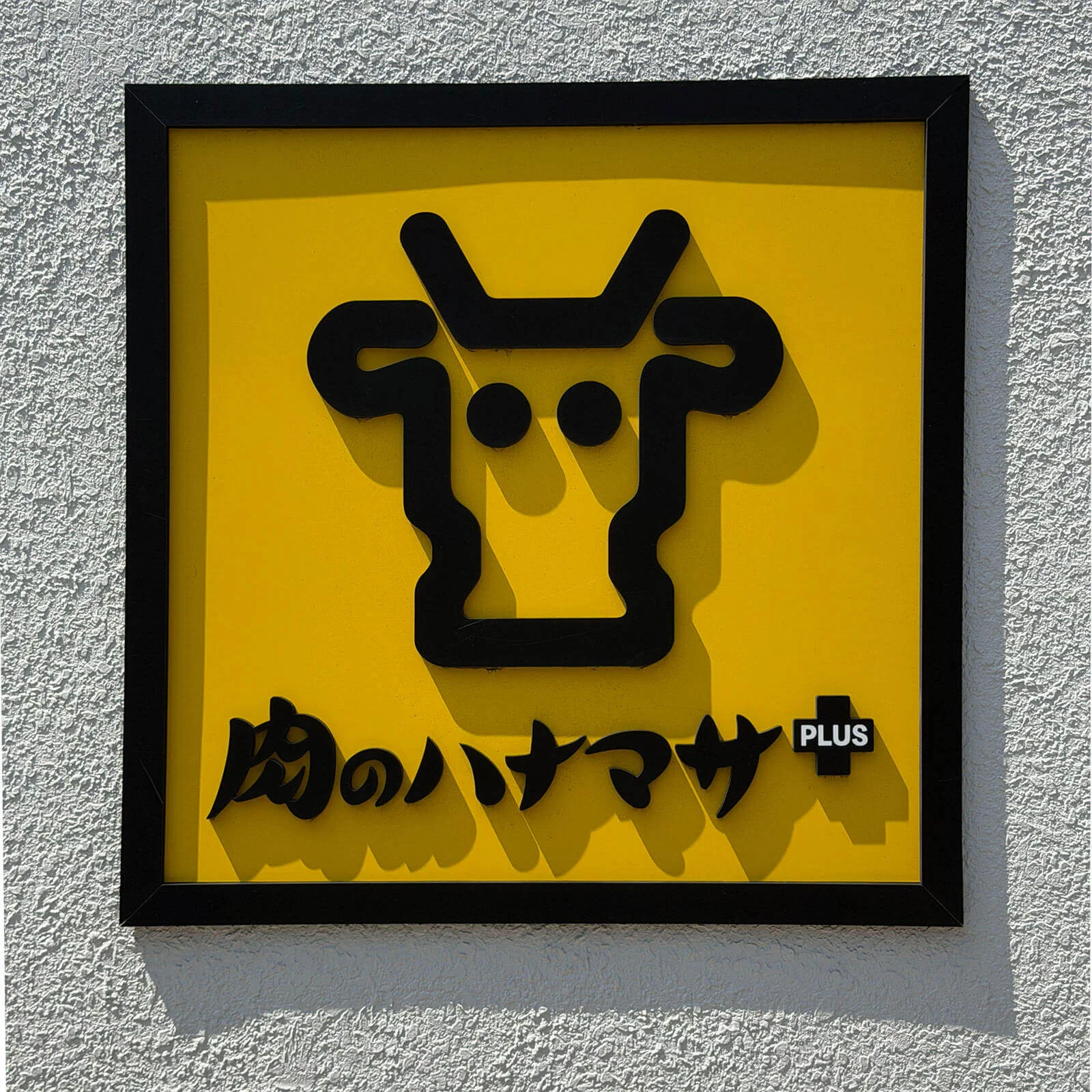
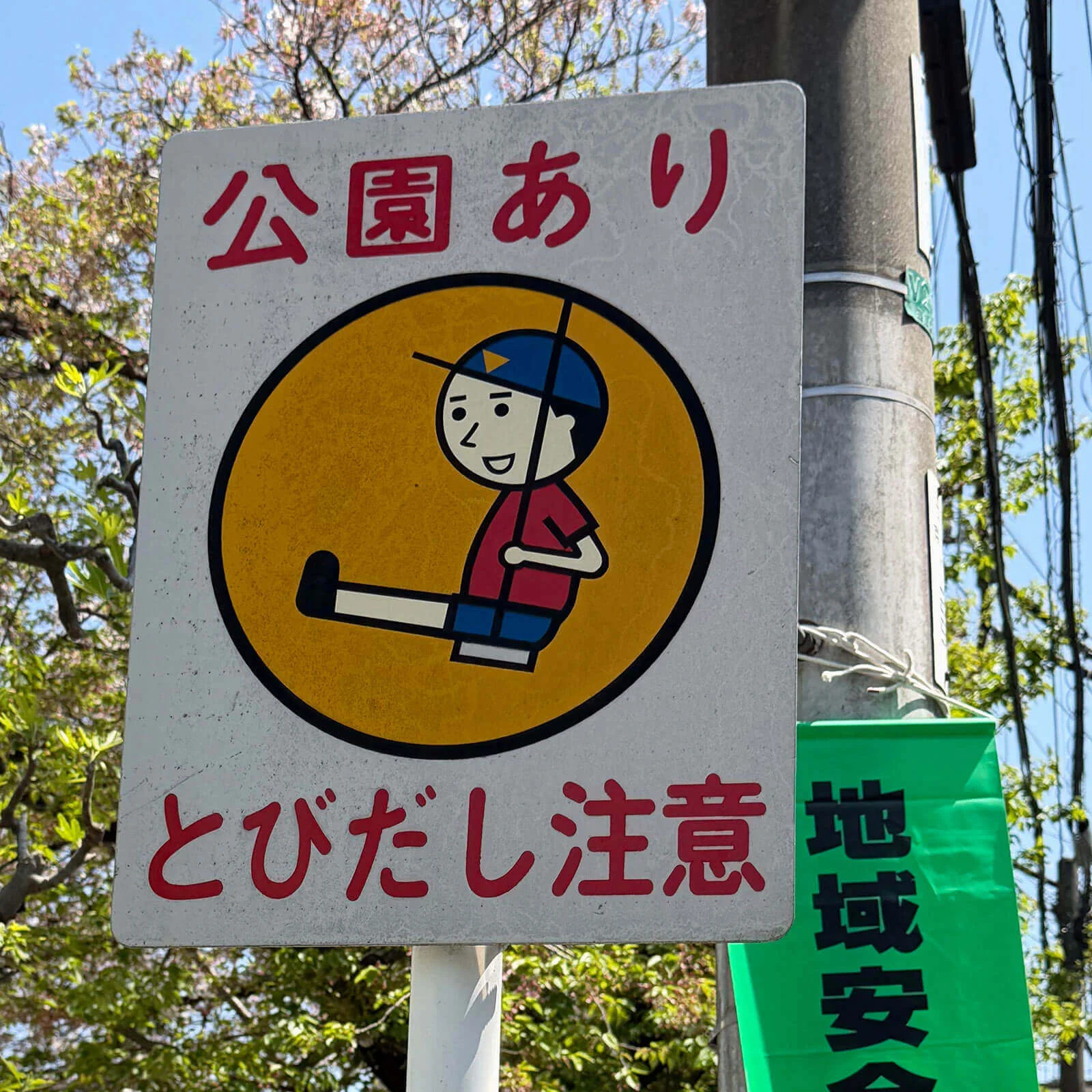
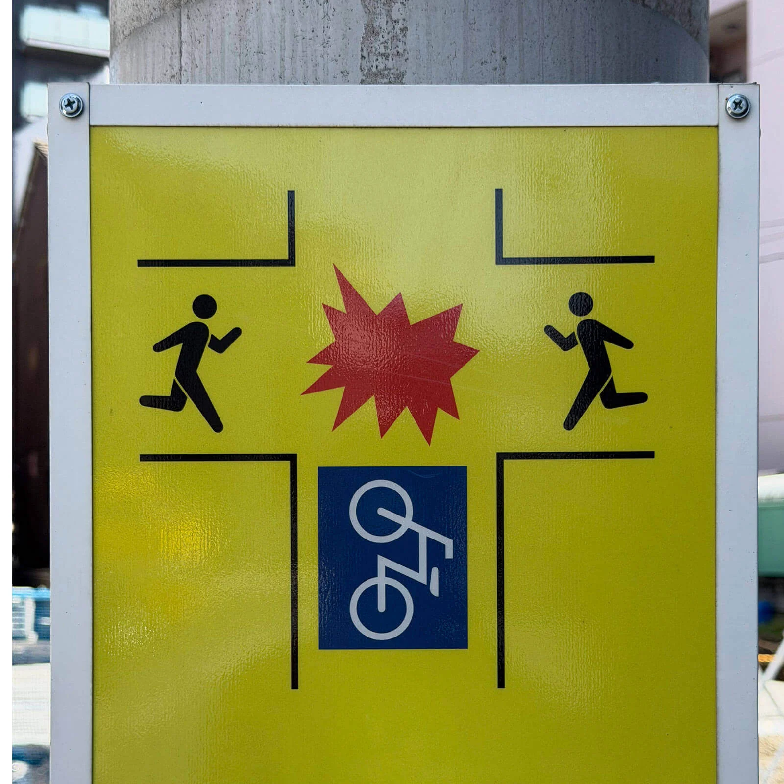
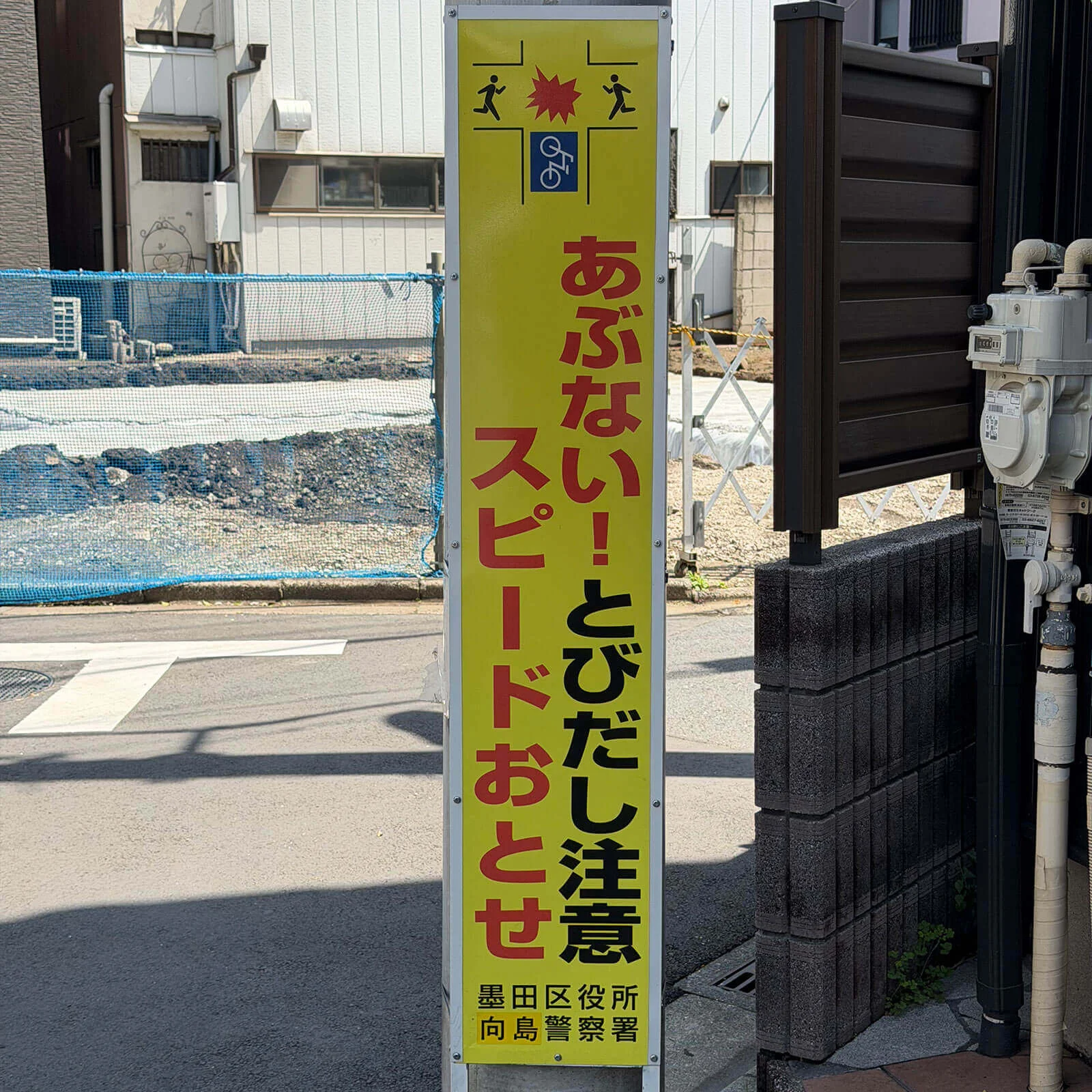
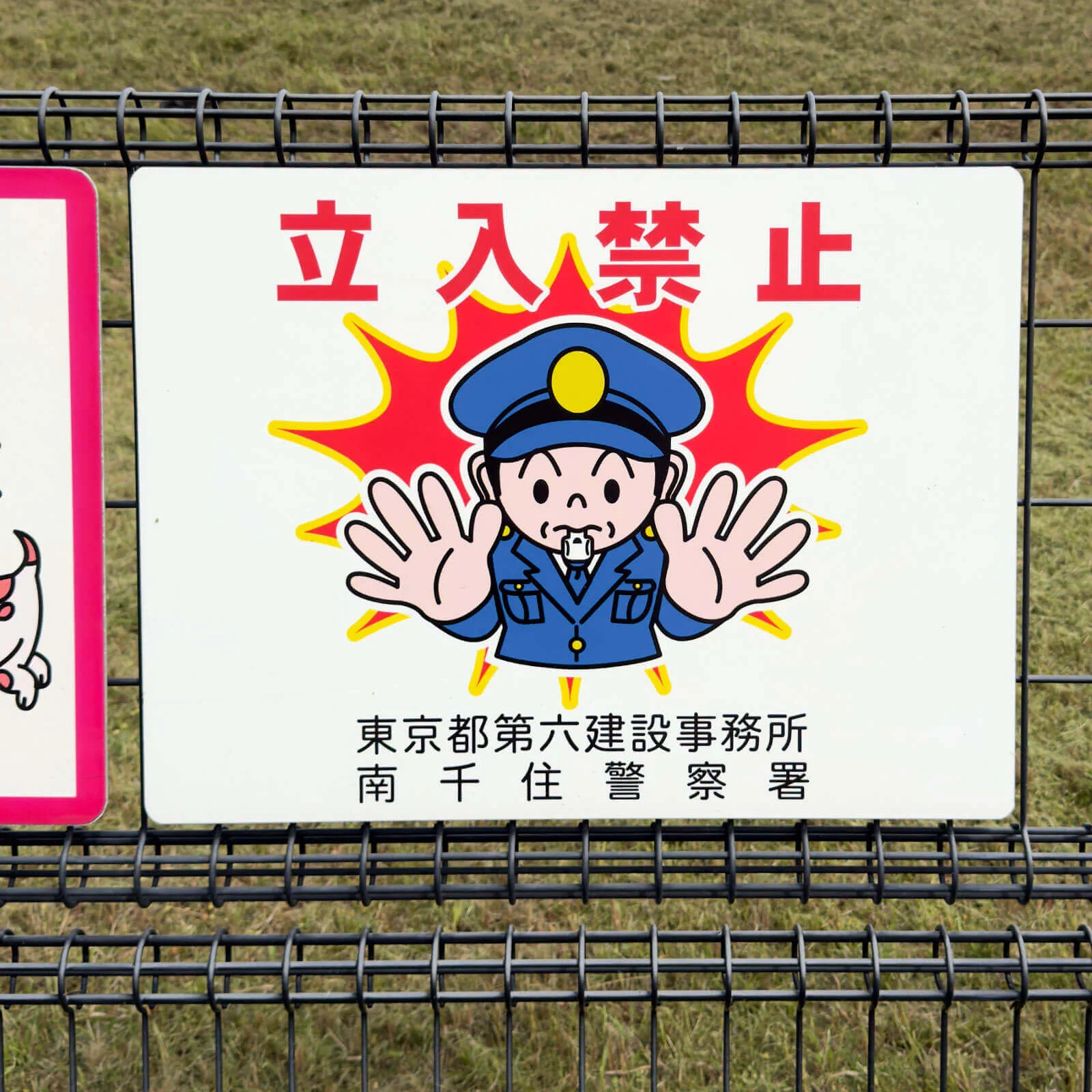
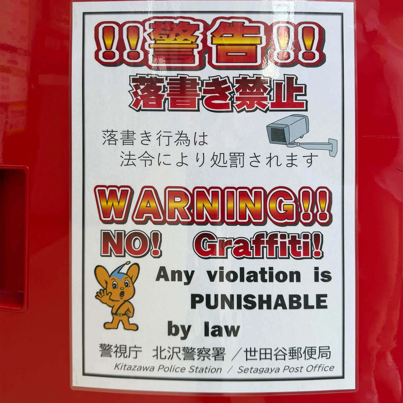
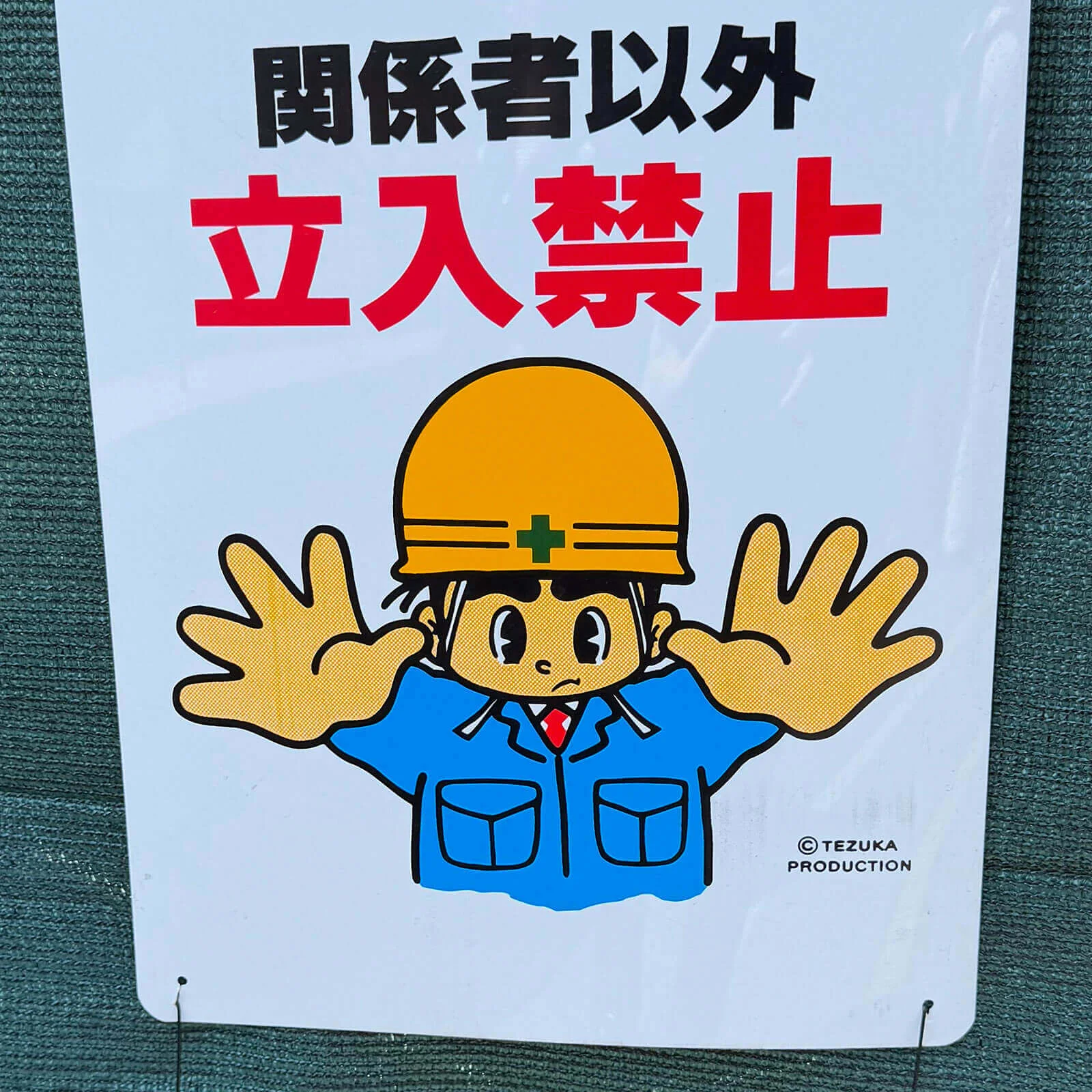
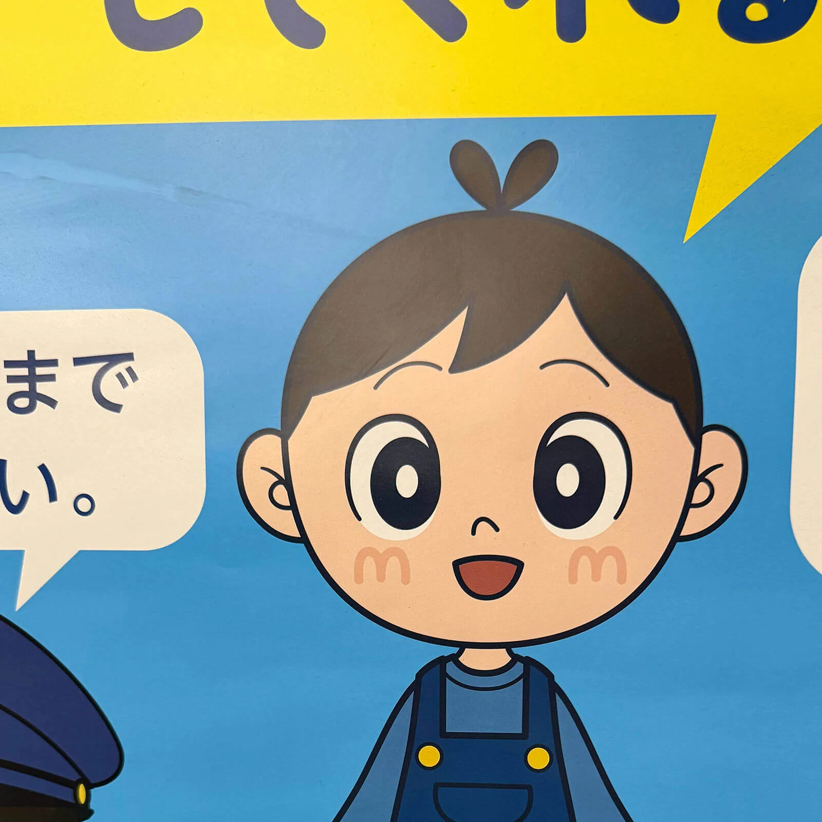
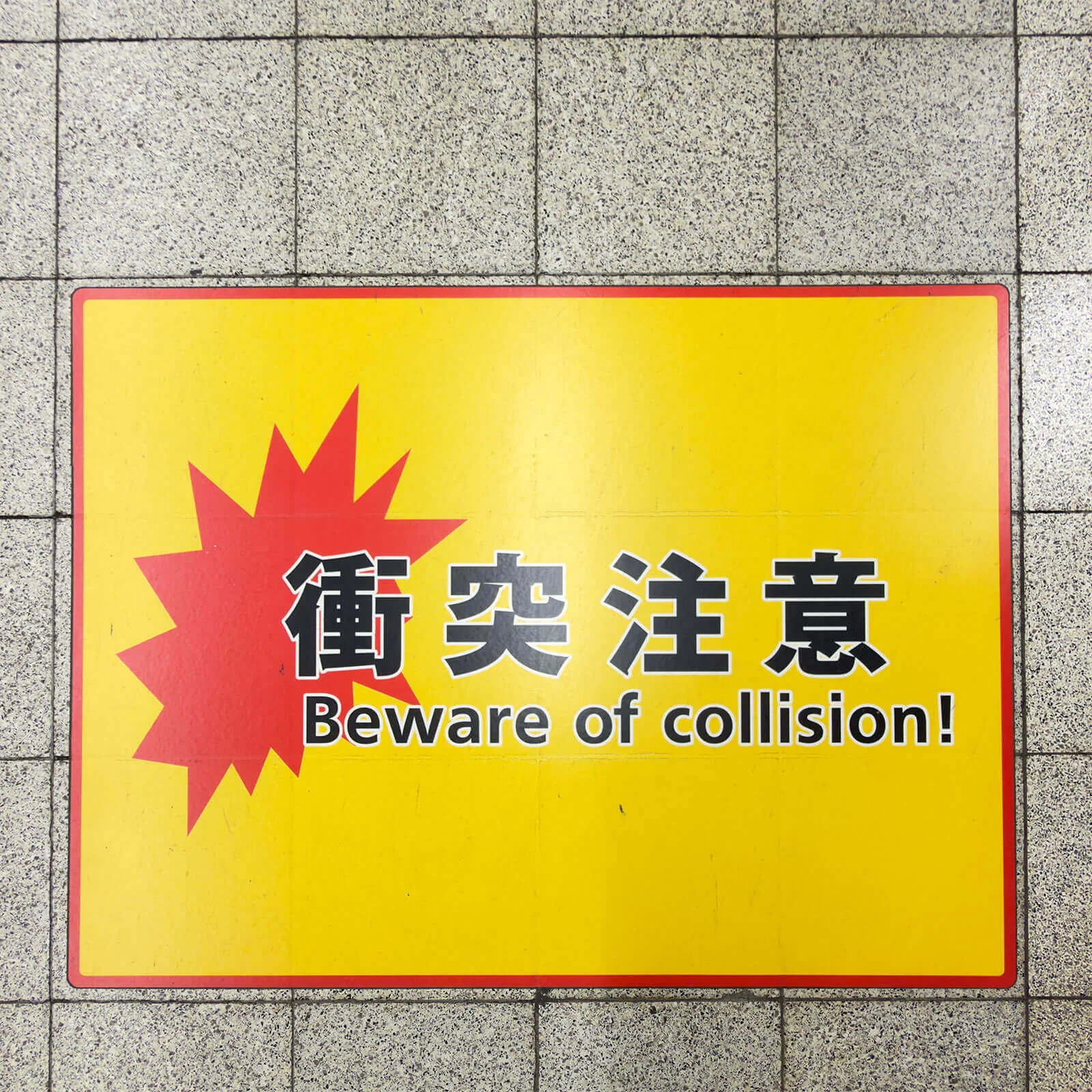
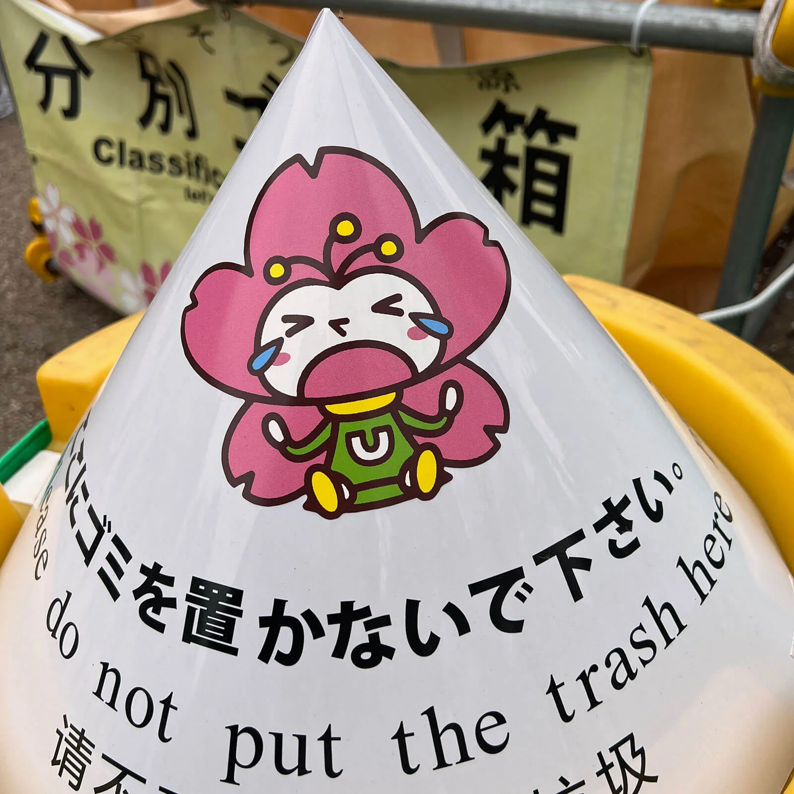
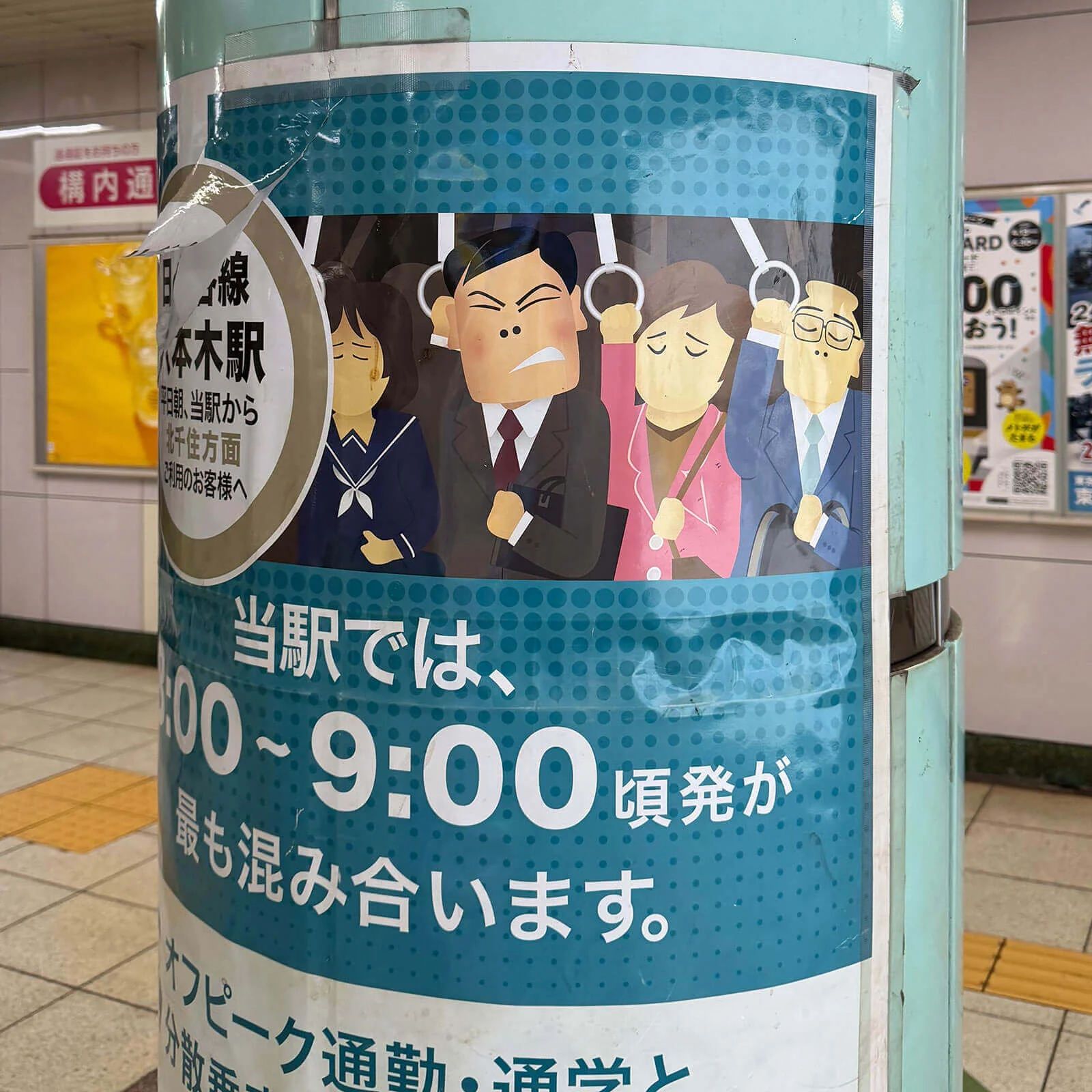
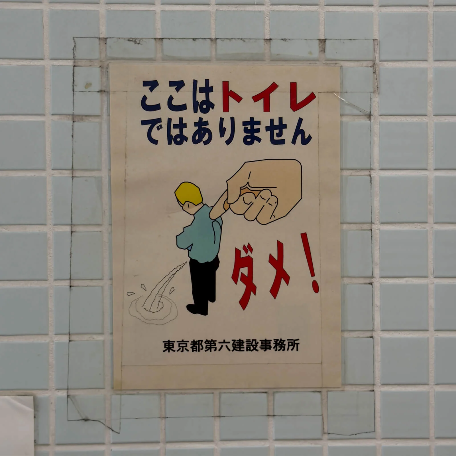
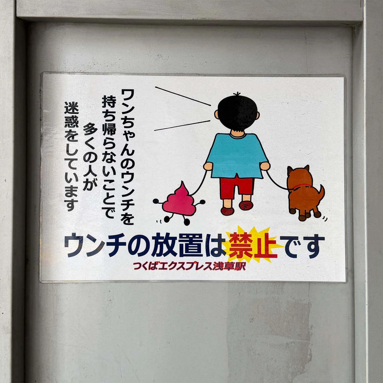
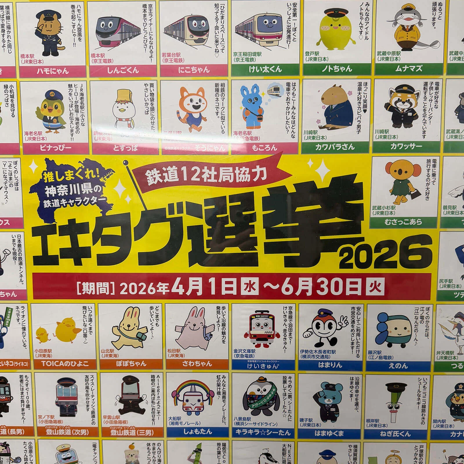
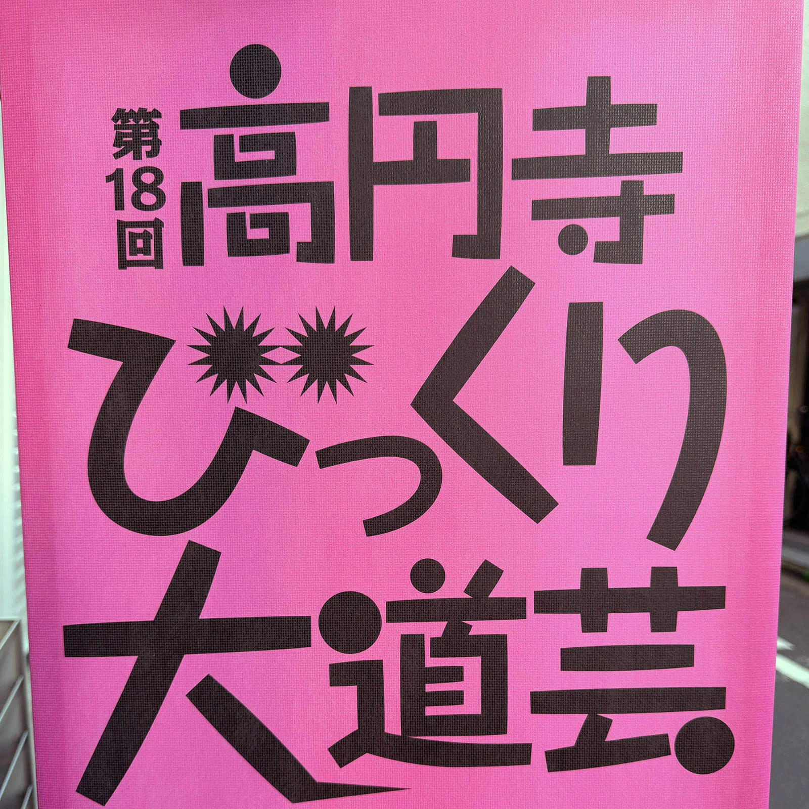
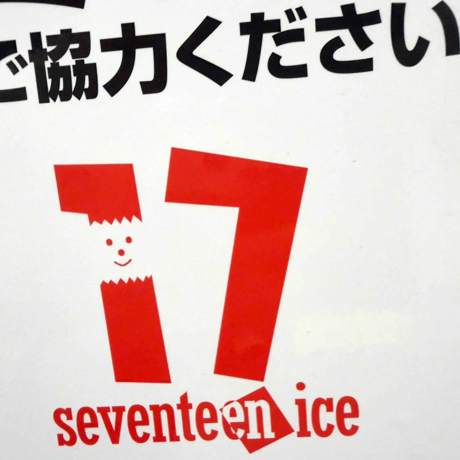
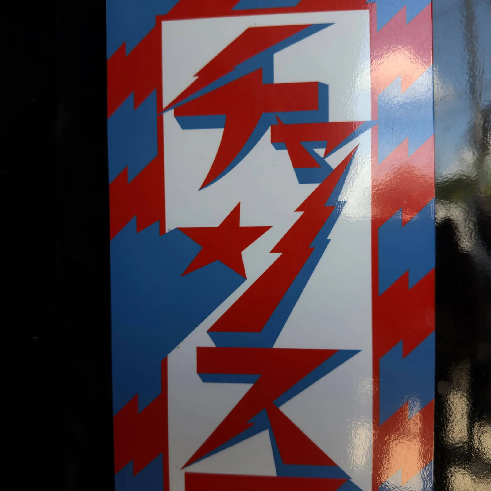
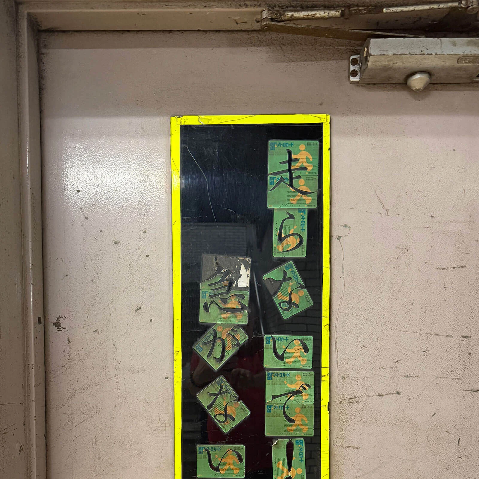
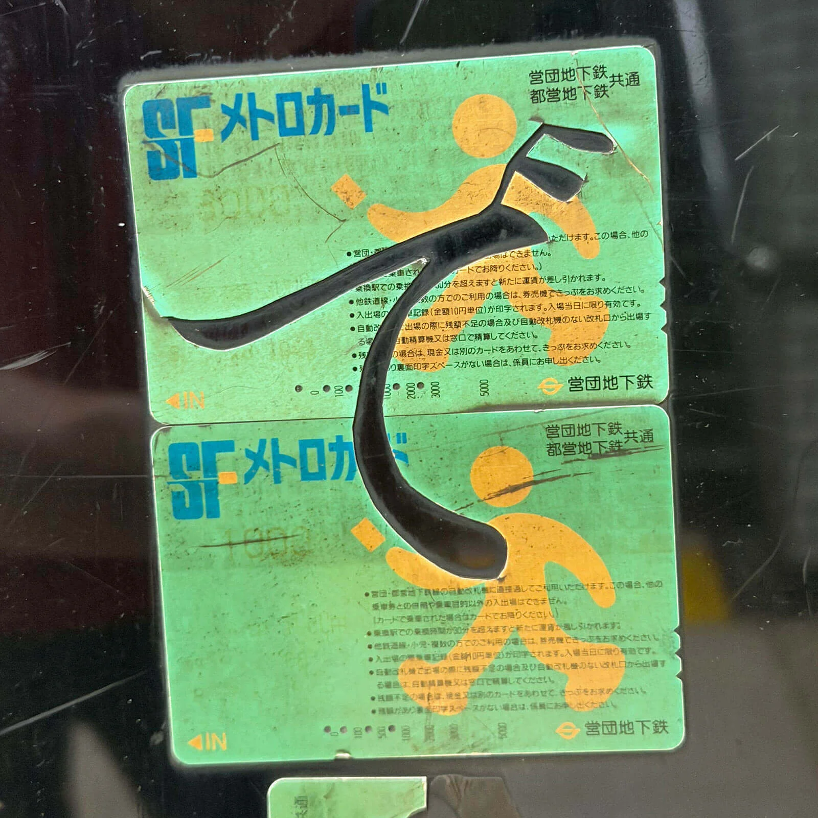
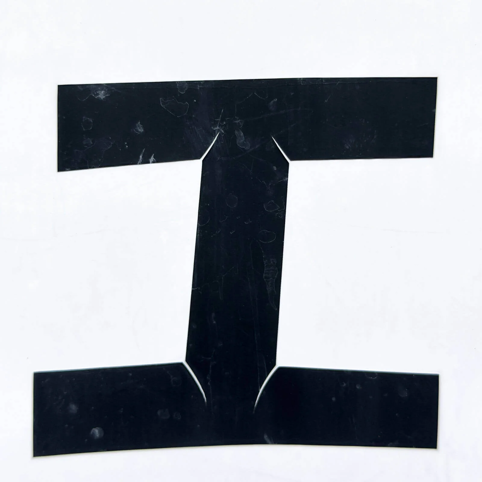
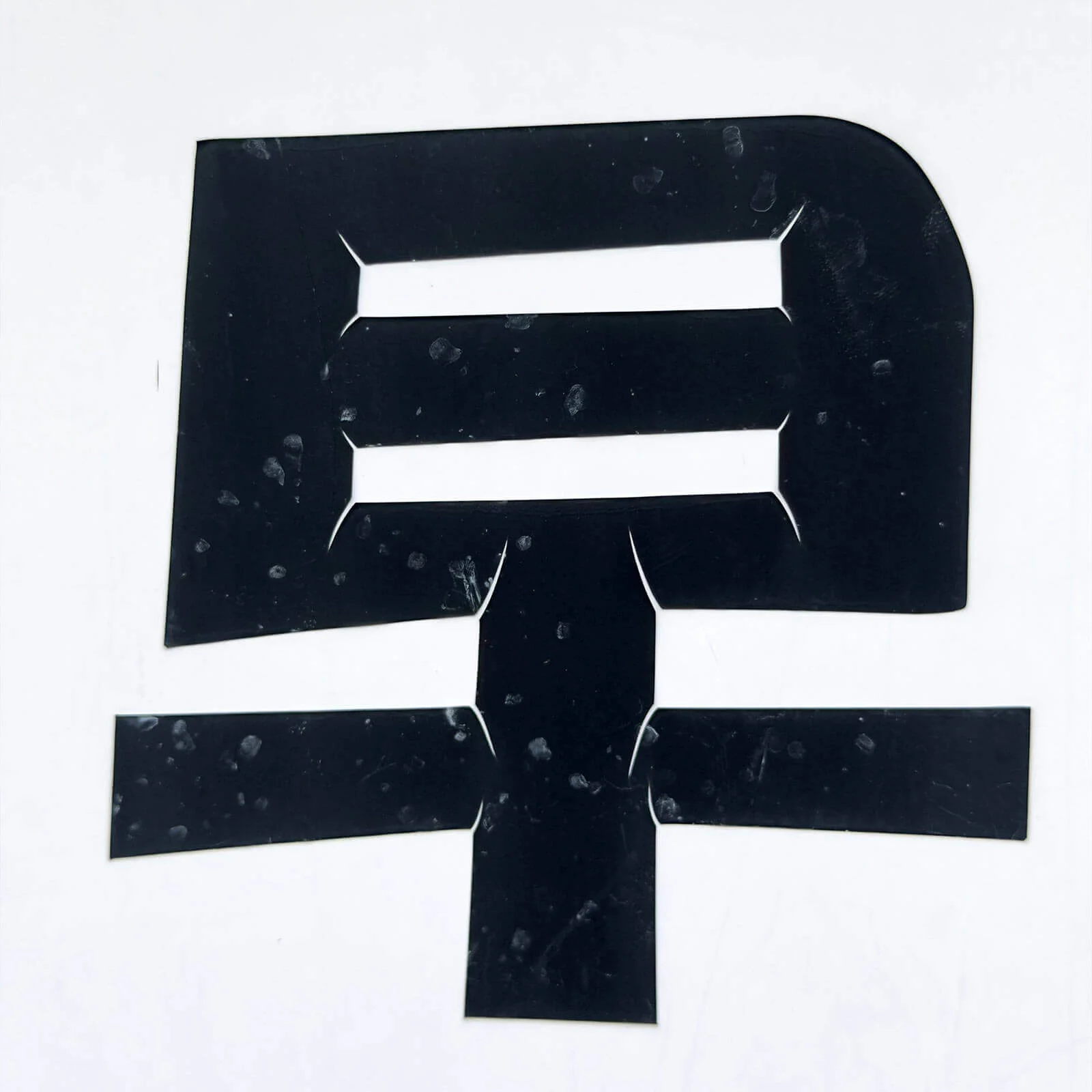
The series The Good, the Bad and the Ugly brings together typographic finds from a range of cities. The photographs present them as they were encountered: unembellished, unedited and without aesthetic or qualitative judgement. Rather than distinguishing between ‘good’ and ‘bad’ or ‘ugly’ design, the focus is on typography as a direct expression of everyday urban culture.



















Write comment
Write comment
Comments
No Comments